Eligasht B2B
Project
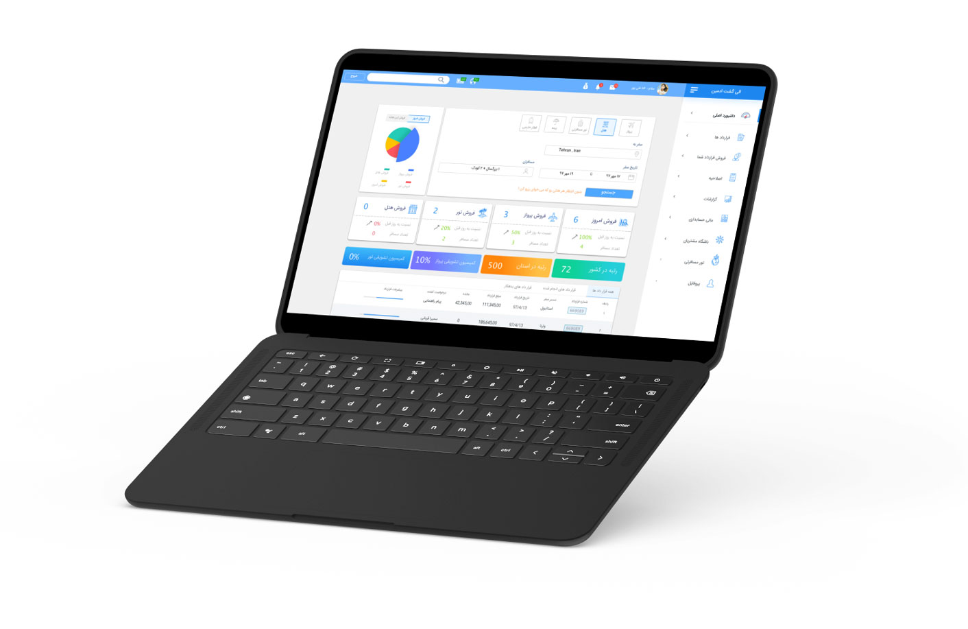
Eligasht B2B is a specialized web-based application tailored for travel agencies.
It functions as a division of the Eligasht company.
My role
To facilitate workshops with users,
experts and senior business, and
technical stakeholders
Create wireframes and prototypes for
usability testing
Conduct usability testing
Meeting up with developers
Objective
The company wanted to streamline the day-to-day operations of travel agencies through a centralized platform. The goal was to design a user-friendly, efficient web application that would cater to the specific needs of travel agents, providing them with a comprehensive tool to manage their bookings, services, and customer interactions in a more effective way.
Research method
stakeholders interviews
Market research analysis
Prototype testing
Card sorting
Persona
focus group
in this section, I just explained part of the project
The Challenge
The main challenge of this project lay in understanding the unique workflows and pain points of travel agency employees. Travel agents handle multiple tasks simultaneously, from booking flights to managing customer service, often using fragmented systems. We needed to create a cohesive tool that could consolidate these processes in a streamlined way.
Additionally, the solution had to work for a broad range of users, tech-savvy and less experienced employees nationwide. Cultural and logistical differences between users posed a potential limitation, which called for an in-depth understanding of the users’ specific needs and environments.
Research Approach: Focus Groups to Uncover Core Issues
The travel industry is built on human connections, and we wanted our research to reflect that. We decided to leverage focus groups as our main research method. We selected a small but diverse group of participants, ensuring that we had the right personas that mirrored our target audience of travel agency employees. The focus group session allowed us to dive deep into their work routines, uncovering frustrations, needs, and how they interacted with existing tools.
Recruitment and Execution:
We brought together 9 participants representing different segments of our user base, including agency owners, ticketing staff, and sales representatives. Rather than seeking a high volume of participants, our priority was relevance and specificity. The focus group gave valuable insights into user behaviors, preferences, and key challenges that informed our design decisions.
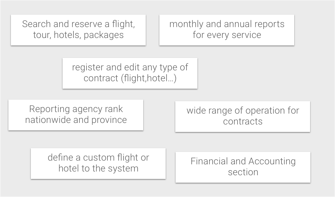
main concepts
Insights Gained from Focus Groups
One of the key findings was the fragmentation in how different agencies operated. Many of them had their workflows, leading to inefficient processes and duplicated efforts. Another significant pain point was the difficulty in tracking bookings and services, leading to lost sales and frustrated customers.
Card sorting
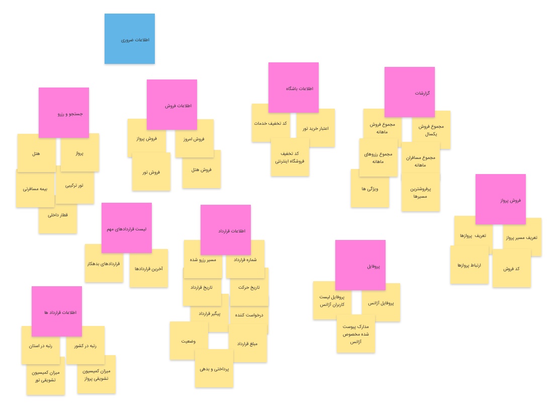
based on our research, we created several features and concepts. we conduct an inventory of project features and content. Each of these features is
made up of one card.
The set of cards is then presented to the users, and then they regrouped the different cards according to their point
of view.
With this, we had the input to define the best-organized information based on the users’ standards.
Site Map
One aspect of the Eligasht B2B that I was very eager to design was the Information Architecture. I wanted to create a simple workflow so any employee with any knowledge level could understand the system.
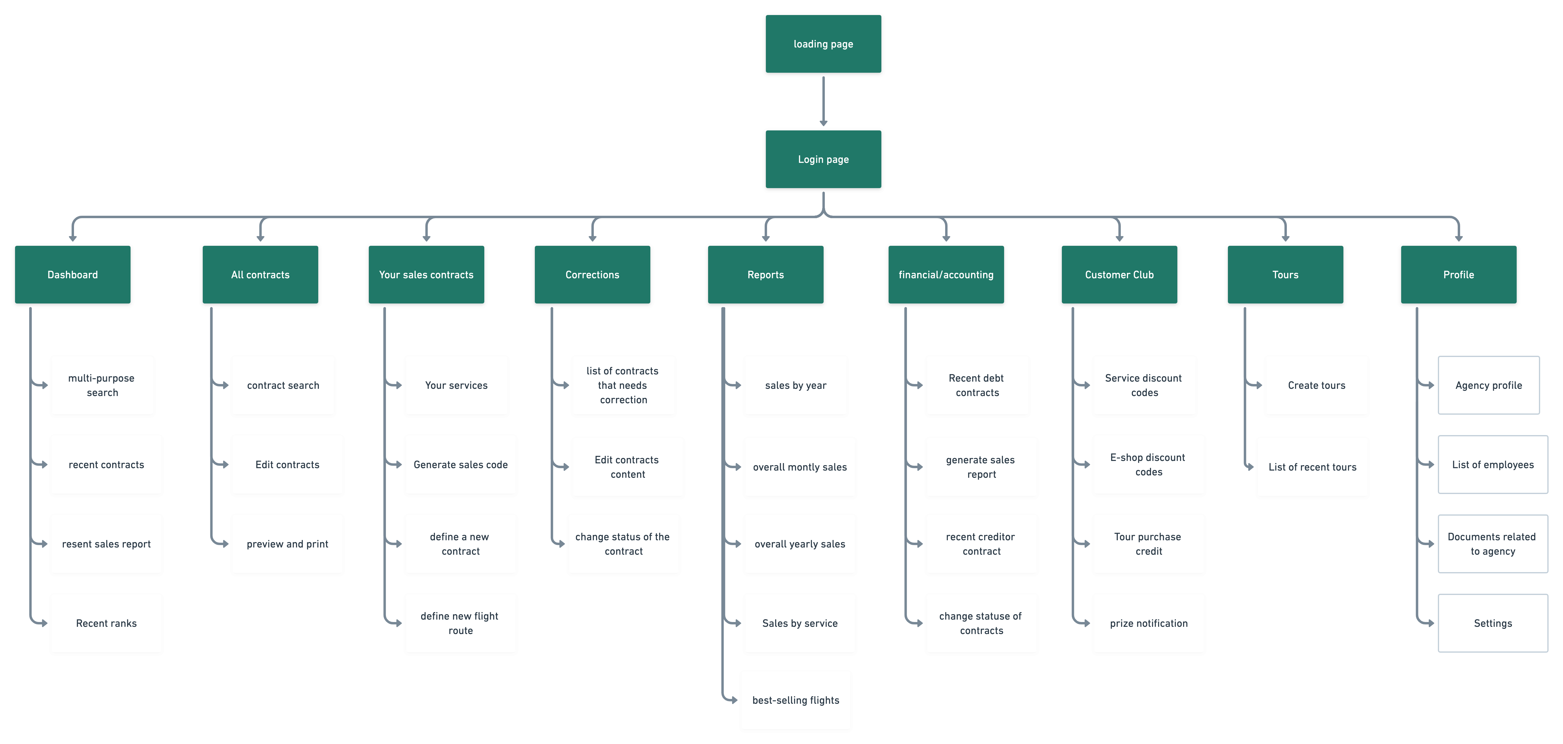
Keeping the card sort results in mind, I developed a site map that will allow users to navigate the web app easily.
Hierarchy and Flow: This sitemap reflects the navigation hierarchy we refined through card sorting exercises. By prioritizing user-centric features like “Dashboard” and “Contracts” at the top of the hierarchy, we ensured that users can access frequently used sections with minimal clicks.
Content Organization: Features like “Sales by Year,” “Best-Selling Flights,” and “Service Discount Codes” are organized to reduce cognitive load on users. This logical flow mirrors the feedback we received during our usability testing, where users appreciated a simplified, linear process for accessing data and managing contracts.
Sketches
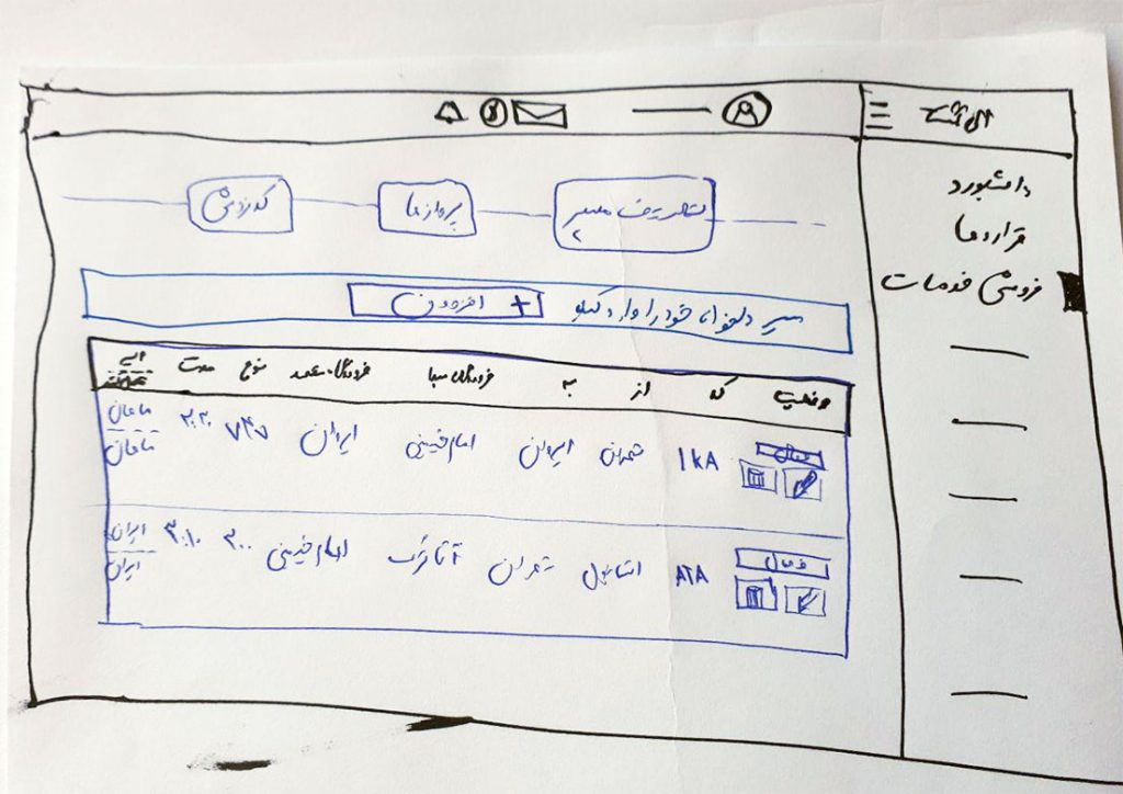
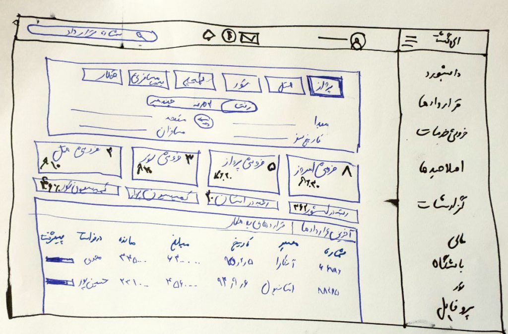
In the next step, I started sketching on the paper. the most important part was the dashboard page, where we should
put all the necessary information for the agencies.
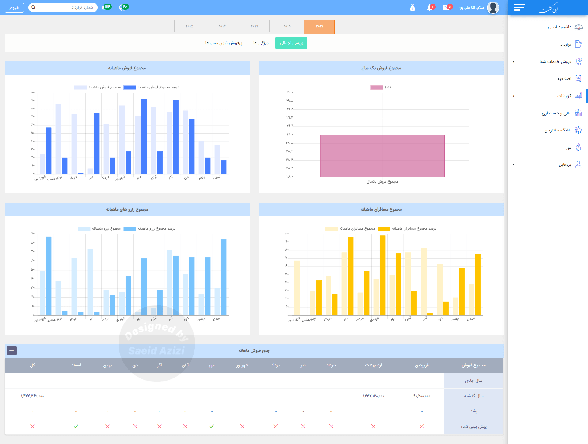
I sketched different versions of the dashboard page and we concluded to display a pie chart for sales and also a
table view for the recent contracts.
Prototype
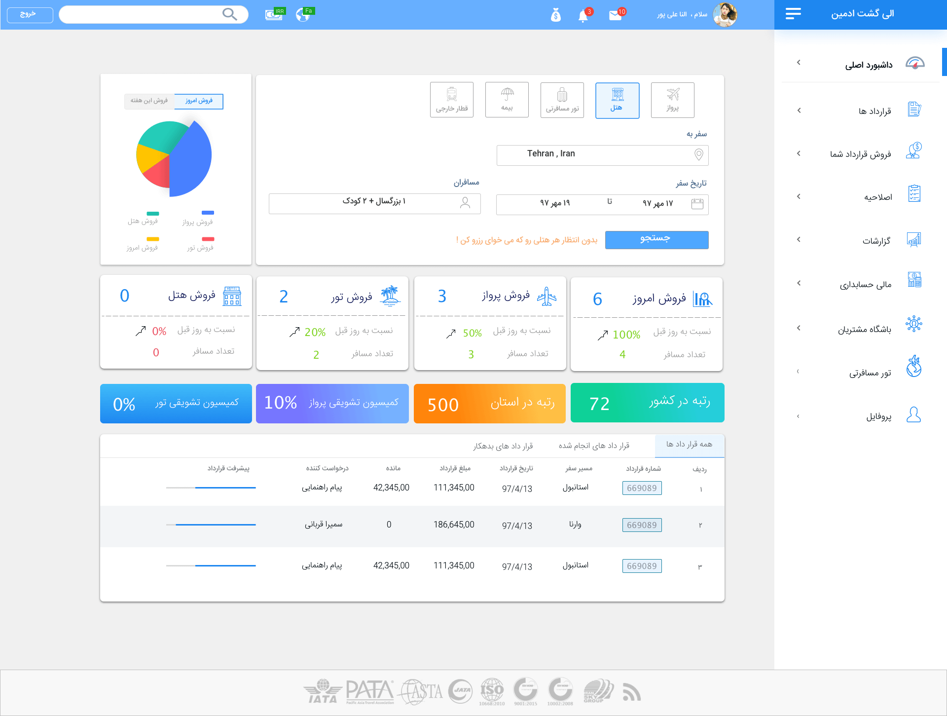
On the dashboard page, we presented a search form for all kinds of services that
agencies have access to.
In the table view, we display all the information about the recent contracts and also show the small progress bar
for each contract to determine the progress percentage of the contract
Contract section design
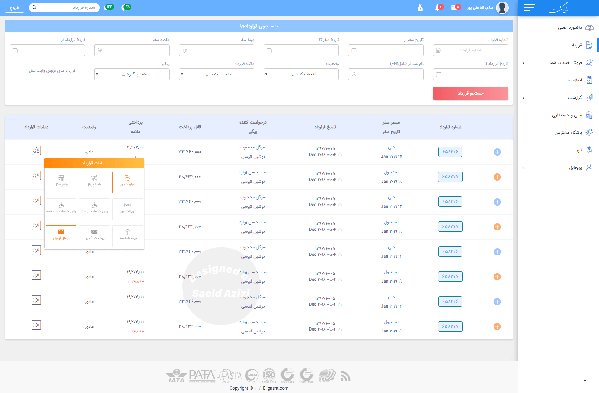
For the contract section, I designed an advanced search at the top so the user can search the contract with just a little bit of information about it.
This concept was essential because, in the research phase, when we built our personas, we found that one of the main user tasks was to search for contracts and edit them. Sometimes, they don’t have all the information available to find the specific contract, so we should provide a simple way for them to find any kind of contract with any information they have available.
The problem we faced in the contract listing was showing many columns in a single table. However, we don’t have
much space, so we came up with the idea of displaying related columns in one column with the divider line so that users can easily scan through the listing.
Report section
for the report section, we considered four important reports and presented them as
a bar chart.
After multiple iterations of the design process, the final design was a high-fidelity prototype. The design aimed to
incorporate consistency throughout the whole product.
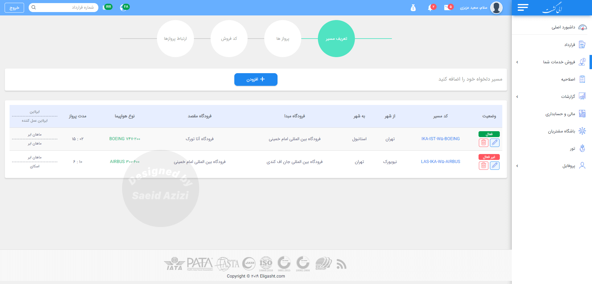
Add custom flight
for this section, users must provide all the information for the new flight, for this purpose we divided the process into 4 small sections
and that is: flight directions, flight names, flight sales code, and flight connections
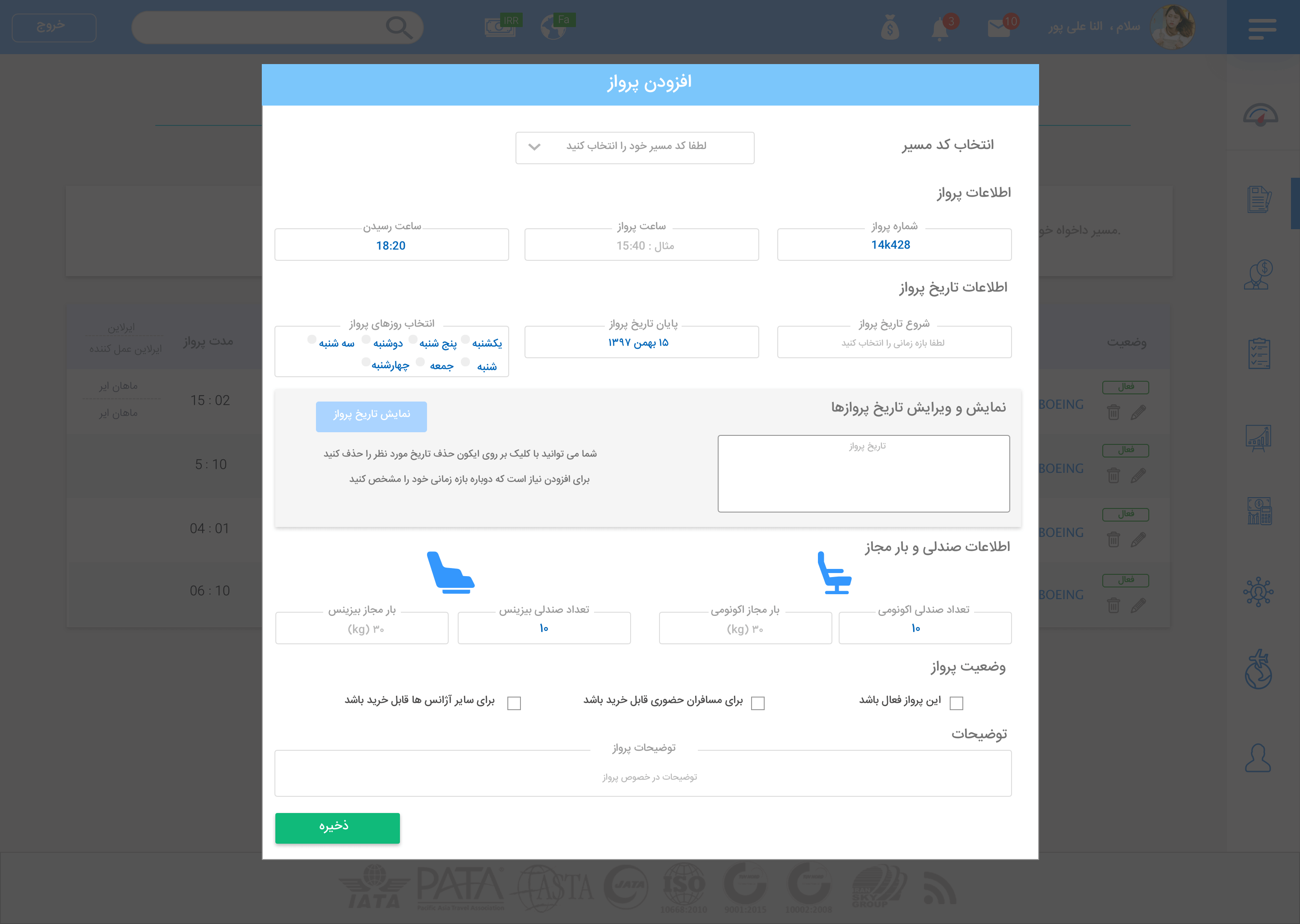
Adding new flight modal
in this section, we have lots of input fields. because this part of the application was dependent on other sections.
to create a clean form, we divided fields into several parts and presented it as a form blow.
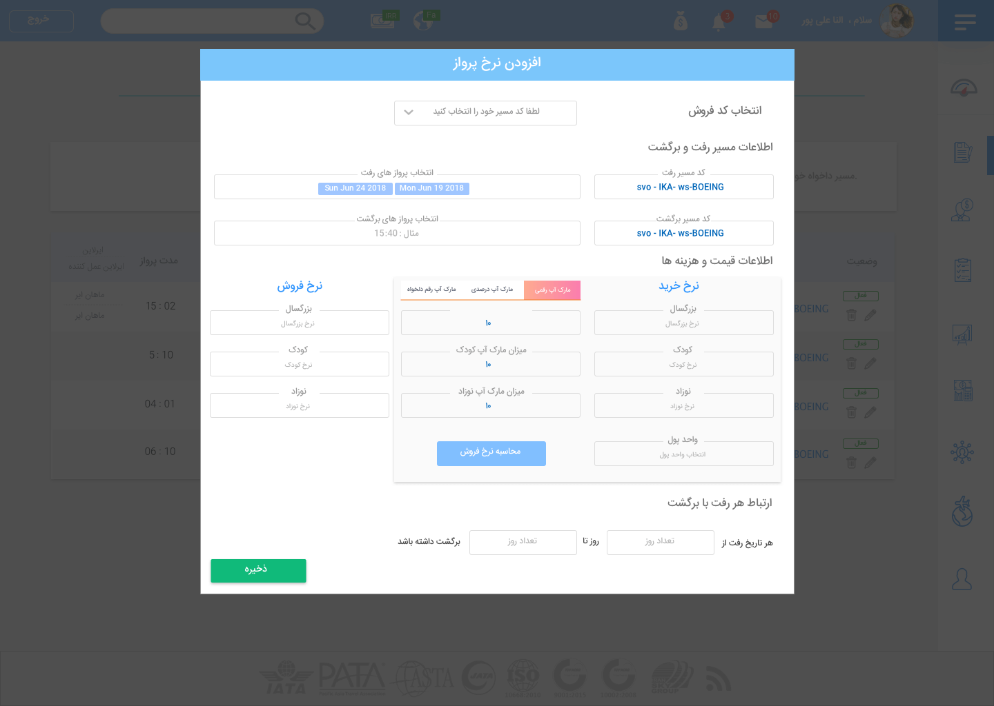
Adding flight prices and codes modal
Throughout the application, there are many complex forms that employees of the agencies have to fill out.
If these forms get disordered, it is going to be a time-consuming process. The form below is another example
that I tried to design in a way that can be easily understood at first glance.
In this model, users should provide information about prices for each flight, including buying and selling prices according to the agency policy.
Profile section
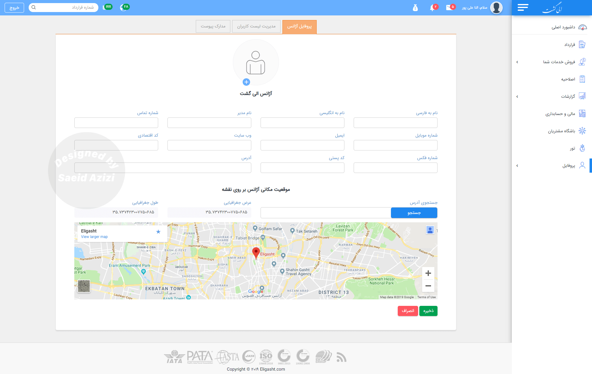
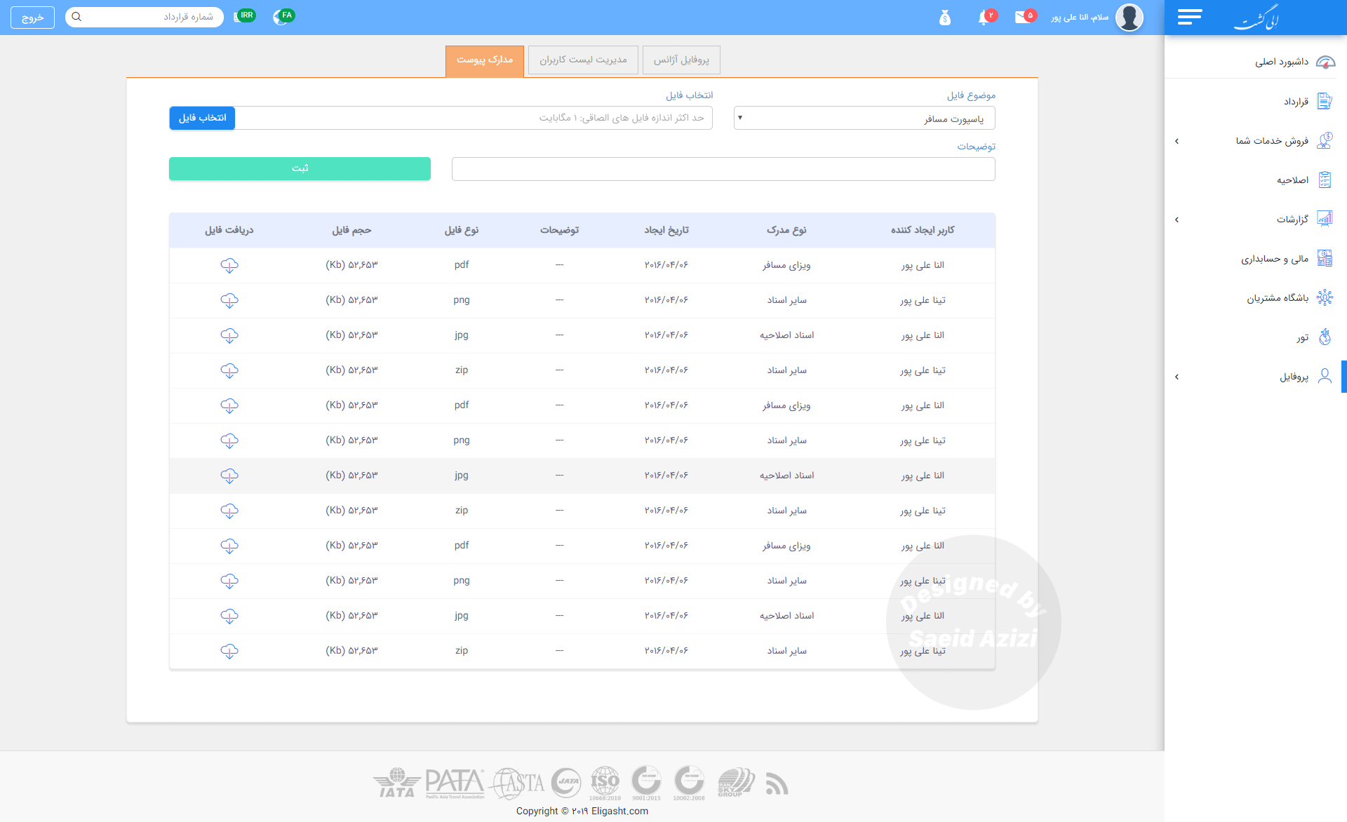
In this section, I created three tabs to display information about the agency and its employees. Our research revealed a connection among these three types of information for every agency: Agency Profile, Employee List, and Attachment Documents.
Attached documents section
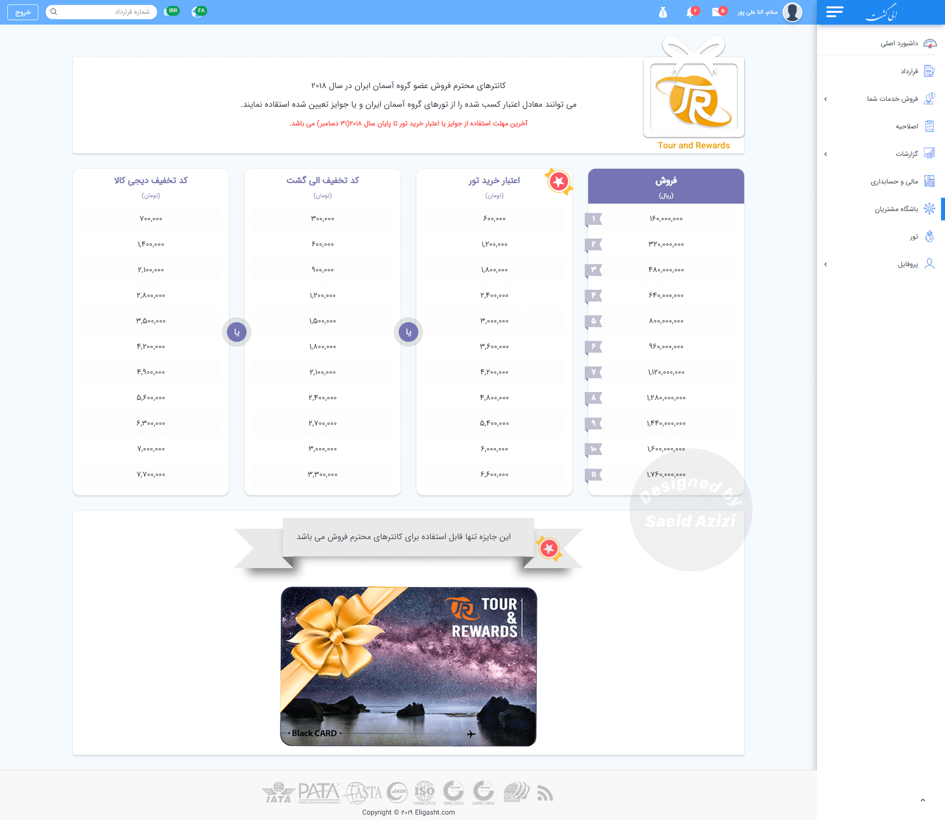
sales bonus section
Lessons Learned and Future Enhancements
The Eligasht B2B project provided valuable insights into designing user-centered platforms for a niche market like the travel industry. Through this process, we were able to deliver a functional and intuitive solution that addressed immediate pain points for travel agency employees. However, every design process is iterative, and this project highlighted several areas where we can refine our approach for future iterations.
What We Learned:
- Undestand the imidiate pain points: Our commitment to understanding users was a key success. Focus group sessions revealed critical needs, such as real-time sales data and a simplified contract management system. We incorporated visual cues like pie charts into the dashboard for easy access to vital data.
- Effective Navigation and Hierarchy: The card sorting method helped us organize content meaningfully. The sitemap prioritized common tasks, such as contract editing and sales reports, allowing travel agents to navigate effortlessly and improving overall user flow.
- Iterative Prototyping and Usability Testing: By creating wireframes and prototypes for early usability testing, we validated design choices before final implementation. This iterative process resulted in a product that met both business goals and user expectations.
Although our current methods were effective, we see opportunities for improvement in the Eligasht B2B platform. In future development phases, we plan to adopt more rigid UX research methods tailored to our B2B needs.
1. Longitudinal User Research
To gain deeper insights into user behavior, we will implement longitudinal studies, observing travel agents’ interactions with the platform over weeks or months. This will help us understand how users adapt, experience friction, and value features over time.
2. Contextual Inquiry
Conducting contextual inquiries in travel agencies will allow us to observe real-time user interactions. This method will reveal challenges not identified in controlled usability tests, such as navigation delays and missed notifications, enabling further optimization of the user experience.
3.Affinity and Journey Mapping
We will enhance affinity mapping to better categorize insights from various user personas. Detailed journey mapping will help visualize the experiences of different user types, enabling us to prioritize features that address specific needs and keep the platform user-focused.
4. A/B Testing for Optimization
Introducing A/B testing will help optimize the user interface. By testing different layout variations, we can measure the impact of design changes on user engagement and performance, leading to data-driven improvements in conversion rates and user satisfaction.
5. Heuristic Evaluation for Usability
Regular heuristic evaluations will ensure our platform complies with usability principles. Engaging external experts to assess learnability and efficiency will provide quality assurance, making the product accessible to all users.
Integrating New Learnings with Current Successes
While these future methods focus on enhancing research, they will build on the core strengths of our initial approach. The insights we gained through our focus groups, affinity mapping, and usability tests laid a solid foundation for the Eligasht B2B platform, and future research will enable us to refine this foundation even further.
