Eligasht Web App
Project
Eligasht web App is the
application for searching and booking flights,
hotels and tour packages all around the world.
My role
Responsible for creating a clean and functional design
based on the requirements
Led different teams on research and design
Create wireframes and prototypes for
usability testing
Conduct usability testing
Meeting up with developers
Objective
the goal was to design a new version of the web app
to improve user experience and increase user engagement.
Research method
Competitive/Comparative Analysis
stakeholders interviews
Prototype testing
mind mapping
Persona
Research and challenges
for this project, I was provided with the previous version of the app, which was pretty confusing
in therm of searching and finding related information.
Eligasht is of the biggest tour and travel companies that have thousands of customers every day.
the site needed to reinforce the customer to use the web application of the company
instead of coming to the office in person.
User Research and User Personas
Who are we really designing this website for? With the information I was given, the company had already defined 3 user personas, each with specific needs and pain points that needed to be addressed on the website.
Based on the three user personas, I identified the main user needs I wanted to address on the website.
The primary needs I defined were:
- A clear service organization for a seamless booking experience
- Helpful tour package Suggestions that reflect Eligasht tour packages all around the world
- Efficient checkout process to save users time and allow for easy purchase of services
- Detailed service information to ensure proper product selection
- Product reviews to help make informed booking decisions and allow for user input.
Competitor Research/Comparative Research
To gain inspiration for my e-commerce website, I began by identifying 3 main competitors.
The most important takeaway from this activity was learning how different websites organized their searching system and services
and the overall layouts they used for those websites. This was helpful information that helped solidify the stage for my second phase of research.
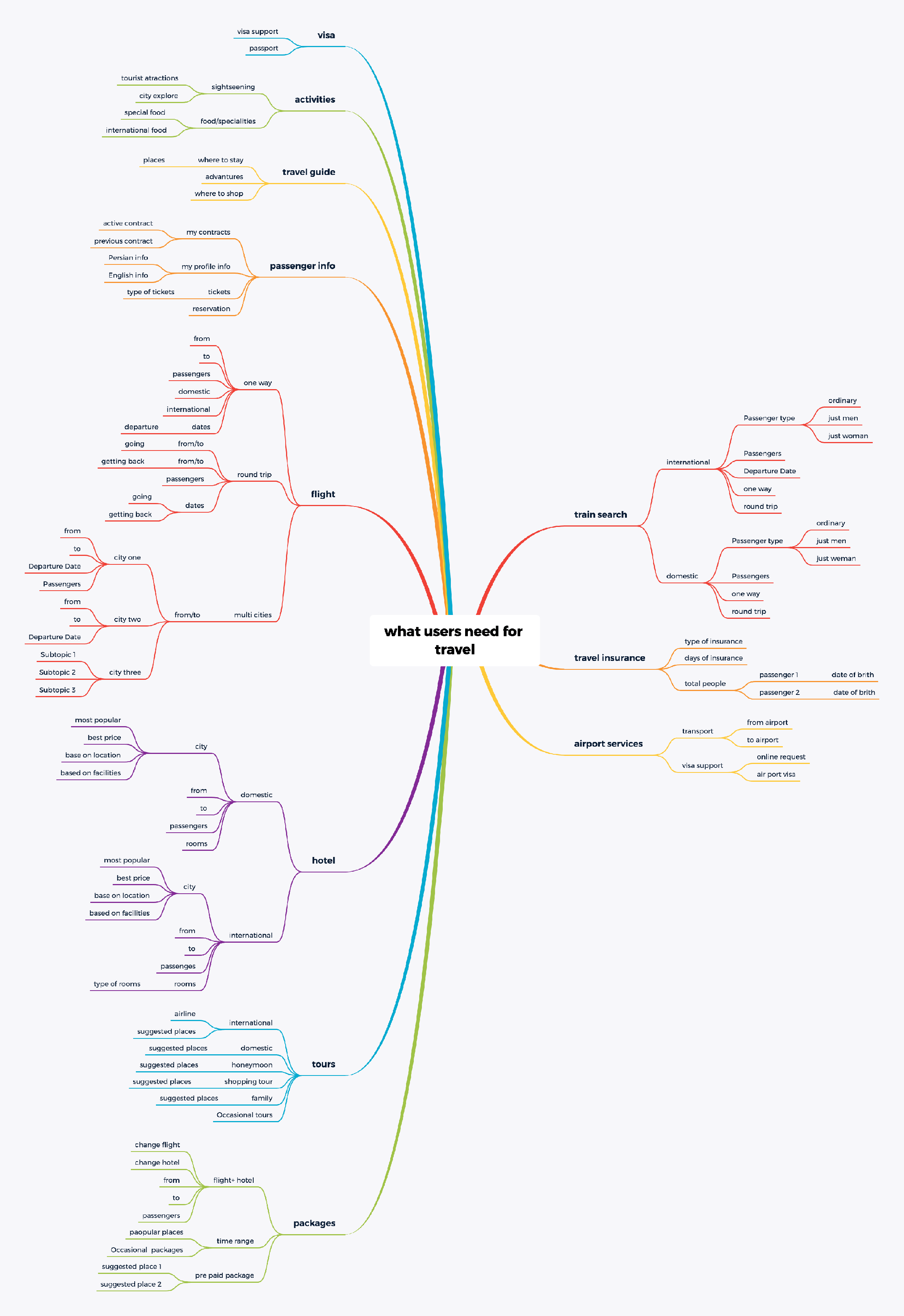
Mind Mapping
After completing my competitor/comparative research, I then went on to complete a mind map. For this project, the needs of the business and the needs of its customers/user personas were already defined in a long list of information.
The next step of my process was to develop the navigation system by conducting card sort,
a user research technique to tap into people’s existing mental models.
Site Map
With the results of the card sort and inspiration from other competitor websites, I created a site map to define the overall structure of the website.
Based on the information we collected from previous sections, we decided to remove completely some pages from the website
, for example, we removed the hotel page that had detailed information about some hotels; instead, we created a mega menu for searching and booking
a specific hotel on the main navigation of the site.
Sketching
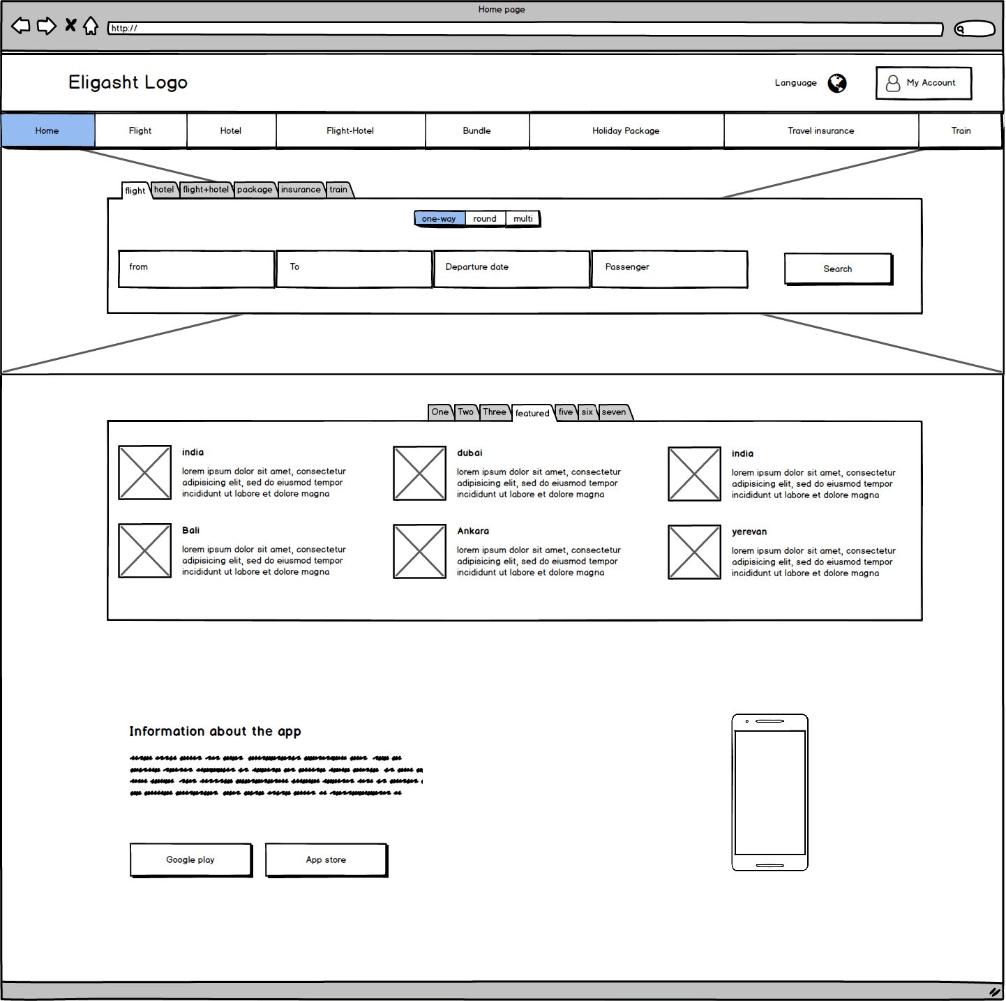
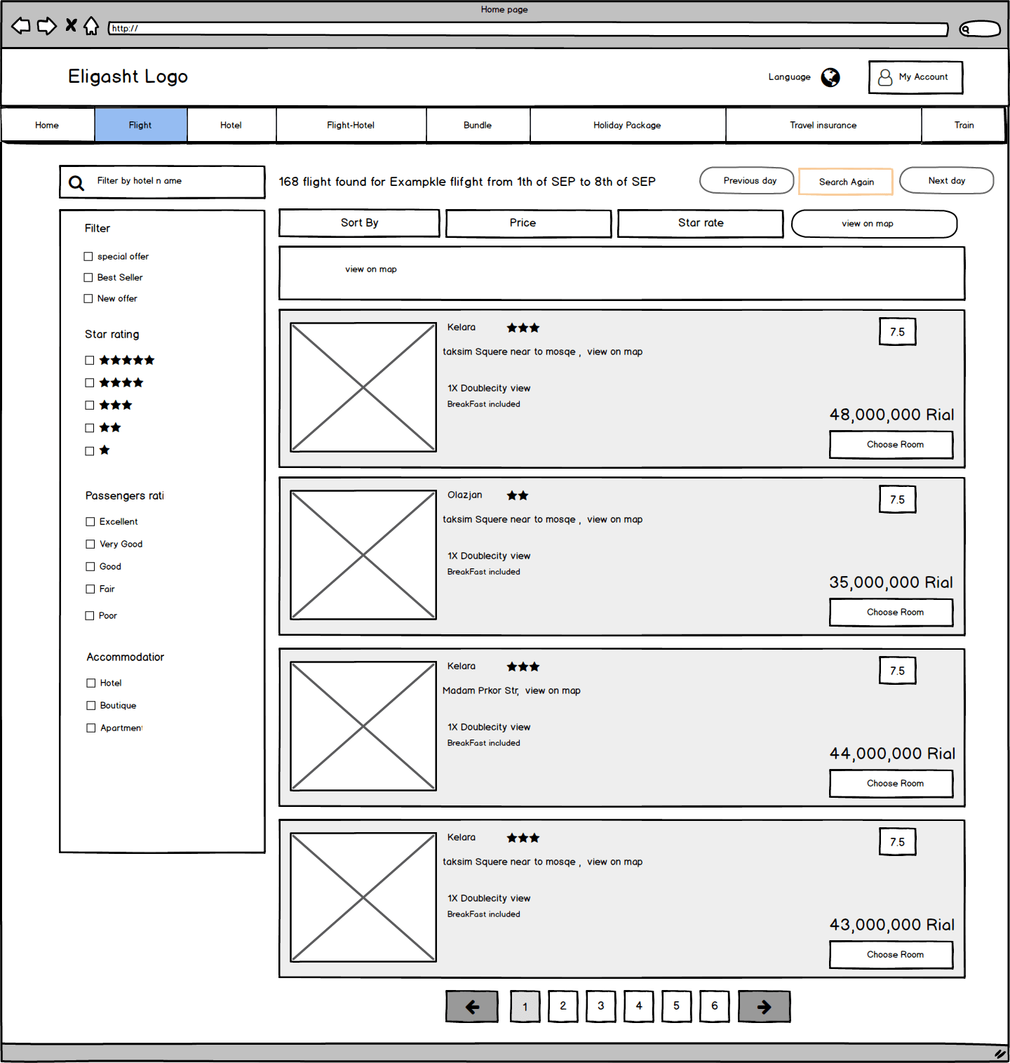
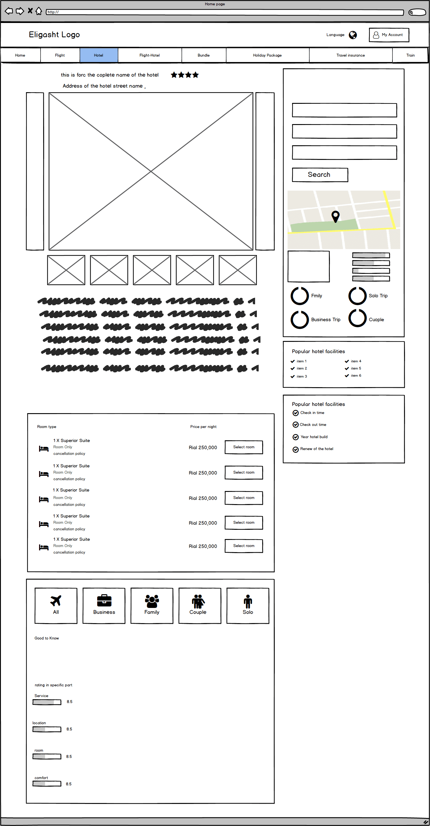
Once I organized all my insights from the exploration phase, I began to design the website. To start this process, I began to create wireframes for several of the site’s main screens, using my user flows as a guide.
Here I include some of the wireframes that I designed at this stage.
Home page wireframe
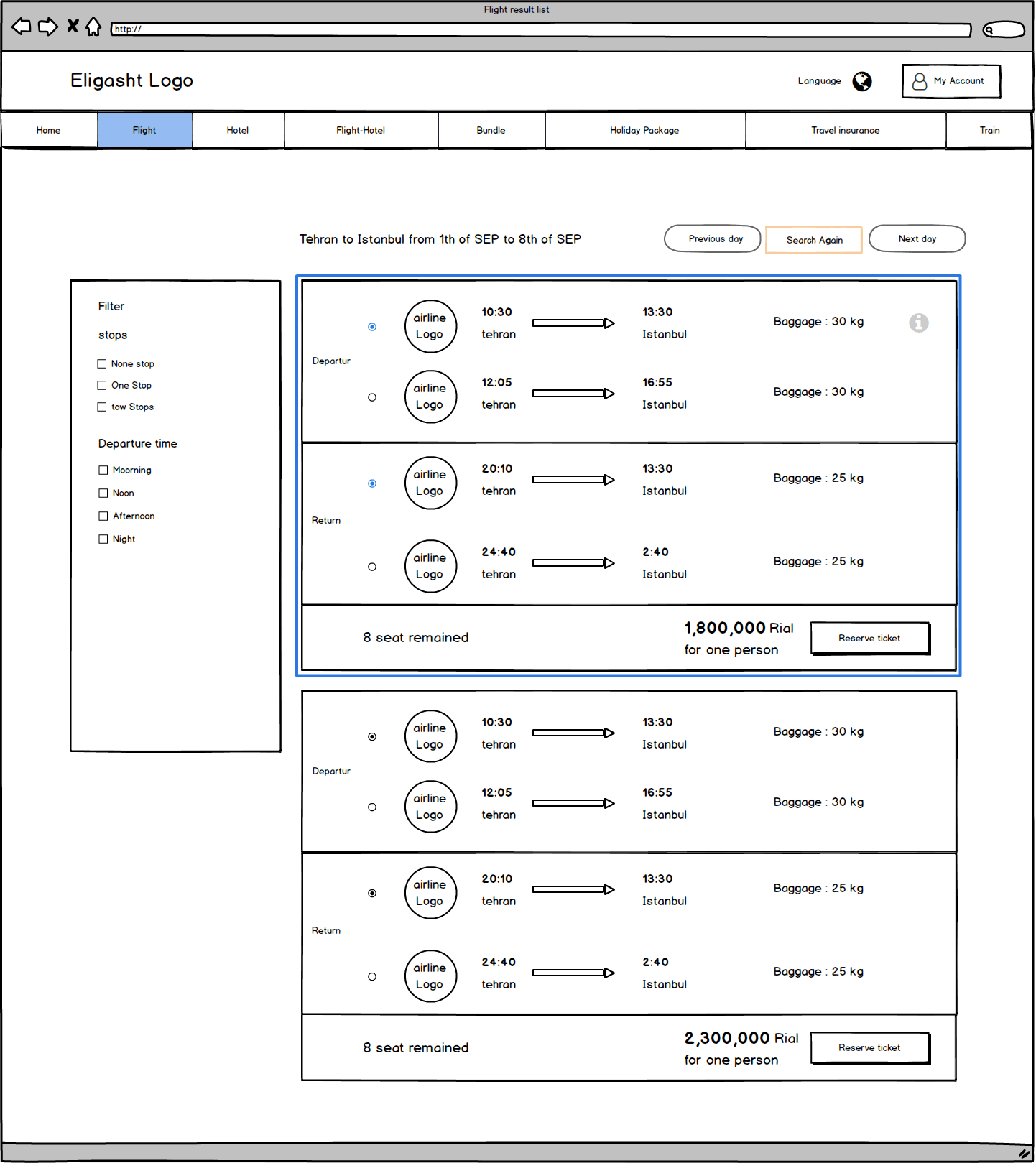
Flight results wireframe
Hotel results wireframe
Hotel detail wireframe
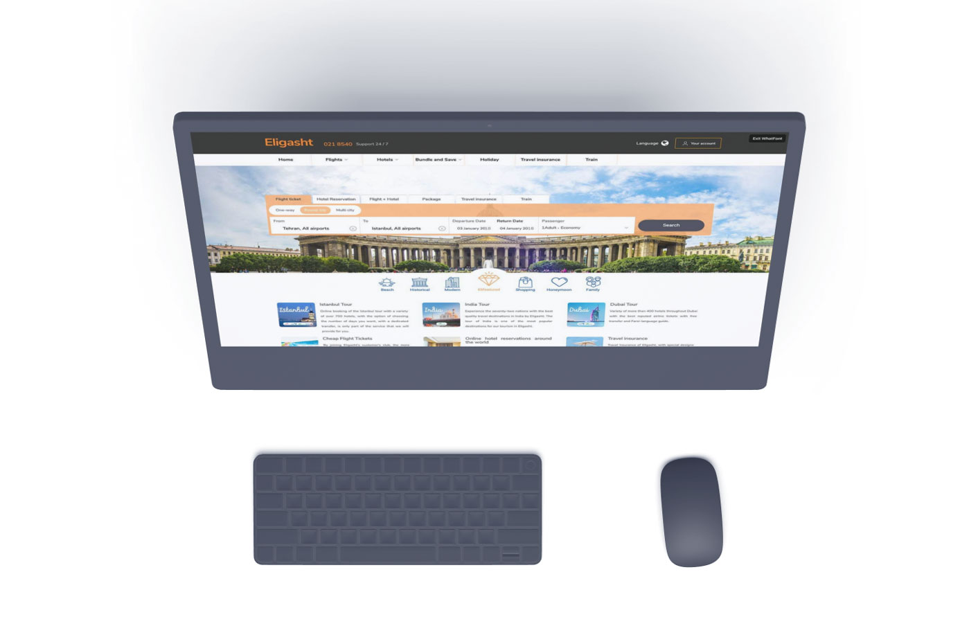
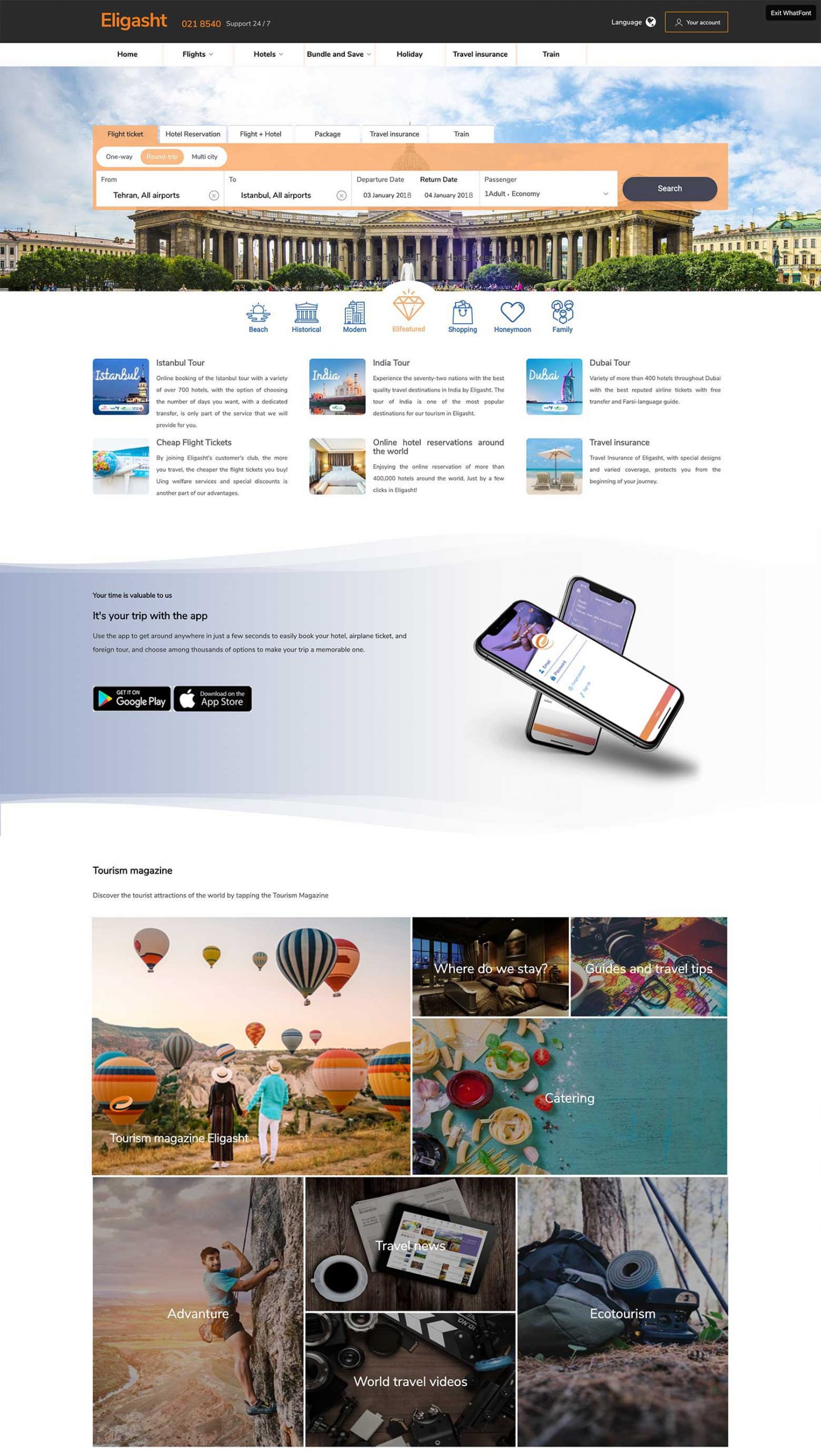
Homepage Hi-fi Design
I kept the homepage clean and straightforward to avoid overwhelming users on the first page they see. I designed a simple search form on the top for the main services of the company.
one of the important tasks of the user in our scenario was to search flights and hotels intuitively
the main goal for the search section was to be as minimal as possible; user engagement begins with the search section.
To measure the success of the feature, we considered the First Interaction Count ( to understand how well the default search section attracts the attention of the users)
At some point in the process, we collected Customer Effort Score by asking users to rate their effort levels for using the search section; the question was:
How would you rate your experience of searching for a flight? (On a scale from extremely easy to extremely difficult)
Below the search section, I designed a section with tabs for tour packages.
We created seven different tour packages for different tendencies.
We did this to draw the user’s attention to tour packages and provide more range of suggestions so that instead of searching for a specific tour, by clicking on every category, they already have several options to choose from.
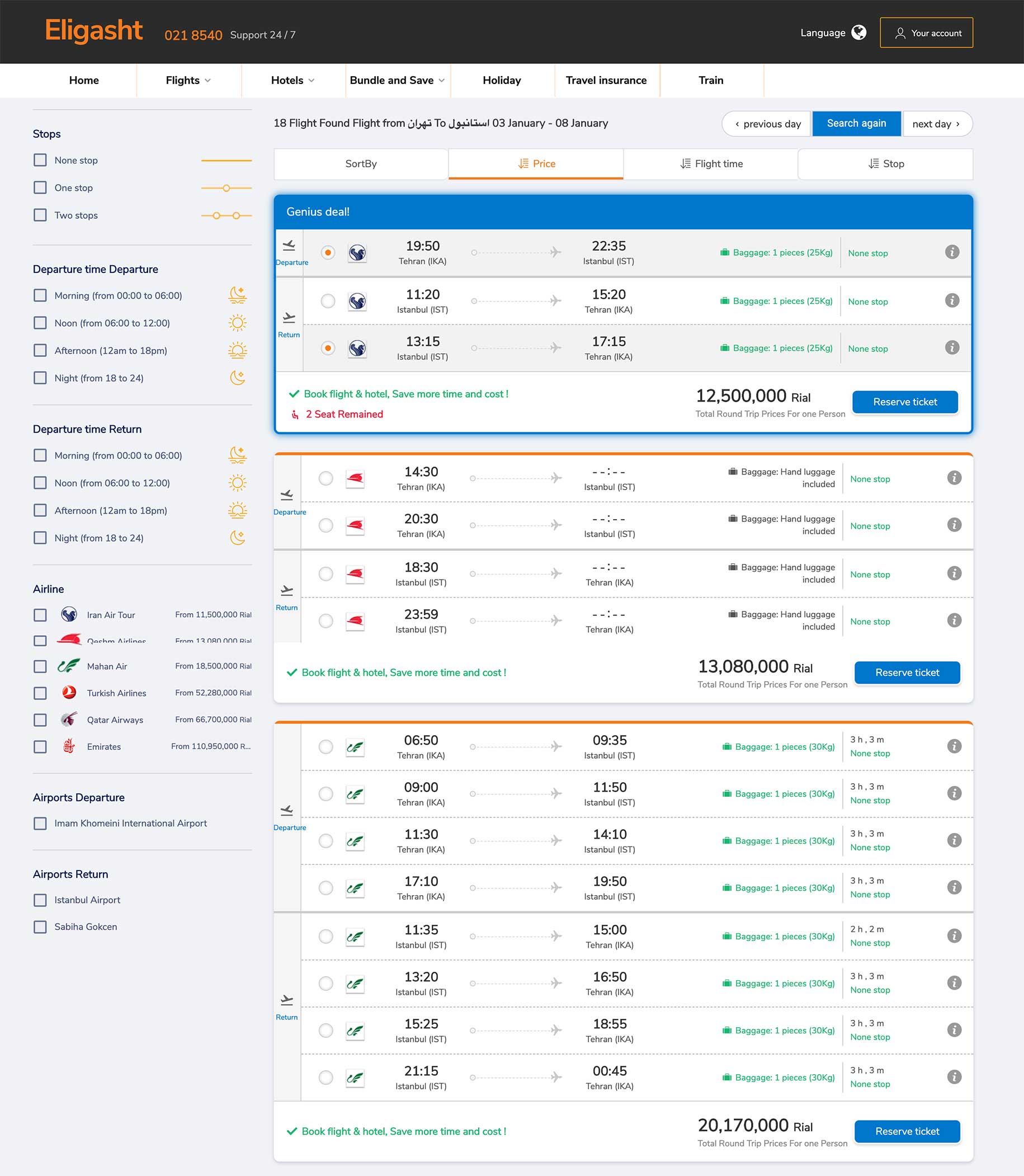
Flight search result
we designed a structure for the search result sections; we divided the layout into three main areas, a search again on top,
filter section on the left and a right section for showing the results.
for each flight result, there might be more than one offer either for the departure or return flight; because of that, we create a big card view for each flight
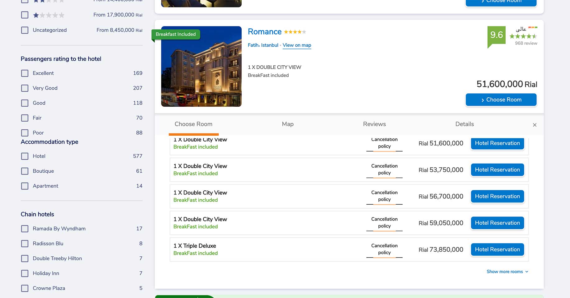
Hotel search result
we kept the same layouts for other search results as well
for the hotel result section, we present the hotels in a list view, and because each hotel has some room available, I create a
expandable card view for each result so a user can easily see and select available rooms of a specific hotel.
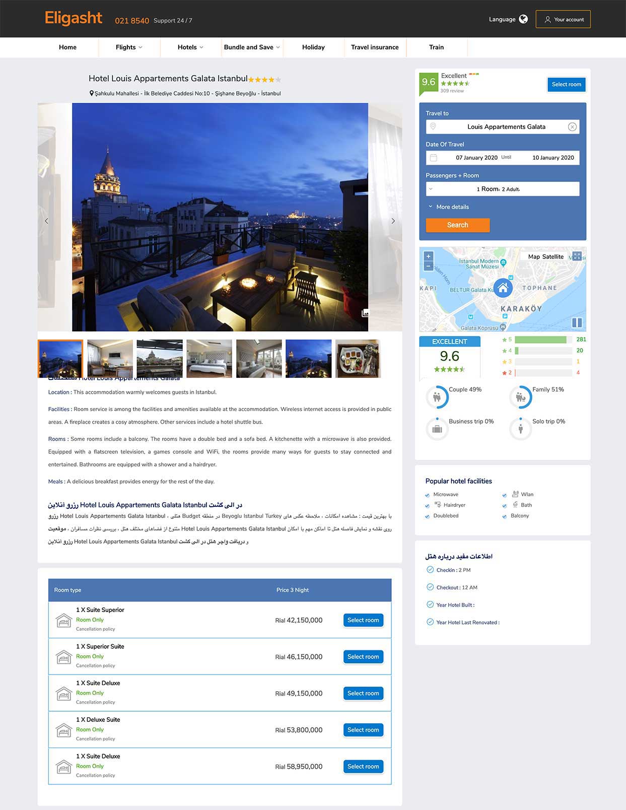
The hotel detail page
for this layout, we decided to provide a search form and relating information on the right and detailed information on the left
based on data that we collected from the research phase, I noticed that users want to be able to search hotels in different cities while they are reading
information about a hotel.
In the bottom section, we present available rooms of a hotel in a clear and straightforward way.
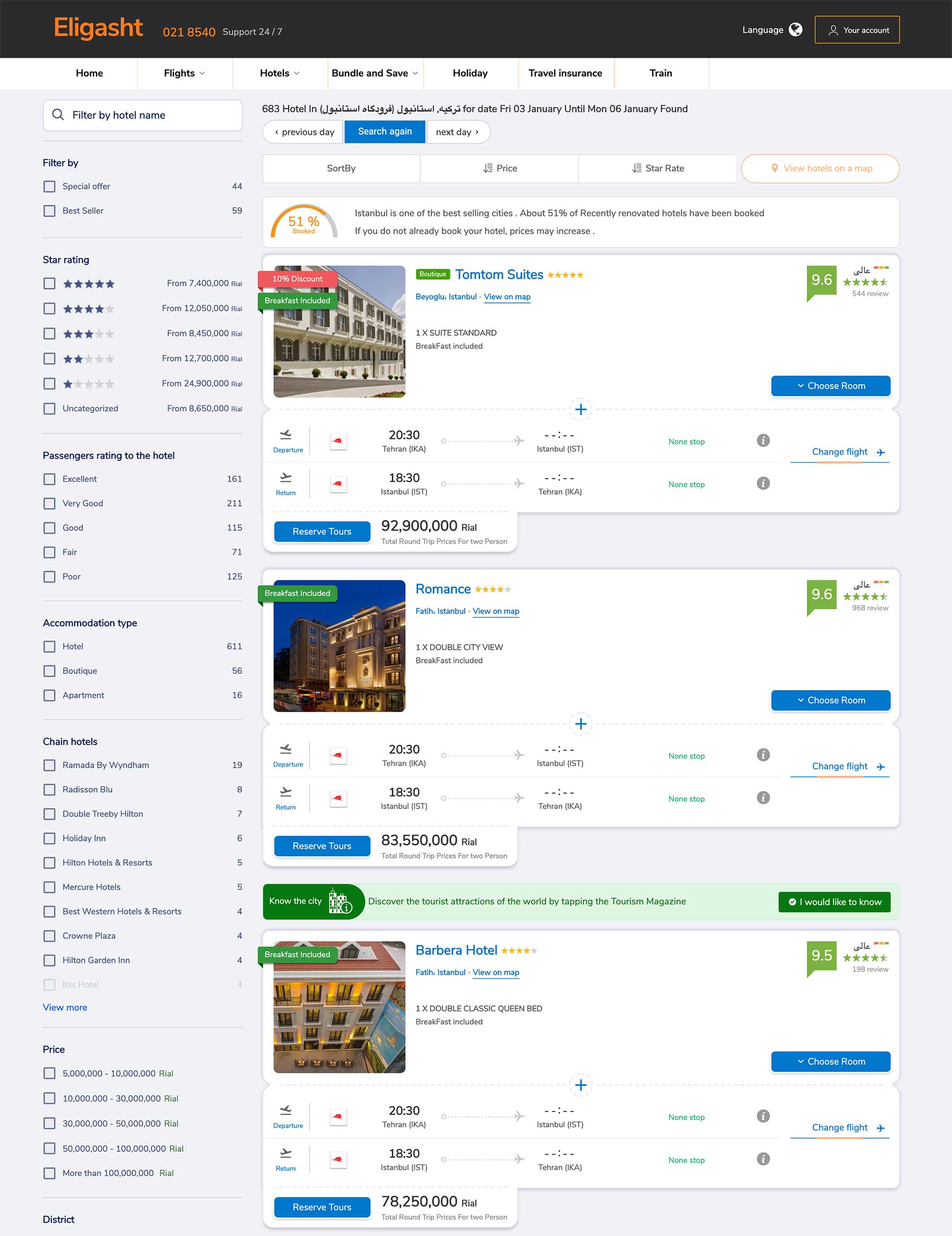
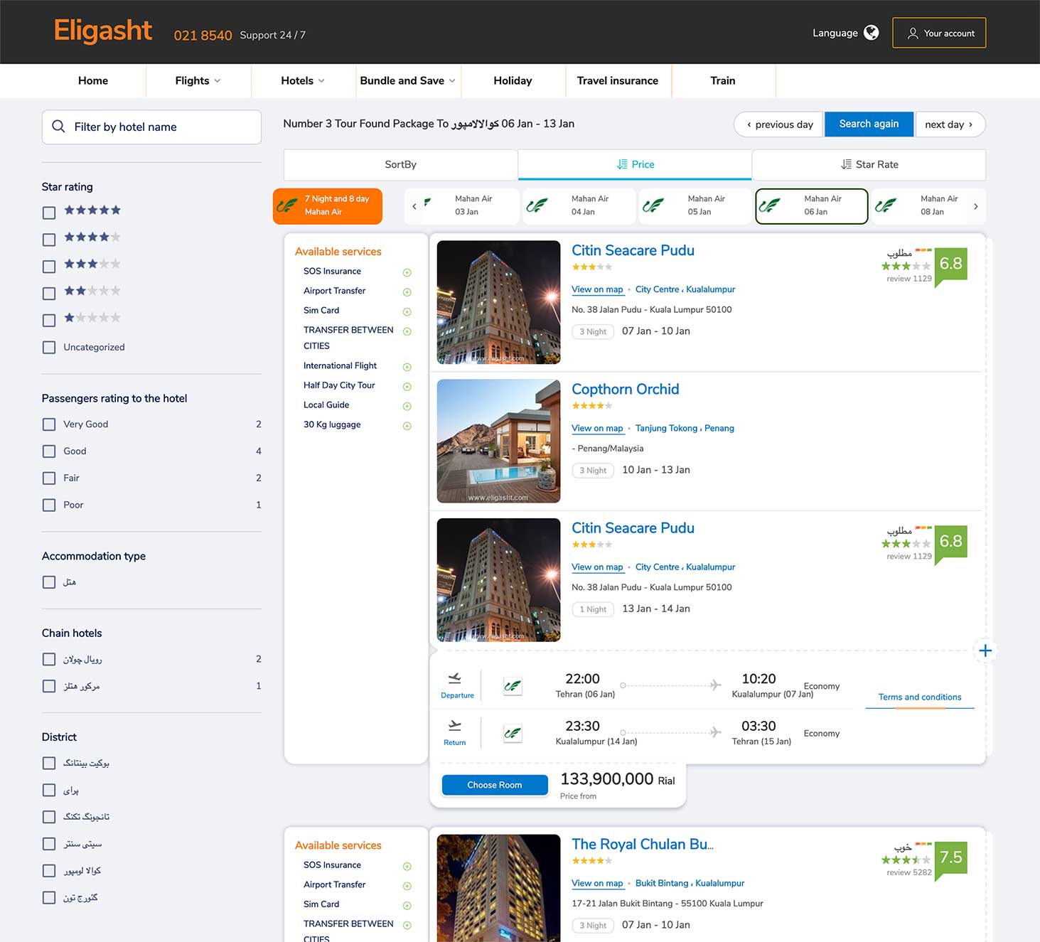
Hotel+flight search result
for this section, I designed a different kind of list.
We provide a feature that users can change a flight for each hotel.
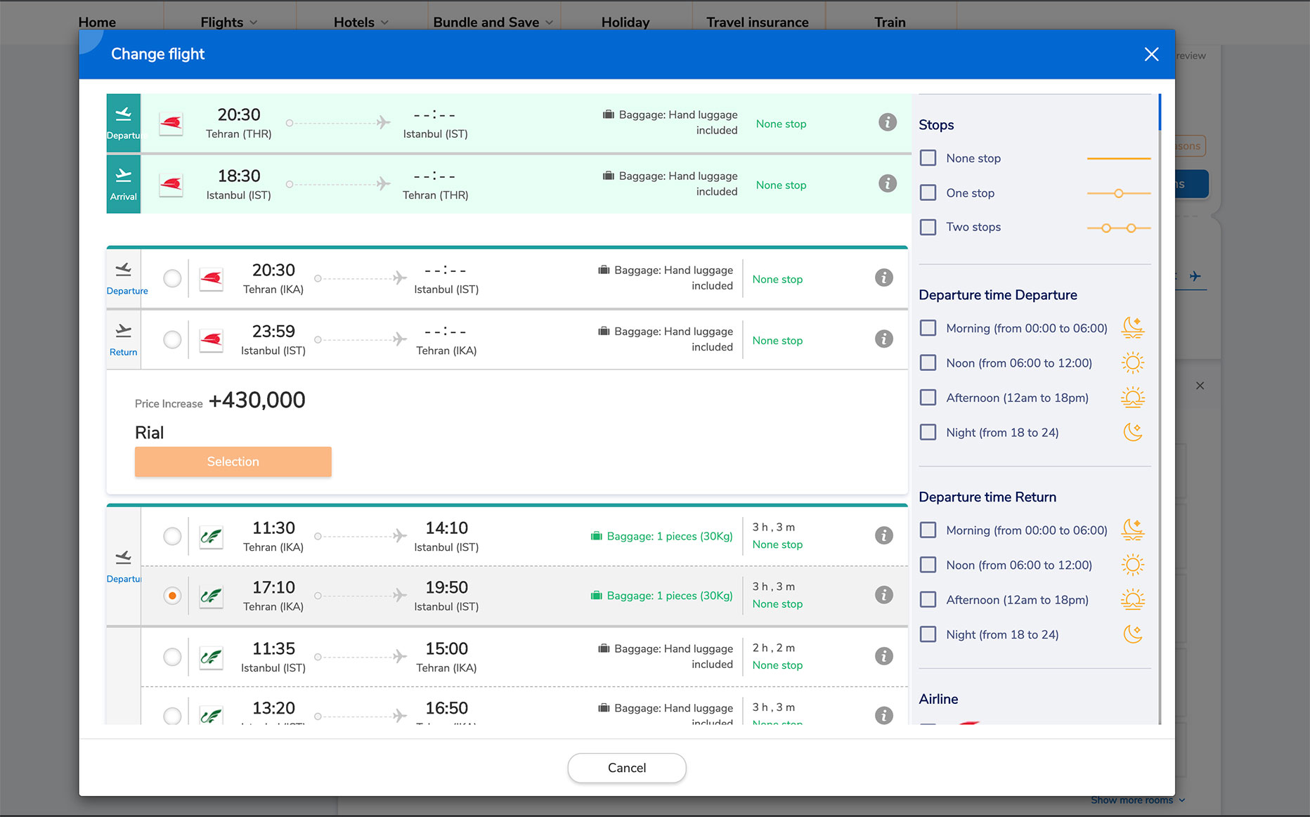
Change flight modal
for changing the flight; we present a modal view showing the other available flights.
In the modal, there is a list of alternative flights that users can select. In order to prevent confusion, we display the current flight so
the user can compare the other flights. We keep the same concept for the flight list and separate each flight box for more readability of the contents.
we decided to display all the long lists in the Modal view the reason for this is we don’t want to redirect a user to a new page to add more frustration, we wanted to give the impression that the user hasn’t left the previous page.
Tour package section
designing the tour package section was similar to hotel+flight sections except for one thing, and that was
the different dates that a tour is beginning. for this purpose, on the top of the page, under the price filtering
I designed a date section showing the dates and the airlines available for the specific tour.
This tiny feature was one of our best decisions since It was aligned with user expectations and business goals, which was increasing the sales of the tours.
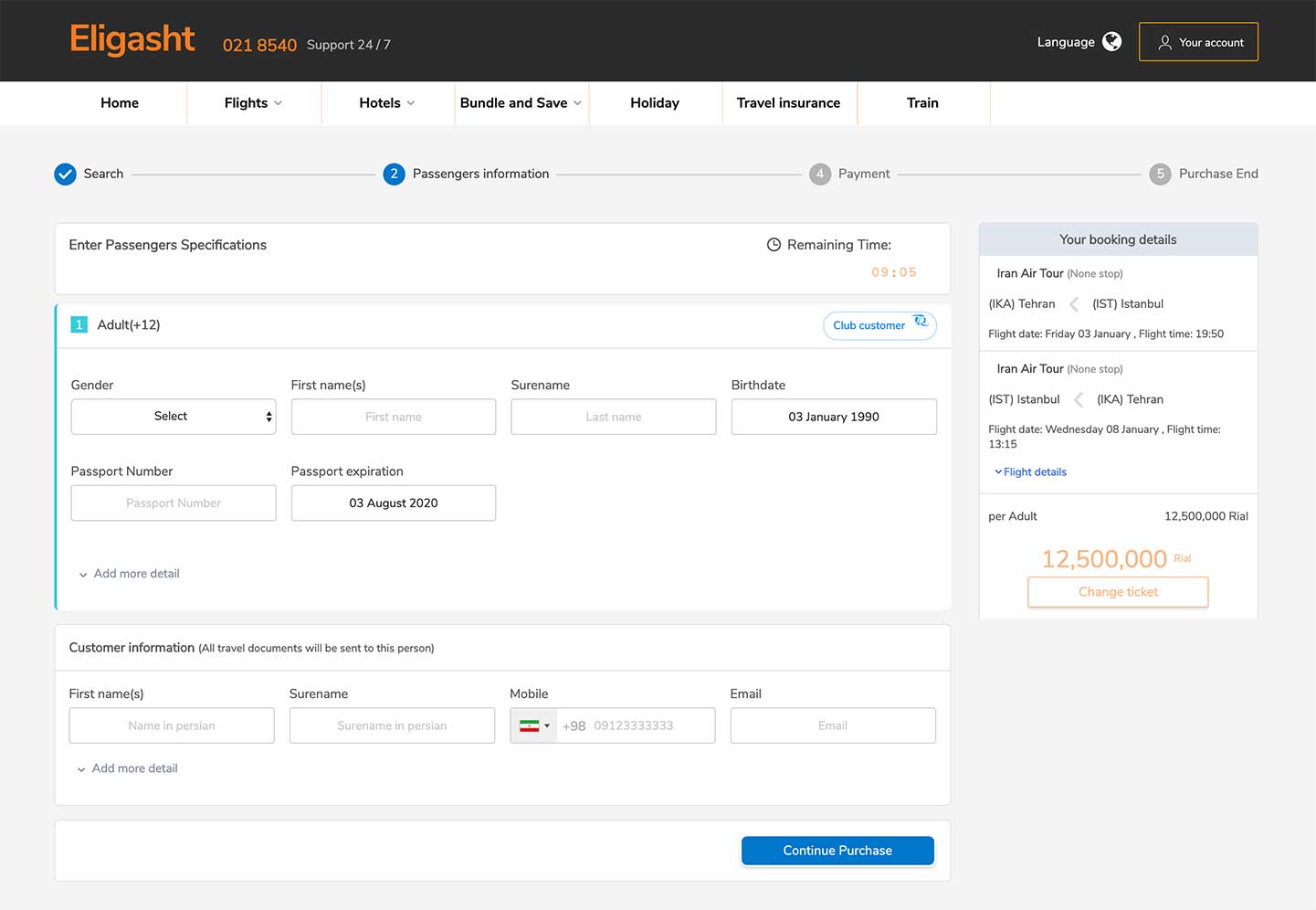
Check out section
One of the primary pain points of the three user personas was having an efficient checkout process
so I made sure to make this experience as seamless as possible.
On the top, we put a progress bar for the stages of the purchase.
User testing
Once I completed my prototype, This would allow me to evaluate how users would engage with the proposed website solution and validate
whether it was addressing the primary user needs. It was important to test with mid-fidelity, greyscale wireframes to gather honest,
critical feedback from potential customers and to solidify the functionality of the website before addressing the visual design.
I conducted a usability test with 4 participants and asked them to complete three different scenarios to put themselves
into the shoes of my user personas. These three scenarios included:
1. You need to book a round-trip flight for two people (you and your friend). Show me how you would find a good flight and successfully book it.
2. Show me how you would find out what tour packages Eligasht provides for the next month, and try to select your desired flight.
3. Show me how you would book a flight and hotel simultaneously on the website.
These were my key findings from the tests:
- Overall, users were able to navigate the website and locate services and information easily
- Participants found the checkout flow is a time-consuming process.
- A few participants wanted a way to book a multi-direction flight.
The Next Steps
This study represents the start of a bigger design process for the development of the Eligasht website.
The next steps I would like to take for this project would be to continue to conduct usability testing and further iterate on my designs.
Given more time, I’d like to explore more ways Eligasht’s company can bring customers to their website. I would also like to create content for the website and start to incorporate more of the visual style and branding of the company.
