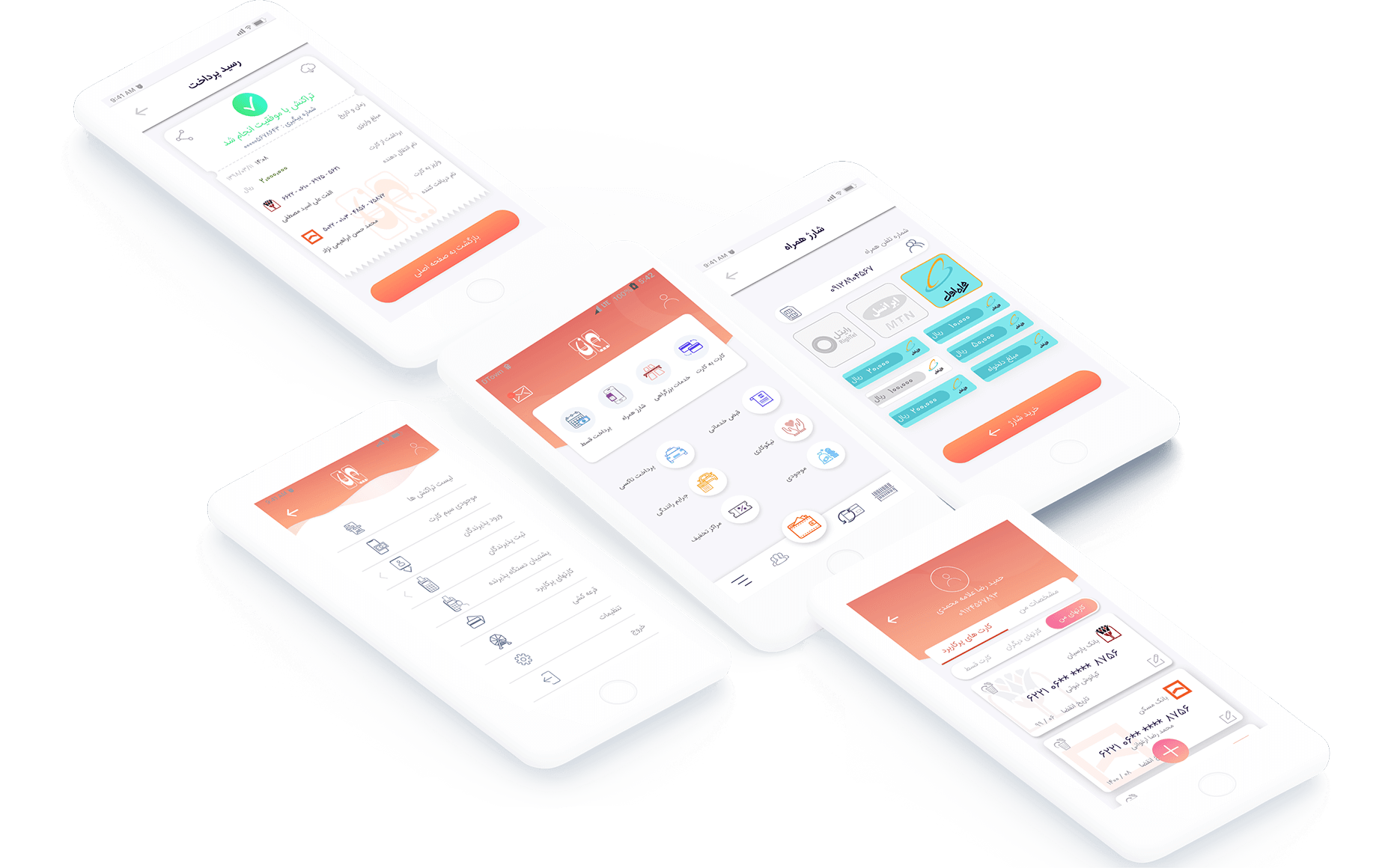
Parna Mobile App
Project
Parna is a financial mobile application
I led the design of a comprehensive mobile financial application for one of the largest banks in Iran.
This app enabled users to perform a wide range of money transactions, from loan repayments to paying highway tolls, all within a streamlined and user-friendly interface. My responsibility was to ensure that the design was clean, functional and met all the user requirements.
I was deeply involved in every aspect of the design process, from creating personas and scenarios to conducting market research to understand user demands.
My role
Product designer
responsible for the overall design of the project and draw up a design plan
creating user flows
conducting usability testing
creating a clean and functional design based on the requirements
Objective
Create a simple and easy to use, financial application to meet business and at the same time customers goals.
Differentiate from competitors through innovation. My focus was on creating intuitive layouts, interactions, and transitions, specially tailored for mobile banking services, ensuring that the user experience was seamless and engaging.
Research method
Customer interviews
Prototype testing
Persona
Empathy map
Survey and storyboard studies
Affinity diagram and thematic analysis
At the beginning of our research, we interviewed stockholders to learn more about our target market, target customers, and the company’s value proposition. After this phase, we interviewed our users to align business goals with user goals.
The analysis involves a constant moving back and forward between our entire data set .we collected and organized important pain points and key factors of our research. After organizing our research, we were able to code our data in order to describe the content.
After that, we searched for patterns or themes in our codes across the different interviews to determine which features to focus on.
Finding
We discover that there are some features that users really want from a financial app, and there are also some frustrations that avoid people using it.
the main features we discovered from our research were:
transferring money from one card to another.
Be able to pay their loans via the app.
Be able to pay highway tolls.
Be able to pay their taxi fees.
can pay their service bills(water, electricity…)
Key focus areas
What’s important for a great app experience?
how often customers use the financial application?
Empathy map
An empathy map is a tool used when collecting data about users to better understand our target customer base.
Similar to a user persona, empathy maps visualize customer needs, condense customer data into a brief chart,
and help us consider what customers want — not what you think they want.
based on our information we developed our empathy map.
we also developed 2 kinds of persona: primary and secondary. we wanted to make the design for the primary and then, as far as possible, accommodate the needs of the secondary.
we also did a comparative analysis to understand why users consider other apps as a substitute solution
user-flows
Once we had an idea of the features that we wanted to incorporate in the app, we used a user flow to focus on what our persona needed to accomplish and how to deliver that in the most effective manner possible
Challenges
There were lots of bank services that have to be presented to the users in a simple and understandable way.
Simplify the User Flows
To create the simplified version of user flows and make sure all the flows are as linear as possible I created following user flows for each interaction:
Paper prototype
I started off by making a paper prototype to rapidly test different variations of key features. I wanted to explore vastly different solutions to the
problem in a short time. I then created medium-fidelity wireframes on Sketch.
wireframes
After doing some sketching I explore several concepts for the App layout.
Based on the feedback and insights I learned from the sketching phase, I began to design my first wireframes. I made sure to prioritize the features that would best address the needs of the users throughout the App.
Parna homepage wireframe
Parna profile wireframe
I then tested this with 3 participants to validate whether these solutions addressed both the user and business needs.
Iconography
For every project that I am responsible for, I usually try to create custom iconography to increase consistency in design elements.
Besides some apps that may also need their own set of icons to represent app-specific functionality.
For this purpose, I use Illustrator and sketch to create a custom set of icons.
Design (Hi-fi prototype)
we selected the most important bank services and place it all in the homepage of the app the 4 services on the top are the most
important and useful both for users and the stack-holders
Prototype
Final homepage and Profile page of the app.
after discussing with stakeholders on the homepage of the app, we separate the four most used services and showed in the center of the user’s vision.
these services are, transferring money by card, highway tolls payment, buying pre-credit for your cell phone and loan payment.
For the profile page, I considered two main sections: the profile detail of the user and the most used bank card.
ATM card design is similar to the real-word example of ATM cards in Iran.
Results
the pre-paid cell phone credit is clearly designed for the 3 most used cellphone operators in Iran. every time the user is in the final stage of payment a dialog comes from bottom to top and makes everything dark in the background to get the full attention of the user.
the receipt page is also similar to the real word card-reader machine receipt just a little bit more fun, with the share
and download functionality.
Highway service
this section was designed for people who want to pay their highway tolls via the app by adding as many license plates as they want into the app.
making the payments
for the card information to make a final payment in each service we provide Bottom pop-ups, the reason for using this pattern instead of normal pop-ups or normal page transition is: bottom pop-ups are easier to interact with, less invasive, and easier to scale.
Evaluate
I completed the entire prototype and we managed to make all the payment processes for every service short and simple.
I totally went through two rounds of usability testing, let the users play with the clickable prototype to go through basic tasks, and I take notes and implemented the changes to the final prototype.
We prepared several scenarios for the user testing and test it with 5 people and they did almost all the tasks I asked them to do at the right time.
Final Mockups
Based on the feedback I captured and the revisions I made to the mockups I created the following final view of all the screens for the Parna Mobile app:


