Valgenesis CPV

Project
The Process Insight application is designed to deliver essential insights into pharmaceutical manufacturing. It features intuitive dashboards that detect deviations, send alerts, and facilitate data-driven decisions. It offers seamless access to essential parameters and attributes, consolidating data for real-time monitoring and reporting. Due to strict industry regulations, Process Insight emphasizes precision and clarity. Its main users, Quality SMEs, need a tool that simplifies complex data workflows while adhering to industry standards.
My role
UX Lead/ Team lead
Responsible for running design workshops to define the scope of the project.
Creating a customer journey map for the product
Conducting stakeholder interviews with key team members
Refining the design operation processes and iterating over designs
Objective
The primary goal of the project was to:
Integrate Process Insight into NGP(Next Generation Platform) to provide a unified experience.
Maintain consistency in functionality while adapting the User Experience to NGP standards.
Simplify the complex workflows of CPV (Continued Process Verification) management.
Enhance information architecture for better navigation and usability.
By achieving these objectives, we aimed to improve user efficiency, reduce cognitive load, and establish a robust decision-support system.
Research method
Customer and stakeholder interviews (Product, SMEs, Validation Engineers)
Comparative analysis of IA and chart comprehension
Moderated usability testing with scientific experts
Archetype development for role-based behavior modeling

When Complexity Becomes a Liability
Before our redesign, the CPV experience inside ValGenesis was a landscape of fragmented screens, dense statistical outputs, and workflows that grew organically over years of incremental development.
- Quality SMEs — some of the sharpest domain experts in pharma manufacturing — were wrestling with:
- CPV plans scattered across multiple views
- Statistical charts that required deep interpretation
- Batches and variables buried under non-intuitive tables
- Slow, error-prone configuration steps
- A lack of cohesive information architecture
Compliance-critical actions (like electronic signatures) hidden inside inconsistent flows
In a regulated environment where deviations can have real consequences, complexity is not just inconvenient; it’s a risk.
My mandate as UX Lead was not simply to redesign screens.
It was to create a unified, navigable, reliable system that supports scientific decisions, regulatory compliance, and operational confidence — all inside the Next Generation Platform (NGP) ecosystem.
This required deep system thinking, careful orchestration, and a scientific UX mindset.
Entering the Problem Space, Understanding the System Before Changing It
I began by leading multiple discovery cycles:
- On-site sessions with Quality SMEs and Validation Engineers
Understanding their mental models of reference batches, variability, PCA, CpK thresholds, and deviation detection.
- Stakeholder interviews
From product managers to statistical SMEs to regulatory experts, to uncover what “trust” means in a CPV system.
- Heuristic evaluation of the legacy CPV workflow
Identifying mismatches between user expectations and the interface — especially around dense data sets and statistical visualisation.
- Archetype development
Mapping precise behavioral patterns across SMEs, reviewers, and approvers to drive role-based UX decisions.
Considering these conversations, a clear problem emerged:
The CPV workflow produced insights, but the system did not help users understand, validate, or trust them.
The information architecture wasn’t supporting the scientific reasoning SMEs needed.
The tool executed steps — but it didn’t explain them.
And navigation patterns didn’t reflect the mental model of CPV as a cyclical, decision-driven process.
This gave us the direction:
Redesign CPV as a guided, intelligible, and reliable end-to-end system , not as a collection of isolated screens.

Orchestrating Alignment, Turning a Complex Domain Into Shared Understanding
Leading this redesign required more than UX craft.
It required orchestration across teams, personas, and constraints.
I guided the team through:
Cross-functional workshops
- Mapping the CPV lifecycle: plan creation → reference batch selection → variability assessment → limit configuration → routine monitoring → reporting.
- Identifying breakpoints where users typically lost context or confidence.
- Defining system boundaries for what belongs to NGP standards vs. where CPV needs domain-specific adaptations.
Pattern alignment sessions with developers
- Converting complex statistical logic into reusable visual patterns.
- Establishing loading, threshold, and alert patterns that could scale across variables and plans.
- Ensuring feasibility within legacy architecture while raising the overall UX maturity.
Guiding junior designers
- Providing the design system’s structural rules.
- Defining the interaction logic and directional patterns.
- Delegating components while keeping the system cohesive.
This orchestration ensured that everyone — designers, developers, SMEs — shared the same mental model of the CPV system.
System Thinking, Re-architecting CPV Into a Cohesive Experience
The core of this project was not UI aesthetics.
It was system architecture — reorganizing a scientifically complex workflow into a coherent, guided experience.
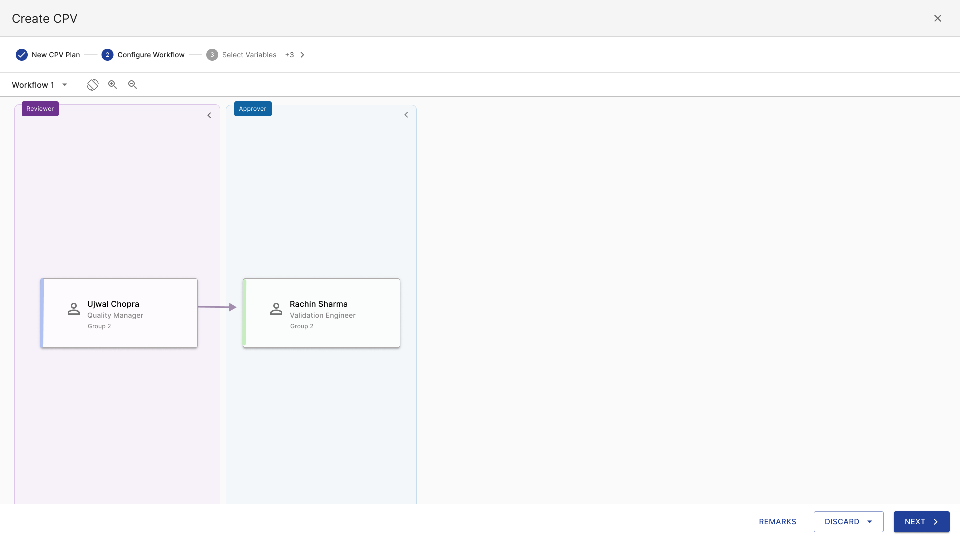
The Turning Point: The 6-Step CPV Configuration Wizard
The old CPV creation process was scattered and unintuitive.
So I redesigned it into a structured 6-step flow that reflects real SME decision-making:
-
Define plan metadata
-
Select reference batches
-
Evaluate variability
-
Configure parameters and limits
-
Validate configuration
-
Finalize and publish
This wizard became the backbone of CPV clarity.

The Reference Batch Variability Preview , Making Statistics Understandable
On the following concept, SMEs can see a redesigned preview of PCA, Hotelling’s T², and Q residual plots.
Previously, these plots were visually overwhelming and detached from workflow context.
The redesign:
- Brought all variability indicators into a unified, interpretable layout.
- Introduced consistent legend behaviour across PCA, loadings, and variability charts.
- Emphasised thresholds and confidence intervals using NGP’s visual language.
- Placed these insights exactly where SMEs make decisions — not in a later disconnected step.
This change improved user comprehension and reduced back-and-forth navigation.


Routine Dashboard, From Chaos to Hierarchical Clarity
The Routine Dashboard (the following concept) previously mixed charts, tables, and signals in a flat layout.
I reorganized the view into:
- Clear hierarchical navigation (Overview → Control Charts → Histogram → Capability Metrics)
- Modular chart containers follow consistent patterns across all statistical views
- Batch-specific deep dives that maintain context through breadcrumb structures
This transformed monitoring from a “hunt and guess” activity into a predictable, navigable flow.


CPV Plan Details: Bringing Order to Dense Data Tables
In the “View CPV Plan”, the tables listing plans, batches, and variable attributes had to balance:
- high-density data
- regulatory accuracy
- multi-filter interactions
- batch-level comparisons
- quick scanning for deviations
I introduced:
- column grouping
- anchored headers
- adaptive row density
- interaction affordances consistent with NGP table patterns
These changes made dense scientific data readable without diluting its precision.


Notification Workflows & Audit Trail, Designing for Compliance and Trust
The “Manage Notifications & Pending Requests” highlights critical compliance moments:
Electronic signatures, reviewer workflows, and audit trail entries.
Key improvements included:
- A unified approval card pattern for author, reviewer, and approver actions
- Modal-driven electronic signature flows, with clear legal messaging
- Separation of pending vs. completed actions
- Consistent visual signals for responsibility & status
This redesign reduced ambiguity around regulatory actions and reinforced system trust.


UX Metrics Strategy & Validation Framework
To ensure the redesign delivered real, measurable value, I defined a compact metrics framework aligned to CPV’s scientific and operational goals. As UX Lead, this allowed me to evaluate clarity, efficiency, and system trust objectively—not just through perception, but through evidence.
UX Metrics Defined
I focused on four categories:
Efficiency
- Time to complete CPV plan configuration
- Number of navigation steps per task
Comprehension
- Correct interpretation of PCA, other complex indicators
- SME confidence in variability assessment
Trust & Compliance
- Reduction in external tool usage
- Completion success of e-signature workflows
Consistency
- Adoption of NGP components
- Reduction of UI inconsistencies across CPV
These metrics gave us a clear definition of “good,” validated against real SME expectations.
Validation Approach
To measure outcomes, I used a concise validation loop:
- Baseline benchmarking of the legacy experience
- Moderated SME usability sessions to test comprehension and workflow alignment
- Prototype interaction analytics to confirm efficiency improvements
- Targeted debriefs with Validation Engineers and SMEs to capture decision confidence and trust signals
This combined scientific UX testing with behavioral insights, ensuring the redesigned system supported accurate, reliable decision-making.
Metric Outcomes (High-Level Summary)
While specific numbers remain confidential, the redesigned experience delivered directional improvements:
- Significant reduction in CPV configuration time
- Higher comprehension rates of PCA, Hotelling’s T², CpK/PI thresholds
- Fewer misinterpretations of batch variability
- Clear improvements in system trust and cross-team adoption
- Consistent interface patterns across CPV steps and NGP
- Reduced reliance on external statistical tools
This turned CPV into a structured, high-clarity, scientifically interpretable workflow.
UX Impact & Outcomes
While some outcome metrics are confidential, the redesign delivered clear improvements:
Efficiency
- Faster CPV plan creation due to the structured wizard flow
- Fewer navigation jumps between steps and charts
- Reduced decision fatigue during variability analysis
Clarity & Confidence
- SMEs reported increased understanding of PCA and CpK indicators
- Reduced reliance on external statistical tools to interpret charts-
- More consistent comprehension across global teams
Consistency & Scale
- Established a CPV-wide pattern library reusable across the NGP ecosystem-
- Reduced design and development fragmentation-
- Created a scalable IA model for future features (e.g., trending, automated deviation insights)
Regulatory Alignment
- Stronger audit-trail visibility and signature patterns
- Clearer separation of compliance-critical actions
This was not simply a redesign — it was a system transformation that elevated the entire CPV workflow into an intelligible, reliable, and scalable experience.
Designing for High-Stakes Systems
CPV is a domain where clarity isn’t optional; it’s foundational.
A misinterpreted deviation or a hidden signal can have real-world consequences.
Leading this project demanded:
- Systems thinking to reorganise complexity-
- Scientific UX strategies to make statistical insight understandable-
- Leadership and orchestration to align designers, developers, and SMEs-
- Vision to see the future state of a unified CPV experience inside NGP
This case study represents more than a UX project.
It reflects how design can bring order to scientific complexity, empower decision-making, and build trust in high-stakes environments.
And it reflects my approach as a UX leader:
To transform systems, not screens, and to guide teams toward clarity in places where clarity matters most.
Detailed case study will be shown