I did not want to reinvent the wheel. I wanted to make a better one.
01 Context
An online store that wanted an elegant, simple experience
LiftShop is an online store that started in clothing and accessories for men and women. In a competitive e-commerce world it wanted to stand out through an elegant and straightforward user experience, without overloading users with unnecessary information. We drew on proven e-commerce solutions and let usability testing, user interviews, stakeholder collaboration and engagement metrics guide design decisions.
In UX we do not want to reinvent the methods, insights or guidelines all the time. We want to improve them.
My approach to this project
02 Measure
Three KPIs, agreed with stakeholders
Usability
How easy it is for users to accomplish tasks on the site.
Engagement
How much people interact with the site and how much time they spend on a flow: time metrics with page views and scroll ranges, combined with user interviews to understand them.
Conversion
Sales made, and other indicators. I wanted to find trends and design new solutions that pay more attention to users’ needs.
To find out why conversion was low, I ran usability tests with real users in the first phase and watched how they used the site. The pages were very crowded, with too much information about each product, so users doubted buying specific products.
03 Design
Less on the page, more to do with it
Decision 01
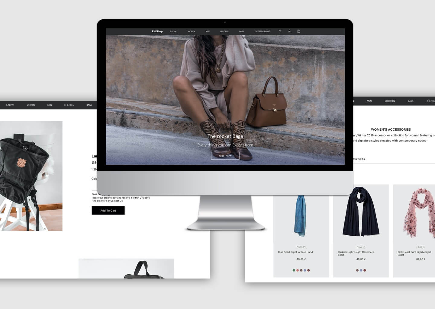
A landing page built for conversion
Context
The main page has to work for marketing campaigns.
The call
Clear calls to action, imagery with customised colour tone, content written for specific audiences, and very simple CTAs: “Shop now”, “Shop women” and “Shop men”, with a clear visual hierarchy.
What it did
One obvious next step for every visitor.


04 Test
Two measures managers understand
For the final usability test I focused on two measures because they translate into the language managers understand: the expected financial benefit.
01
Success rate: how many users can complete the task?
02
Time on task: how long do people take to complete it?
Based on the early research, I changed categories, product pages, the product card view and the checkout process. Focusing on those two measures, we optimised the experience to increase the success rate and decrease time on task.
Next
A better wheel.
Simpler pages, and decisions measured the way the business measures.
