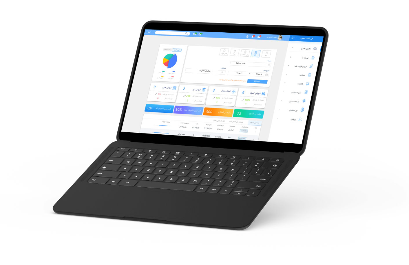
Project
Eligasht B2B is a specialized web-based application tailored for travel agencies.
It functions as a division of the Eligasht company.
My role
- To facilitate workshops with users,
- experts and senior business, and
- technical stakeholders
- Create wireframes and prototypes for
- usability testing
- Conduct usability testing
- Meeting up with developers
Objective
The company wanted to streamline the day-to-day operations of travel agencies through a centralized platform. The goal was to design a user-friendly, efficient web application that would cater to the specific needs of travel agents, providing them with a comprehensive tool to manage their bookings, services, and customer interactions in a more effective way.
Research methods
- stakeholders interviews
- Market research analysis
- Prototype testing
- Card sorting
- Persona
- focus group
Travel agents juggle bookings, services and customers across fragmented tools. They needed one place.
01 Challenge
Understanding how a travel agency really works
Eligasht B2B is a web application for travel agencies, a division of the Eligasht company. The company wanted to streamline agencies’ day-to-day work on one platform.
The main challenge was understanding the workflows and pain points of travel agency employees: many tasks at once, from booking flights to customer service, often in fragmented systems. The solution had to work for tech-savvy and less experienced employees across the country, with cultural and logistical differences in play.
9
Focus group participants: owners, ticketing staff, sales
6
Research methods used
4
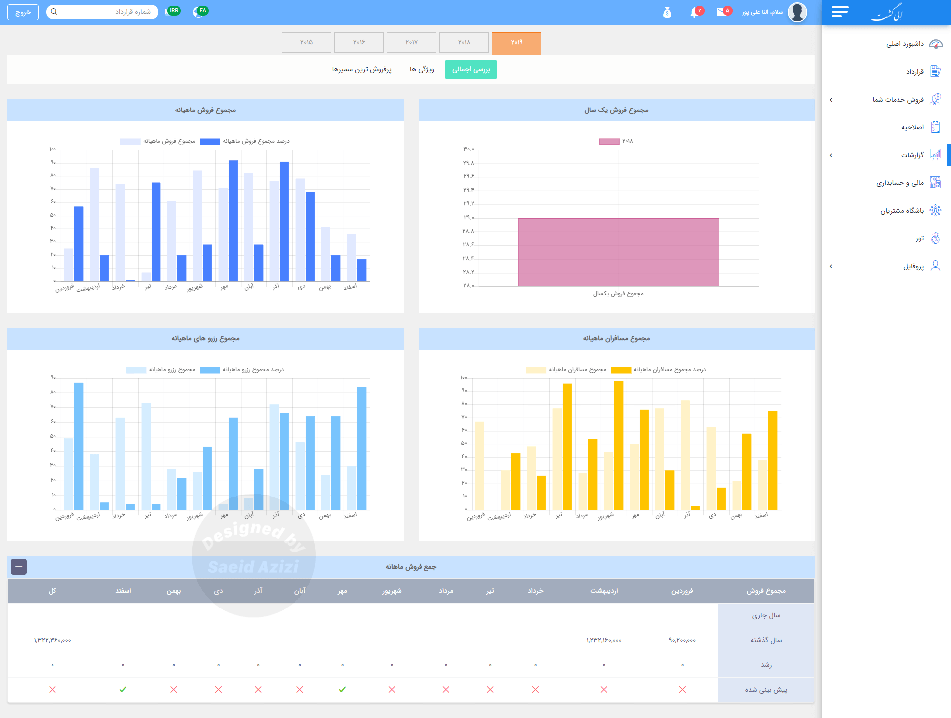
Reports designed
3
Tabs in the agency profile
I wanted to create a simple workflow so any employee with any knowledge level could understand the system.
My goal for the information architecture
02 Research
A small, relevant focus group
The travel industry is built on human connections, so focus groups were the main method. We chose relevance over volume: nine participants across agency owners, ticketing staff and sales representatives, matched to our personas.
Two things stood out. Agencies each had their own workflows, so processes were inefficient and duplicated. And tracking bookings and services was hard, which meant lost sales and frustrated customers.
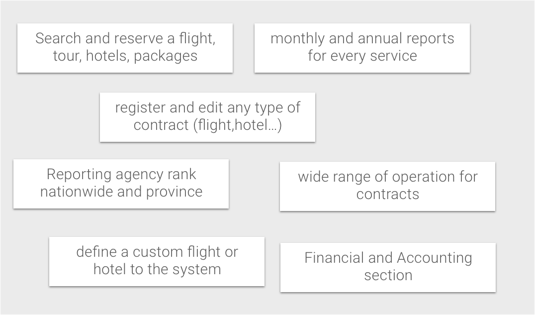
03 Structure
Card sorting and a site map users could trust
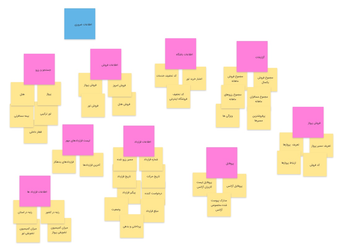
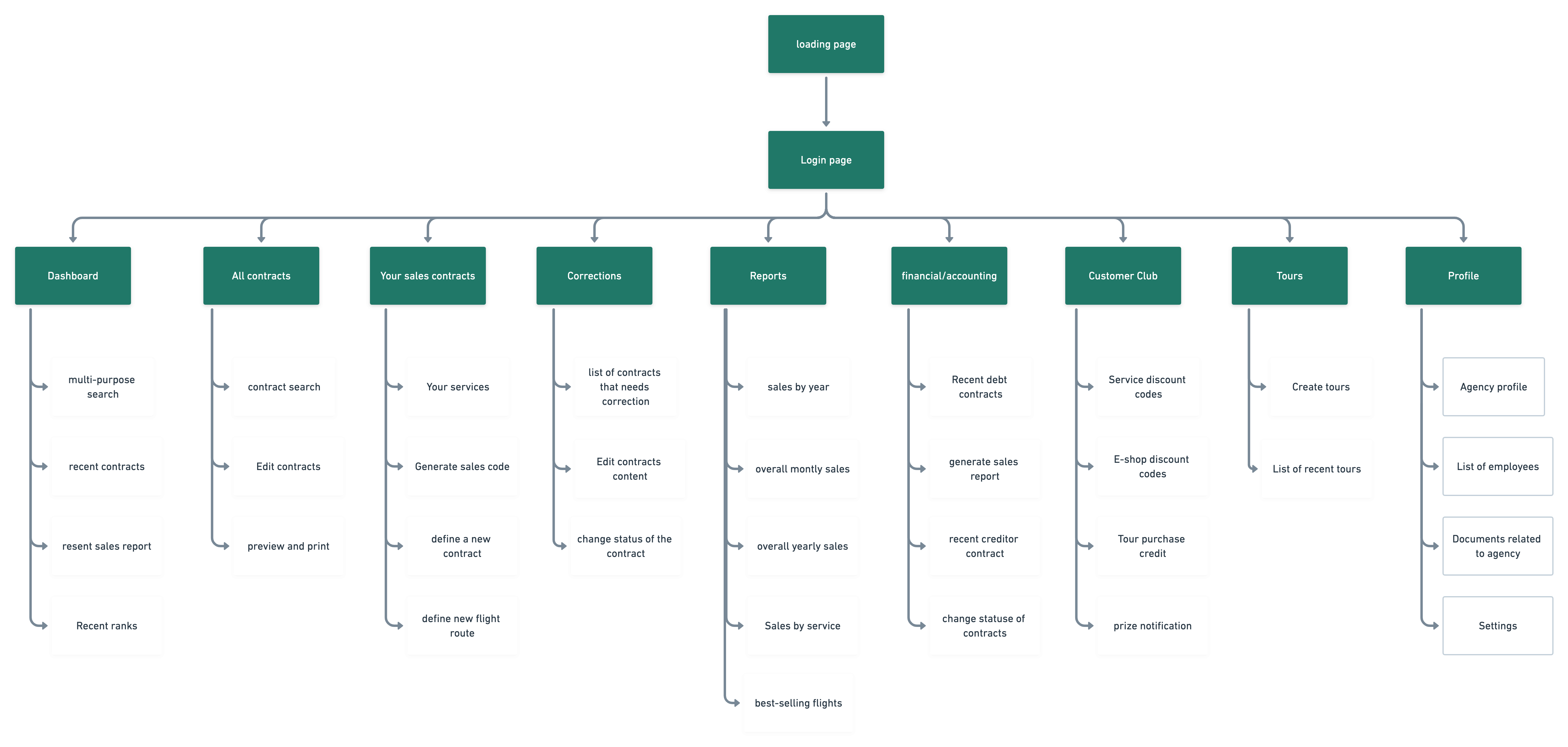
I turned the features into cards and asked users to regroup them from their point of view. That gave us an information structure based on their standards. Frequently used sections such as Dashboard and Contracts sit at the top of the hierarchy, so they take few clicks to reach.
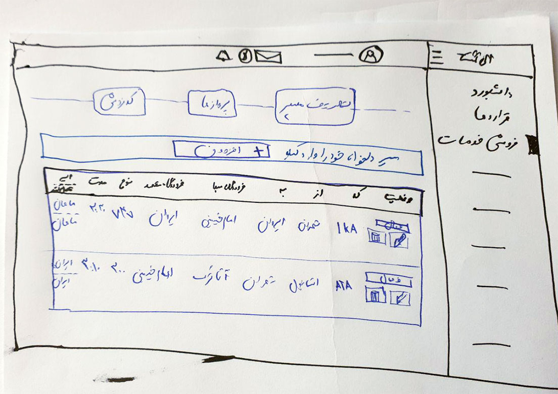
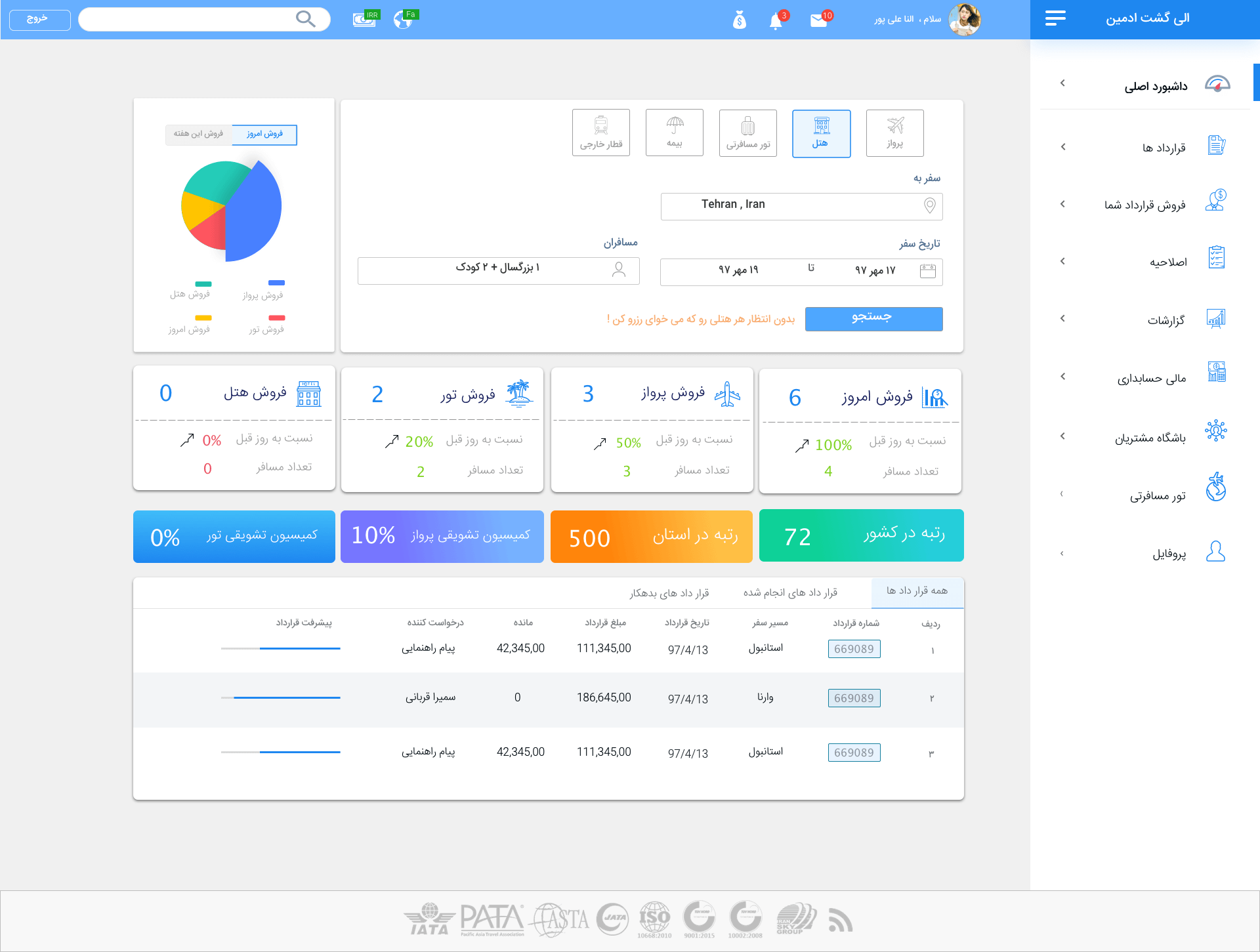
On paper I sketched different versions of the dashboard. We concluded with a pie chart for sales and a table of recent contracts.
04 Decisions
Design for the tasks people repeat
Decision 01
A dashboard that starts with the work
Context
Agencies need a search form for every service they can access, plus a sense of sales and contract status.
The call
A search form for all services, a sales chart, and a table of recent contracts with a small progress bar for each contract.
What it did
The most important information is in one place.
Decision 02
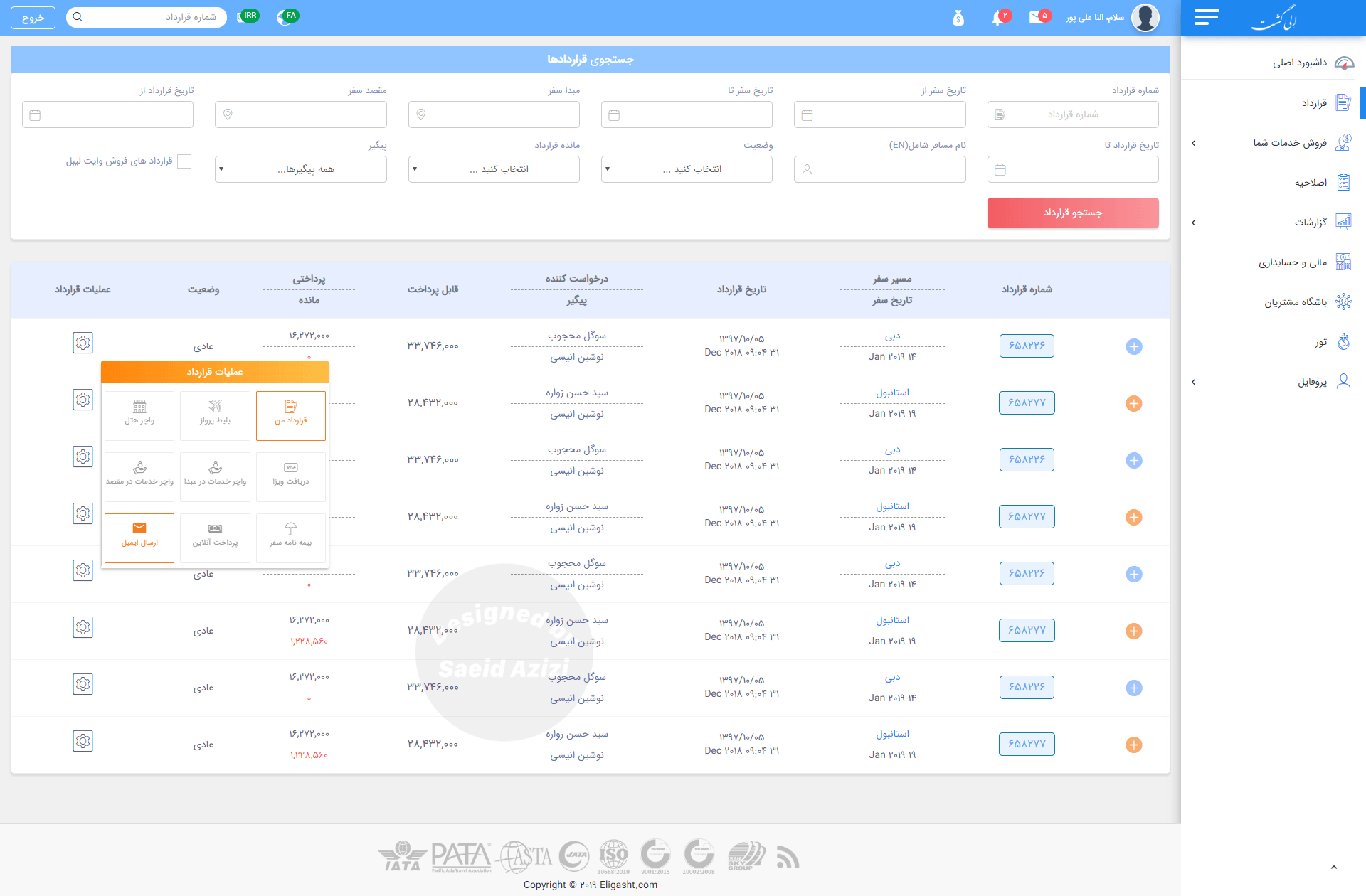
Let people find a contract with whatever they remember
Context
Users often do not have all the information to find a specific contract, and tables with many columns are hard to scan.
The call
An advanced search at the top, and related columns grouped into one column with a divider line.
What it did
Any piece of information can find the contract, and the listing is easier to scan.
Decision 03
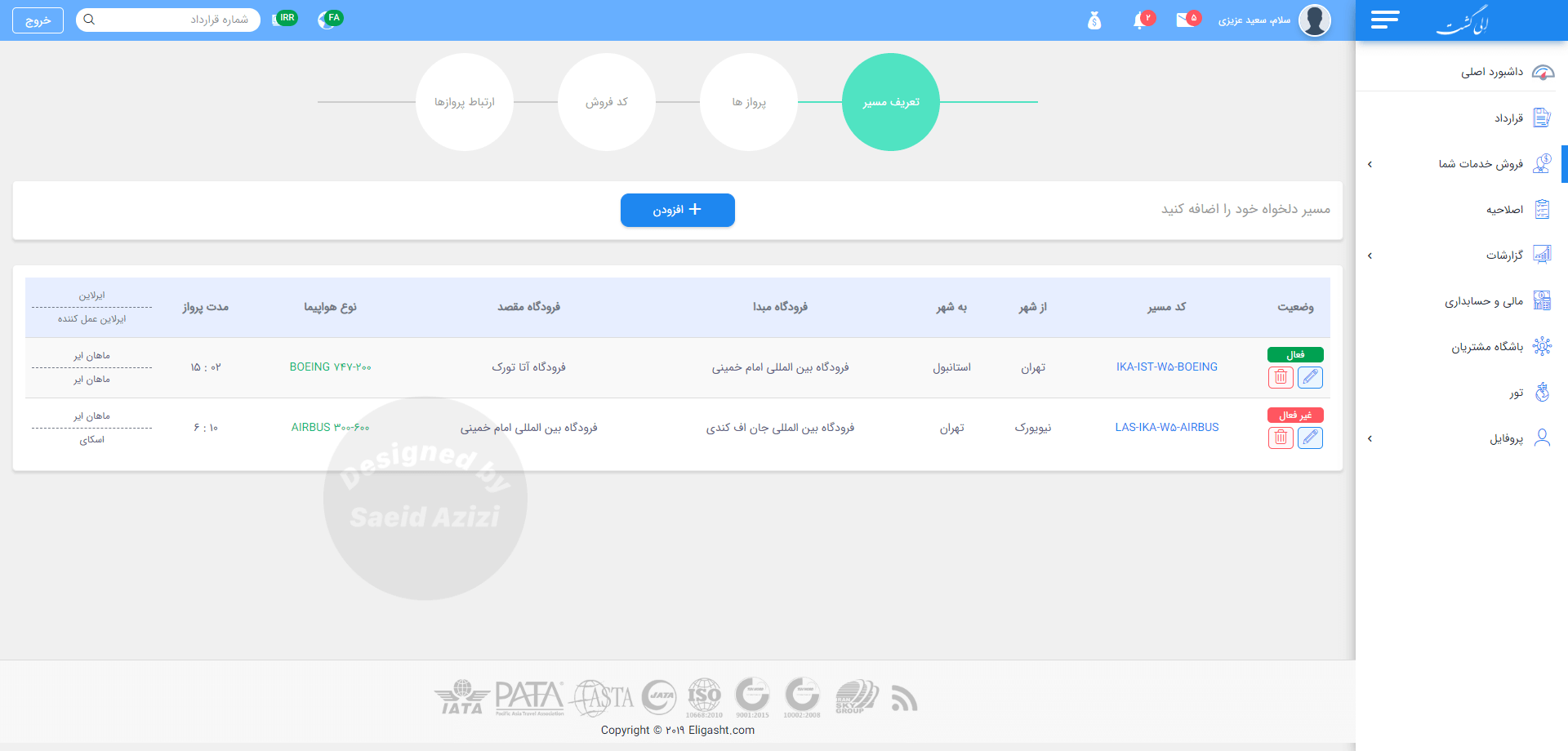
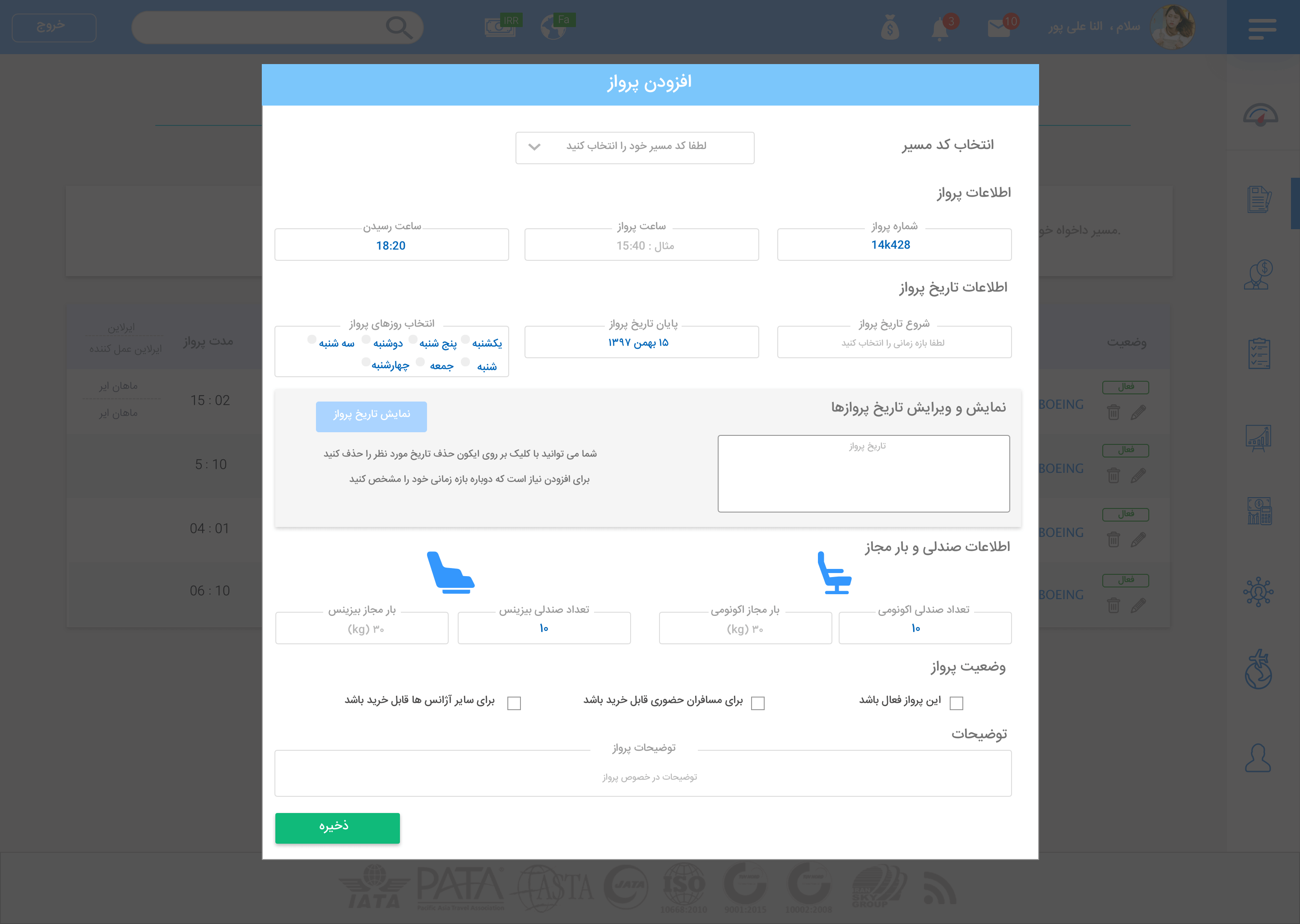
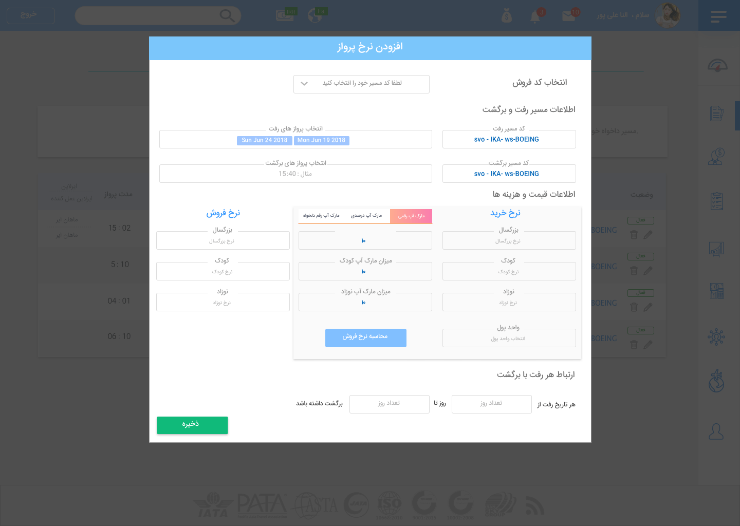
Break complex forms into small, understandable parts
Context
Agencies fill out many complex forms. If they feel disordered, they take a long time.
The call
Custom flights are split into four small sections, and the new flight and price modals divide fields into clear groups.
What it did
Forms that can be understood at first glance.
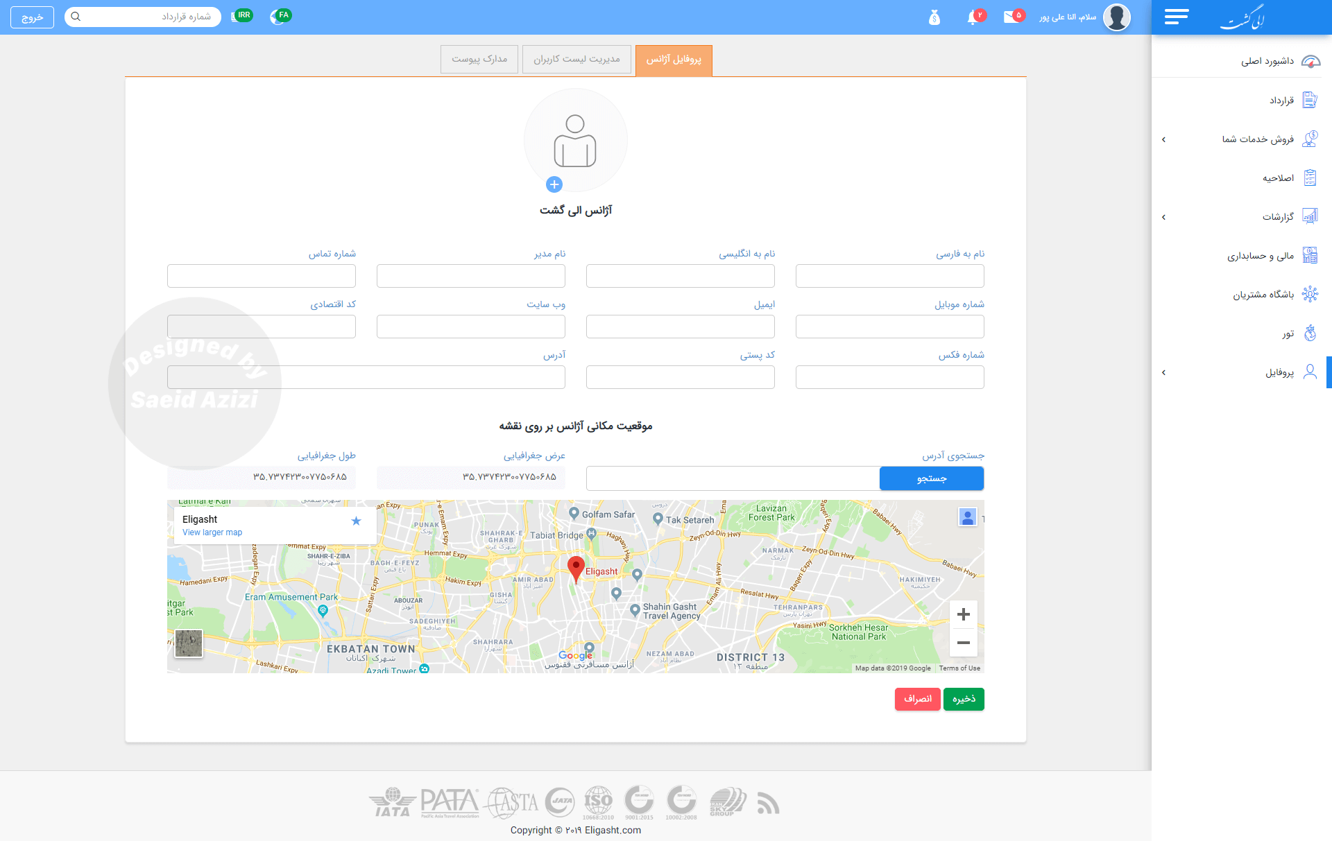
Decision 04
Show agency information the way it connects
Context
Research showed that every agency has three connected kinds of information.
The call
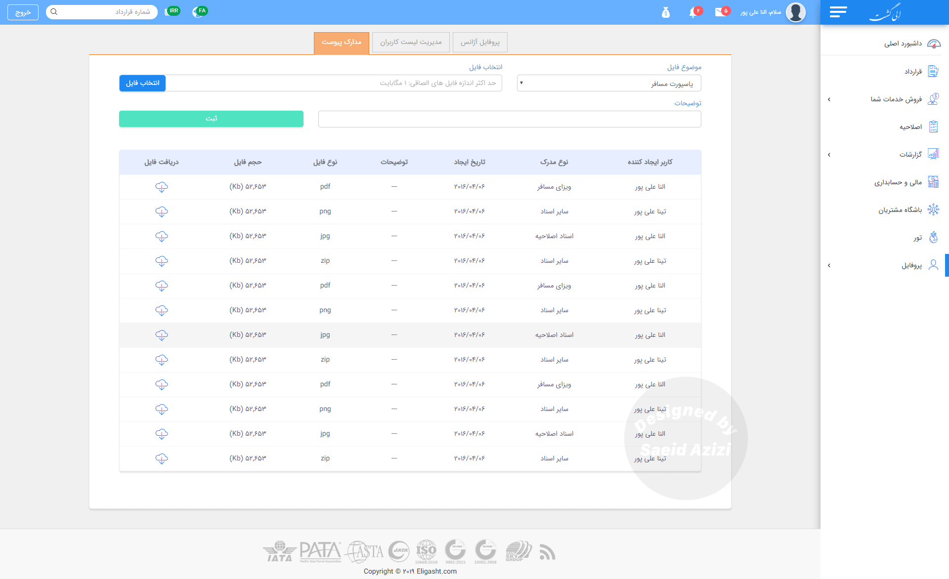
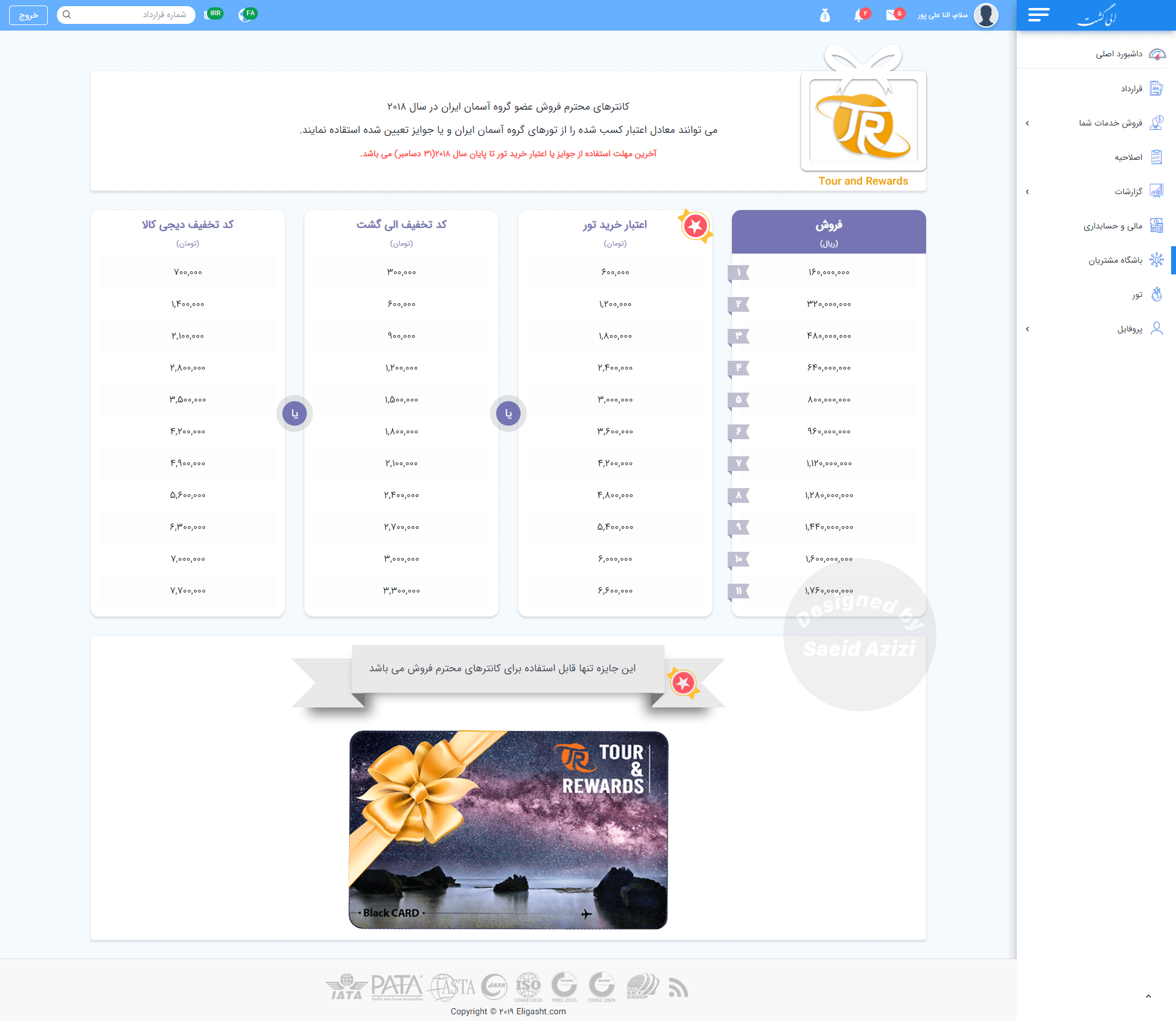
Three tabs in the profile: Agency Profile, Employee List and Attachment Documents, plus a sales bonus section.
What it did
Agency data lives where users expect it.
05 Reflection
What we learned, and what I would do next
Understanding immediate pain points was the key success: focus groups revealed the need for real-time sales data and simpler contract management, and the card sort and site map kept common tasks close. Prototyping and early usability testing let us validate choices before implementation.
In future phases I planned to adopt more rigorous research methods for B2B:
01
Longitudinal research: observe agents over weeks or months to see how they adapt and where friction builds.
02
Contextual inquiry in agencies, to find issues that controlled tests miss, such as navigation delays and missed notifications.
03
Affinity and journey mapping across personas, to prioritise features.
04
A/B testing of layouts, to measure impact on engagement and conversion.
05
Regular heuristic evaluations, including external experts, for learnability and efficiency.
Next
A foundation to refine.
The focus groups, affinity mapping and usability tests laid the base for the platform. Future research is how it keeps improving.
