Project
Eligasht is one of the largest tour and
travel company in Iran and wanted to
Introduce a special mobile app for all its
services.
My role
- To lead the design and set customer
- experience direction for both iOS and
- Android applications
- Mentoring and task assigning of UX
- staff
Objective
The main goals were to incorporate
Features such as book a flight, hotel, and
flight+hotel as well as
other services in an engaging way to
increase the sales of the company.
Research methods
- Customer interviews
- Google Analytics
- Prototype testing
- Persona
- competitor analysis
- Research and Empathise
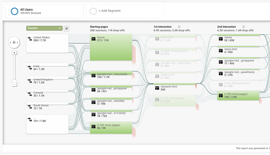
- I collected the data from the SEO team to know what is the most services that users search on the web-based version
- And after that try to rank them. I gathered Pageview Tracking and behavior analysis of the web site
- User Research
- In the user research phase, I conducted a series of interviews with potential stakeholders including managers, and employees to better understand the current process, areas of complexity, and frustrations.we also did some competitor research and we interviewed several travelers to find out how they currently searched for flights and planned their trips. I then summarised the information I collected and created:
- 1. Personas: Creating a short bio for the 2 main personas, highlighting their motivation, needs and frustrations.
- 2. User flow: Mapping the common booking steps for flows of our target users.
- Behavior analysis
People knew roughly where they wanted to go. The app had to help them find the rest.
01 Research
Starting from what people already search for
Eligasht is one of the largest tour and travel companies in Iran and wanted a special mobile app for all its services. I led the design and customer-experience direction for both iOS and Android, and mentored and assigned tasks to the UX staff.
I took data from the SEO team to see which services people search for most on the web version, ranked them, and tracked pageviews and behaviour on the site. I interviewed managers and employees, did competitor research, and interviewed travellers about how they search for flights and plan trips.
2
Personas created
4
Layouts explored for the main page
3
Common insights from the affinity diagram
2
Platforms: iOS and Android

Neighbouring countries
Most searches were for flights to a neighbouring country.
Not sure, but with an idea
People were not sure where they wanted to go on their next holiday, but had a basic idea.
Friends influence
Travel choices were often influenced by where friends went.
02 Ideation
Four layouts for the first screen
The first page of the app had to be flight search, in an intuitive way. I sketched as many ideas as we could think of, discussed them, and pulled out the key ideas. Then I created wireframes of four different layouts so stakeholders could understand each one.
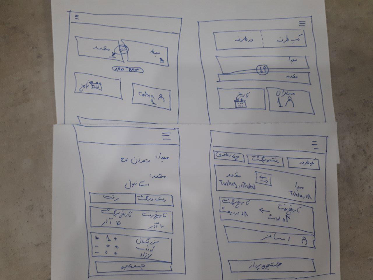

We discussed every layout with our persona and with stakeholders, and went on with layout 2, the most intuitive and easiest to use among them.
03 Decisions
One concept, repeated across every service
Decision 01
Make flight search quick to scan and adjust
Context
Search had to be intuitive, and booking has many steps.
The call
Flight search built from the research and journey, with all three passenger types in one component so users can add or remove them quickly, and a progress bar at the top of the reservation page.
What it did
Users always know which stage of the booking they are in.

Decision 02
Apply the same pattern to every other service
Context
Hotel + flight, holiday packages and hotel search each have their own needs.
The call
The same concept everywhere. Hotel + flight gets a change flight button so users can combine any flight with any hotel. Holiday packages show days and dates for each hotel, with a date slider at the top because airline and dates matter to users. For hotel search we tested several date pickers with users and chose one that selects a range simply.
What it did
Learning one screen means knowing the rest.


04 Testing
A hi-fi prototype, on a real phone
We were short on time, but I tested the hi-fi prototype on a mobile phone, with participants recruited to match the personas. A scenario-based test plan asked them to think aloud while they searched for flights, hotels, travel insurance or trains.
People liked the overall feeling of the app and could reserve any travel service they wanted.
The research conducted to absorb the domain knowledge proved to be really valuable.
On what I took from the project
Next
Beyond the booking journey.
This case covers the booking journey. The next step would be other journeys, such as order tracking and support.