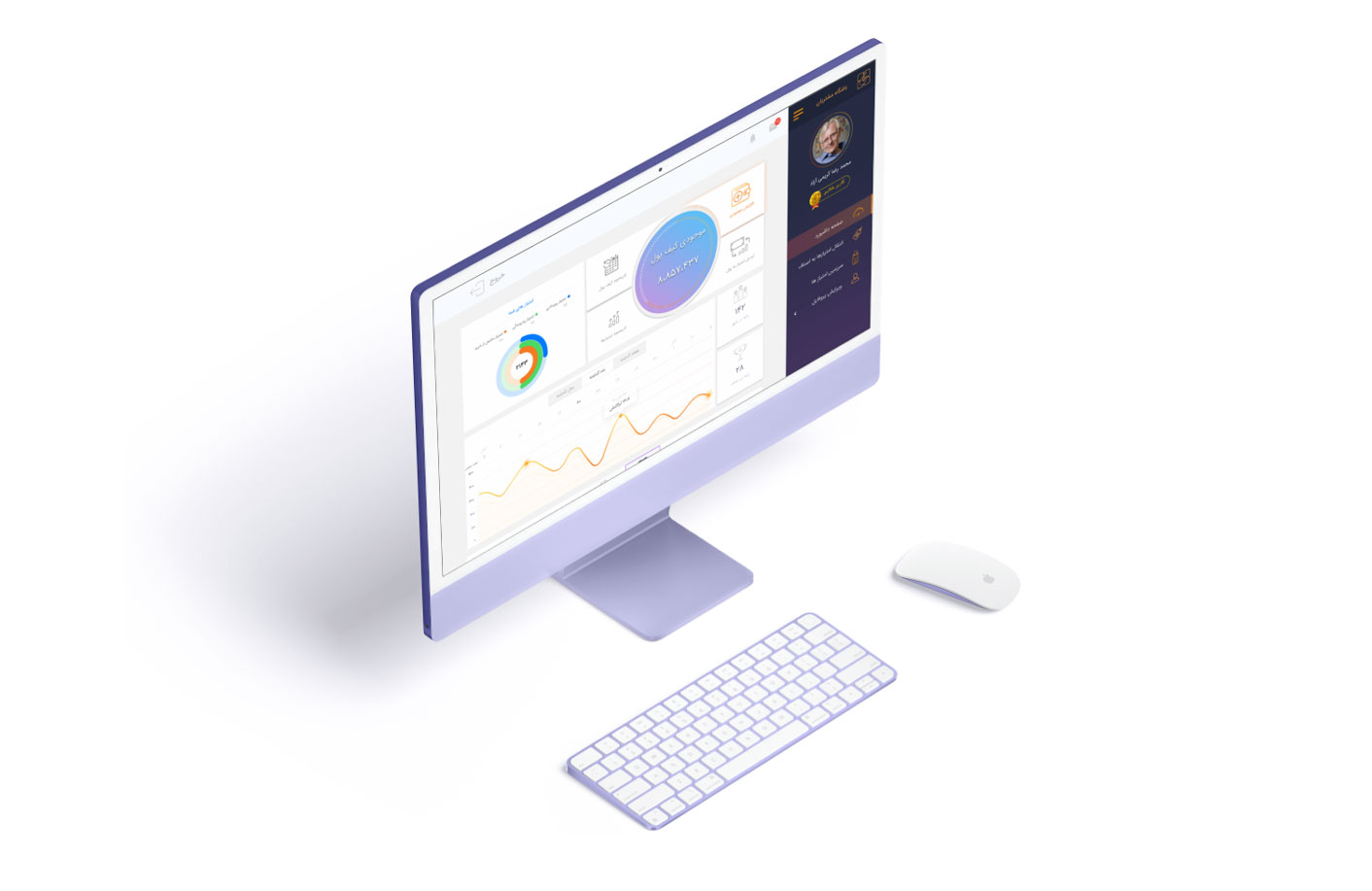
Project
Parna is a financial mobile application
I led the design of a comprehensive mobile financial application for one of the largest banks in Iran.
This app enabled users to perform a wide range of money transactions, from loan repayments to paying highway tolls, all within a streamlined and user-friendly interface. My responsibility was to ensure that the design was clean, functional and met all the user requirements.
I was deeply involved in every aspect of the design process, from creating personas and scenarios to conducting market research to understand user demands.
My role
- Product designer
- Responsible for the overall design of the project and draw up a design plan
- creating user flows
- conducting usability testing
- Creating a clean and functional design based on the requirements
Objective
Create a simple and easy to use, financial application to meet business and at the same time customers goals.
Differentiate from competitors through innovation. My focus was on creating intuitive layouts, interactions, and transitions, specially tailored for mobile banking services, ensuring that the user experience was seamless and engaging.
Research methods
- Customer interviews
- Prototype testing
- Persona
- Empathy map
- Survey and storyboard studies
From repaying a loan to paying a highway toll, one clean flow.
01 Brief
A banking app for one of the largest banks in Iran
Parna is a financial mobile application. I led the design for a comprehensive app that lets users make a wide range of money transactions in a streamlined, user-friendly interface, and I was involved in every part of the process, from personas and scenarios to market research.
The objective was a simple, easy-to-use app that meets business goals and customer goals at the same time, and stands apart from competitors through innovation: intuitive layouts, interactions and transitions made for mobile banking.
5
Features users wanted most
2
Personas: primary and secondary
2
Rounds of usability testing
5
Participants in the final scenarios
02 Research
What do customers want, not what do we think they want
I first interviewed stakeholders about the market, the customers and the company’s value proposition, then interviewed users to align business and user goals. For the analysis I moved back and forth through the whole data set, coded it, and searched for patterns across interviews to decide which features to focus on.
Move money
Transfer money from one card to another.
Pay loans
Pay loans via the app.
Highway tolls
Pay highway tolls.
Taxi fares
Pay taxi fees.
Bills
Pay service bills such as water and electricity.
An empathy map helps us consider what customers want, not what we think they want.
Why I use empathy maps


I designed for the primary persona first, and accommodated the secondary one as far as possible. A comparative analysis showed why users saw other apps as substitutes.
03 Flows
Making every flow as linear as possible
There were many bank services to present in a simple and understandable way. With the features chosen, I used user flows to focus on what each persona needed to accomplish, then simplified them so each interaction was as linear as possible.


I started with a paper prototype to test different variations of key features quickly, then built medium-fidelity wireframes in Sketch, and tested them with three participants to check both user and business needs.




04 Decisions
Four calls that shaped the app
Decision 01
Put the four most-used services front and centre
Context
Many services, limited screen.
The call
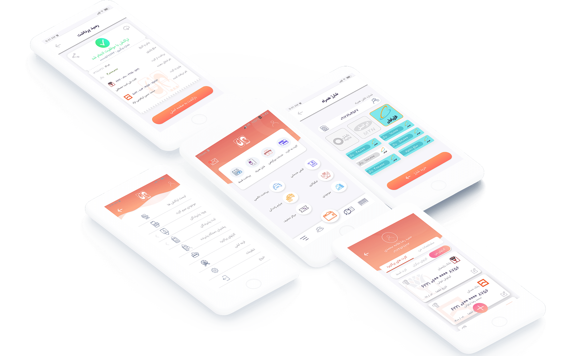
After talking with stakeholders, the four most-used services sit at the top of the home screen: transfer money by card, highway tolls, phone pre-credit and loan payment.
What it did
The services that matter most to users and stakeholders are always in the centre of the user’s vision.

Decision 02
Use bottom pop-ups for payment
Context
Card details are needed to make a final payment in each service.
The call
A dialog rises from the bottom and darkens the background, to take the user’s full attention.
What it did
Bottom pop-ups are easier to interact with, less invasive and easier to scale than normal pop-ups or page transitions.
Decision 03
Make the receipt feel familiar, a bit more fun
Context
Users should trust that a payment went through.
The call
A receipt page similar to the printout of a real card-reader machine, with share and download. Pre-paid phone credit is designed for the three most-used operators in Iran.
What it did
A clear end to every payment.


Decision 04
Let people add as many license plates as they want
Context
The highway toll service is for people who pay tolls via the app.
The call
A section where users add any number of license plates into the app.
What it did
Paying tolls for several vehicles in one place.
05 Evaluate
Two rounds of testing, then final screens
I completed the entire prototype and made every payment process short and simple. Across two rounds of usability testing I let users play with the clickable prototype, took notes and applied the changes. We prepared several scenarios and tested with five people, who did almost all tasks at the right time.


Next
Simple on the surface, structured underneath.
Research, flows, prototypes and tests kept a complicated set of bank services simple to use.