Project
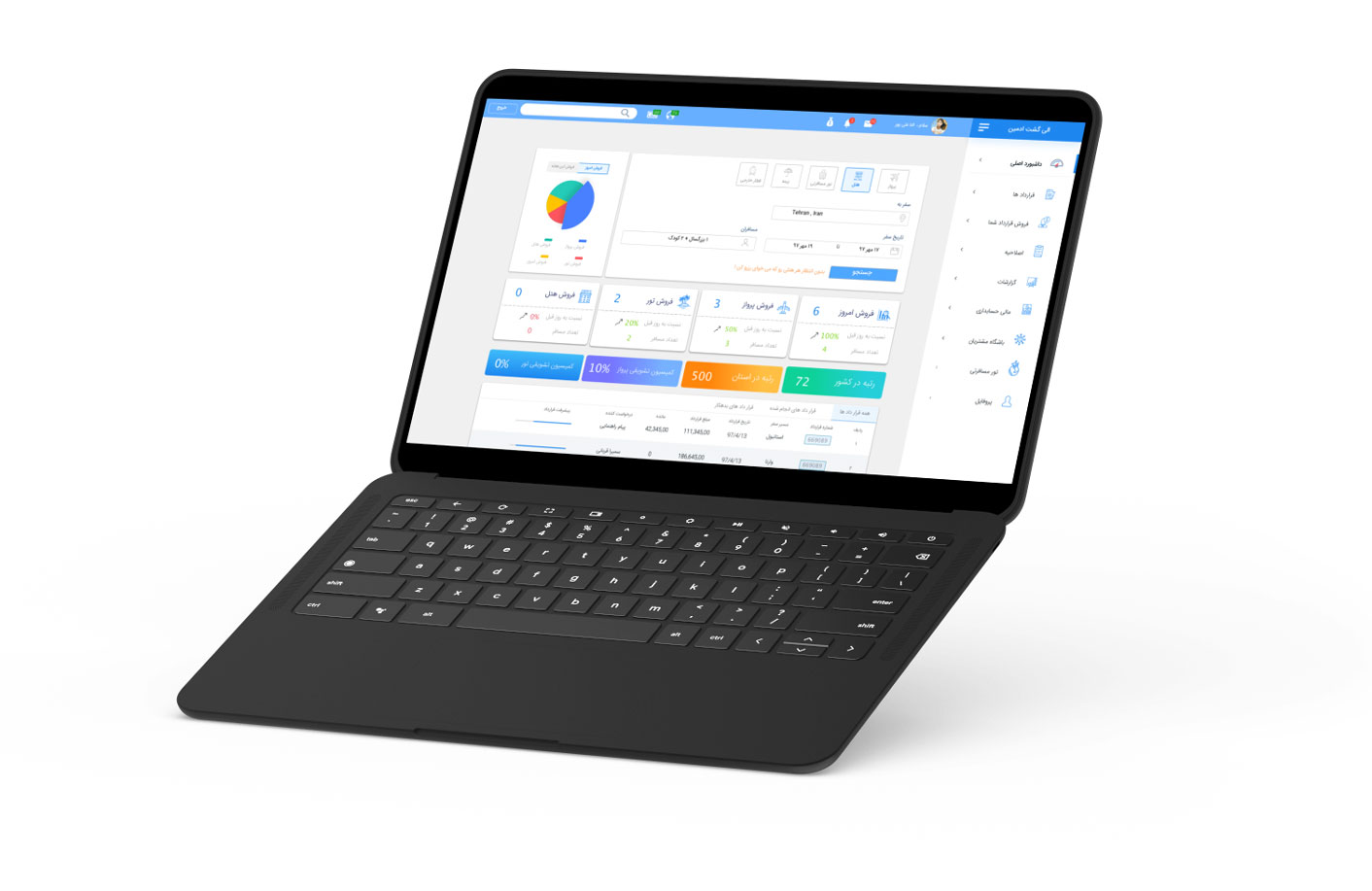
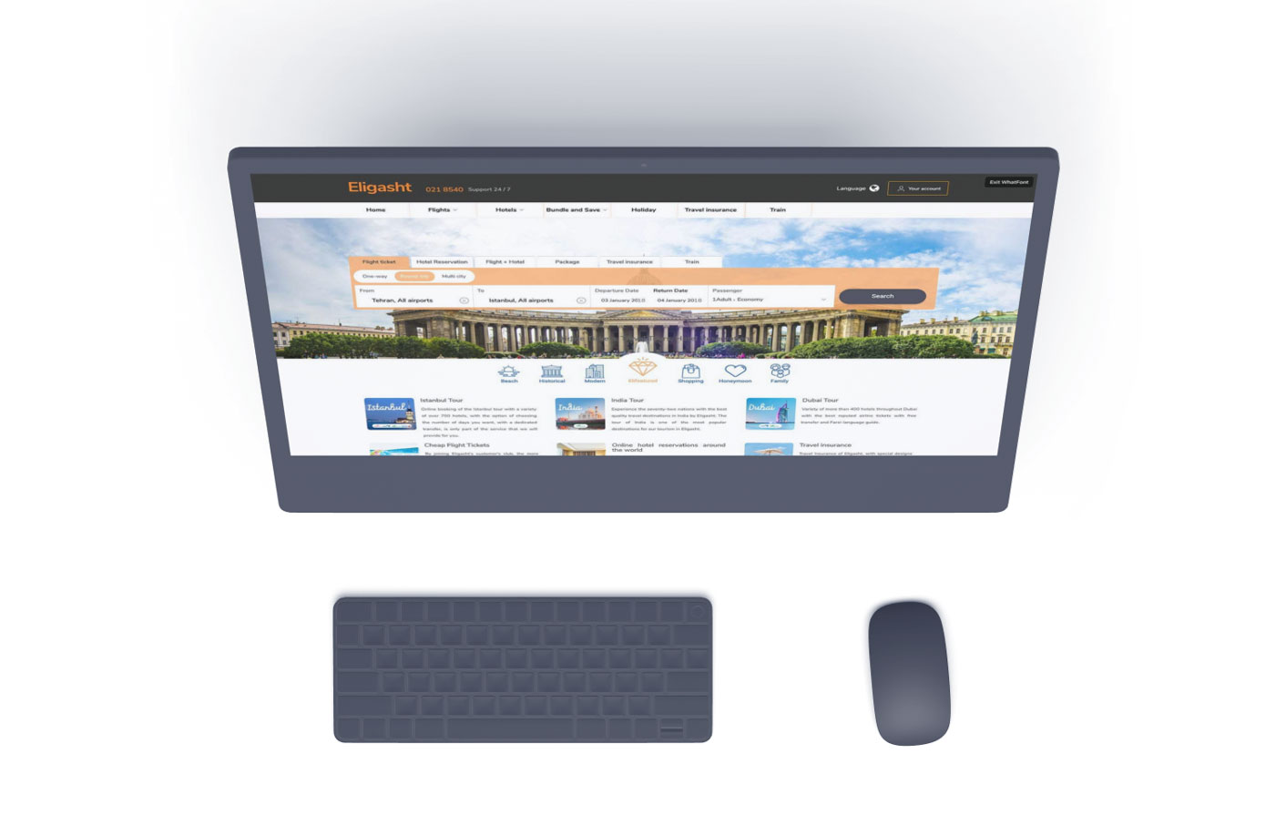
Eligasht web App is the
Application for searching and booking flights,
Hotels and tour packages all around the world.
My role
- Responsible for creating a clean and functional design
- based on the requirements
- Led different teams on research and design
- Create wireframes and prototypes for
- usability testing
- Conduct usability testing
- Meeting up with developers
Objective
The goal was to design a new version of the web app
To improve user experience and increase user engagement.
Research methods
- Competitive/Comparative Analysis
- stakeholders interviews
- Prototype testing
- mind mapping
- Persona
- Research and challenges
- For this project, I was provided with the previous version of the app, which was pretty confusing
- In terms of searching and finding related information.
- Eligasht is of the biggest tour and travel companies that have thousands of customers every day.
- The site needed to reinforce the customer to use the web application of the company
- Instead of coming to the office in person.
Get customers to book online, instead of walking into the office.
01 Brief
A booking site that made people give up
Eligasht is one of the biggest tour and travel companies in Iran, with thousands of customers every day. The previous version of the web app was confusing when people tried to search and find related information.
The goal was a new version that improved the experience and increased engagement, and gave customers a reason to use the web application instead of coming to the office in person.
3
User personas defined by the company
5
Primary user needs addressed
3
Competitors studied
7
Tour package categories on the homepage
A clear service organisation
For a seamless booking experience.
Helpful tour package suggestions
That reflect Eligasht packages around the world.
An efficient checkout
To save time and make purchase easy.
Detailed service information
So people choose the right product.
Product reviews
To support informed decisions and give users a voice.
02 Structure
Mind map, card sort, site map
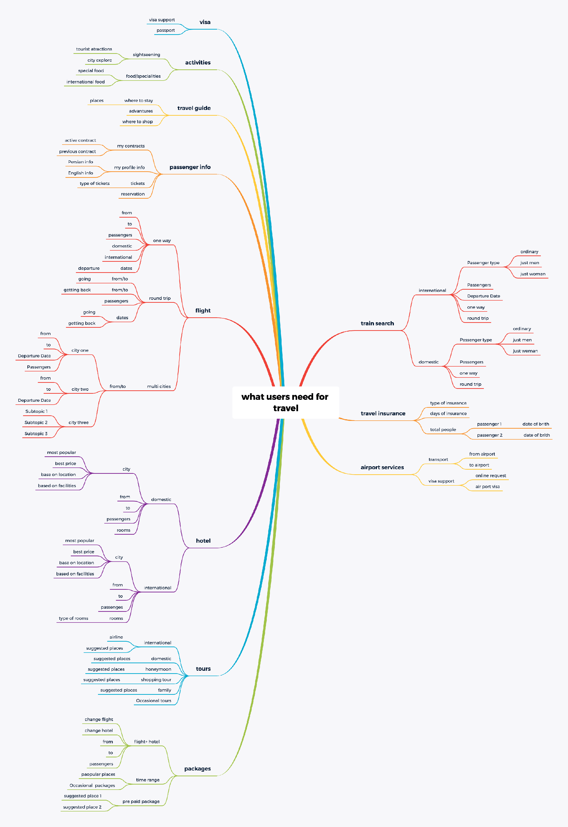
I started with three main competitors, to learn how they organised searching and services. Then I built a mind map of business needs and customer needs, and ran a card sort to tap into how people already think about the services.
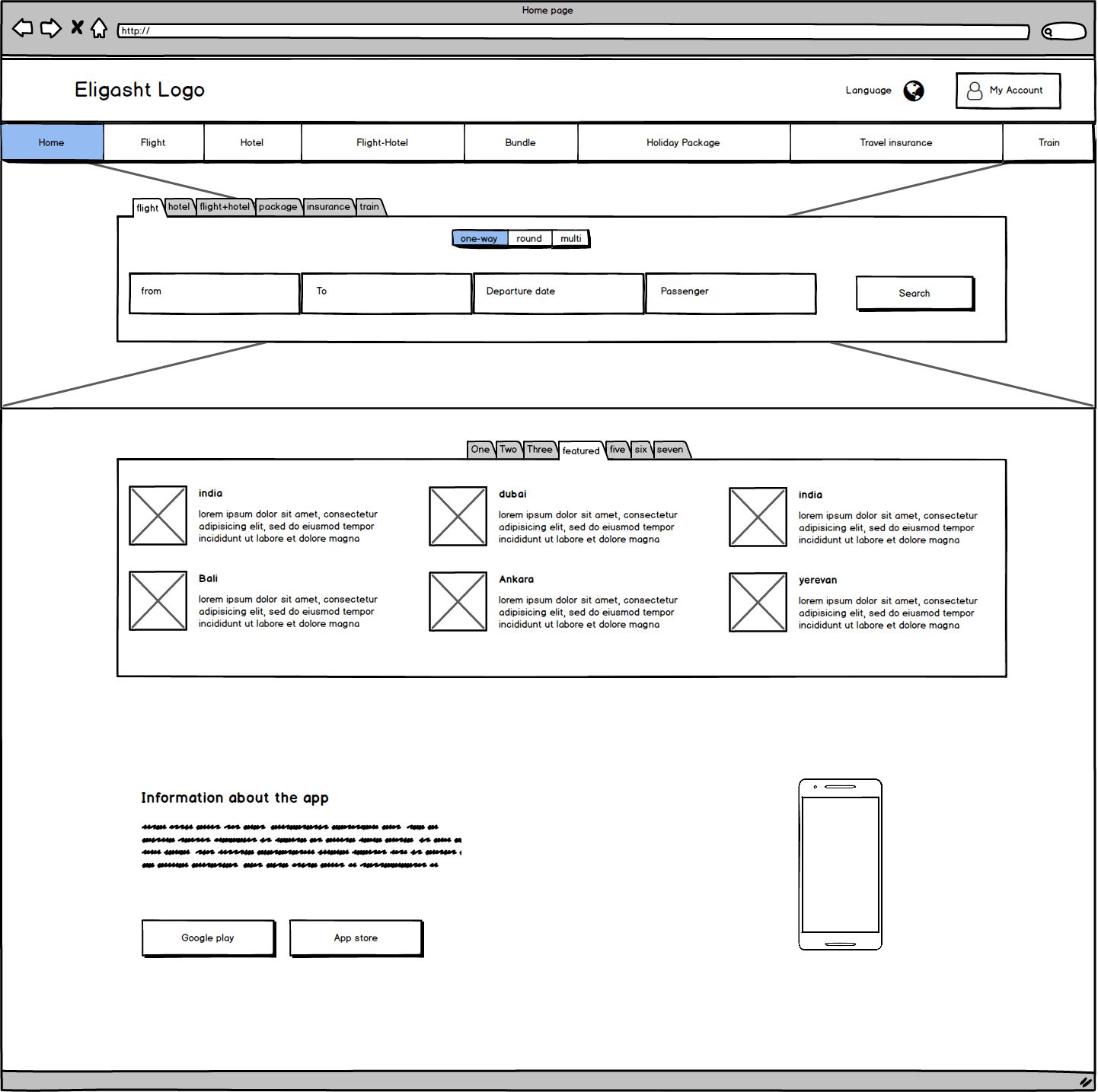
From the card sort and competitor ideas I built the site map. Some pages were removed completely. For example, the standalone hotel information page went away, and a mega menu to search and book a specific hotel took its place.
03 Decisions
Six calls across search, results and checkout
Decision 01
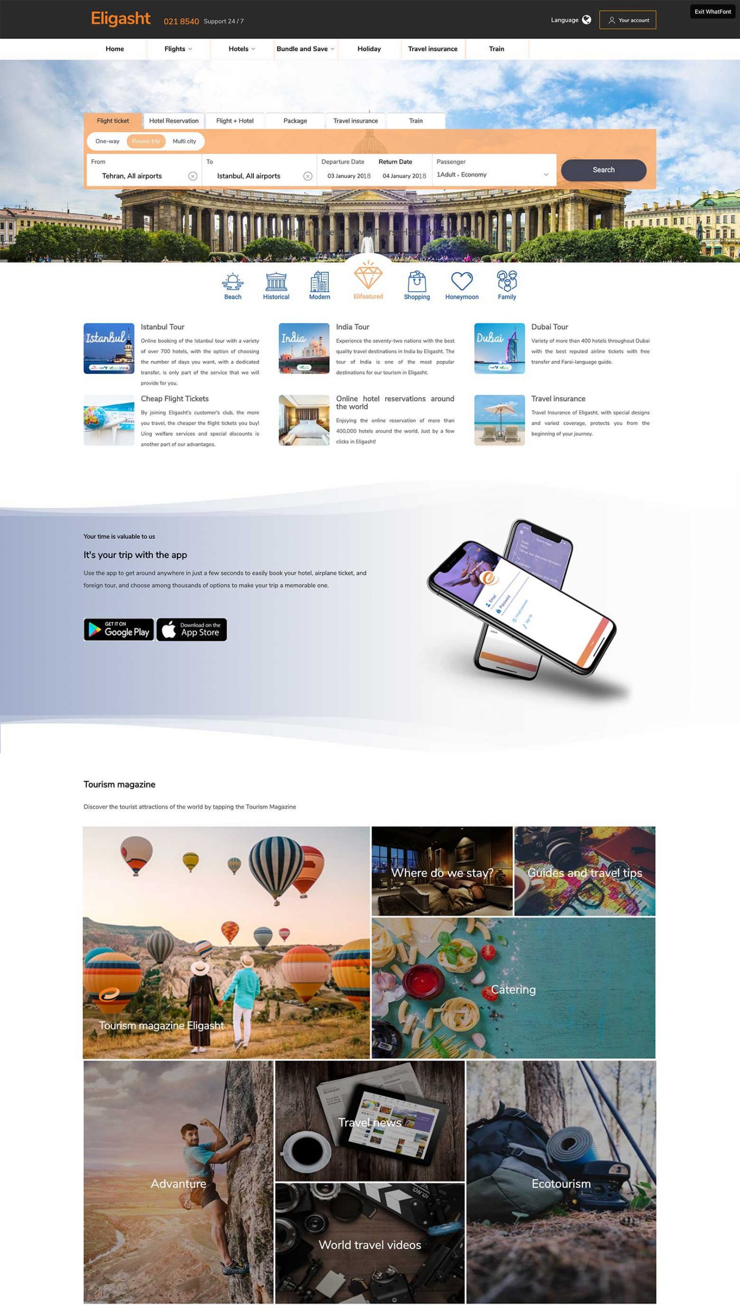
A minimal search, then seven reasons to explore
Context
User engagement begins with the search section, and the homepage must not overwhelm.
The call
A simple search form on top for the main services, then tabs of tour packages below, seven categories for different interests, so people can browse instead of searching for one specific tour.
What it did
We tracked First Interaction Count and asked users for a Customer Effort Score on flight search.
Decision 02
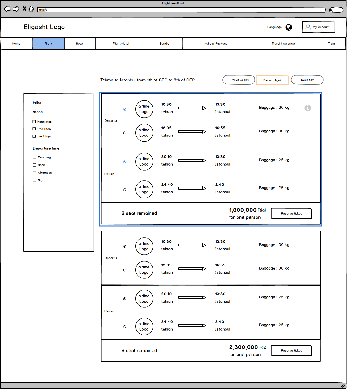
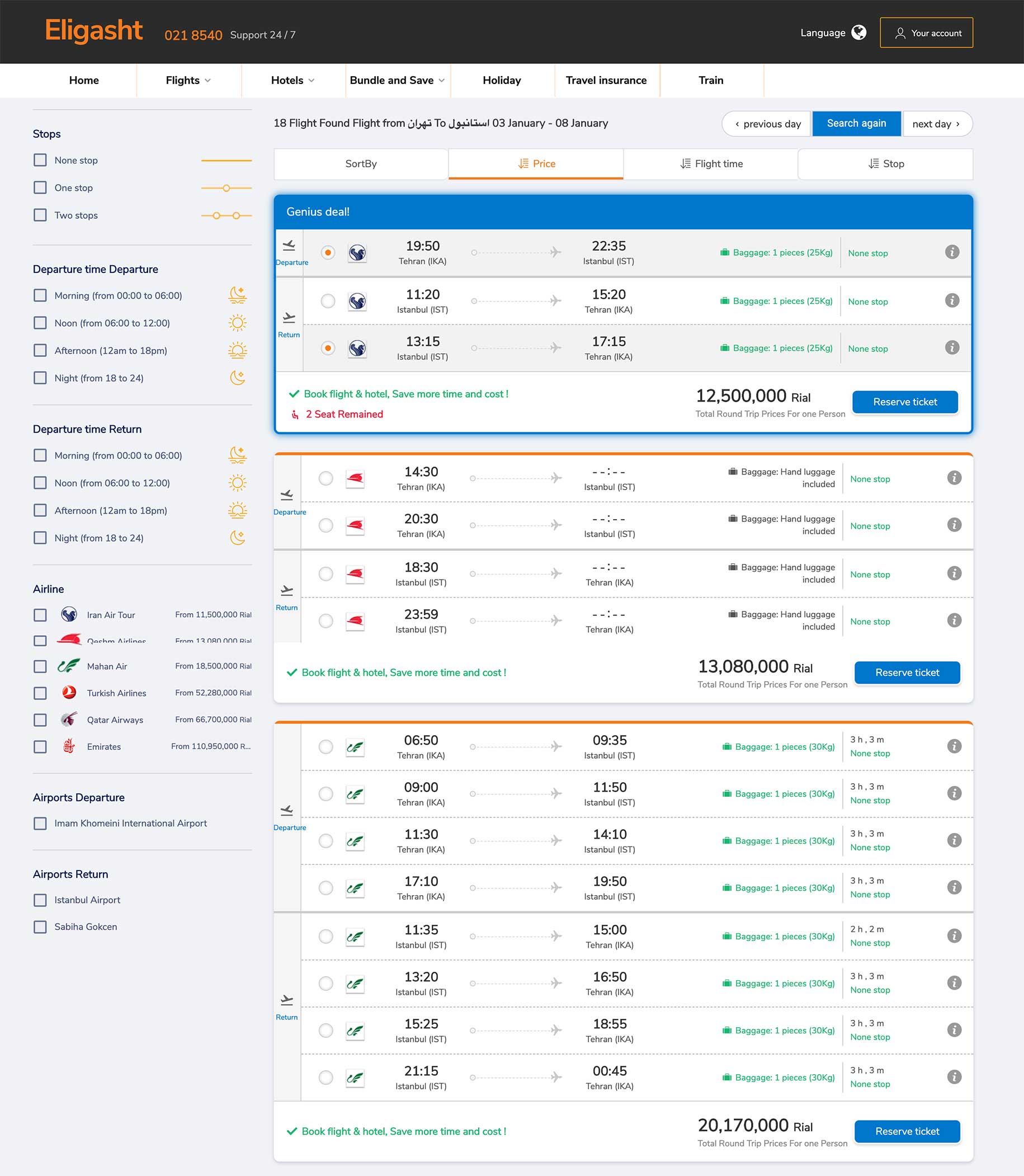
Three areas for results, and a big card per flight
Context
A flight can have more than one offer for departure or return.
The call
Search again on top, filters on the left, results on the right. Each flight is a large card that separates departure and return flights.
What it did
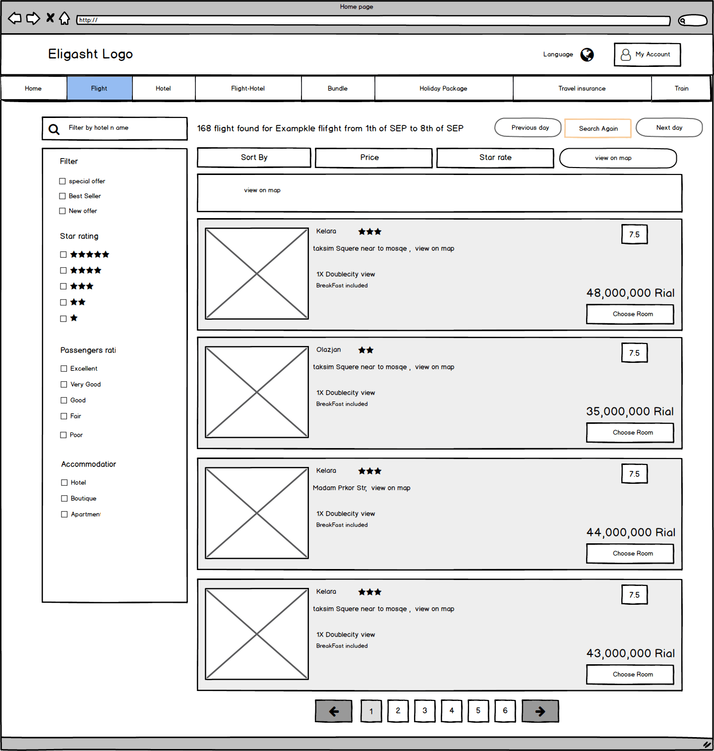
Offers are easy to compare, and the same layout carries over to every other search result.
Decision 03
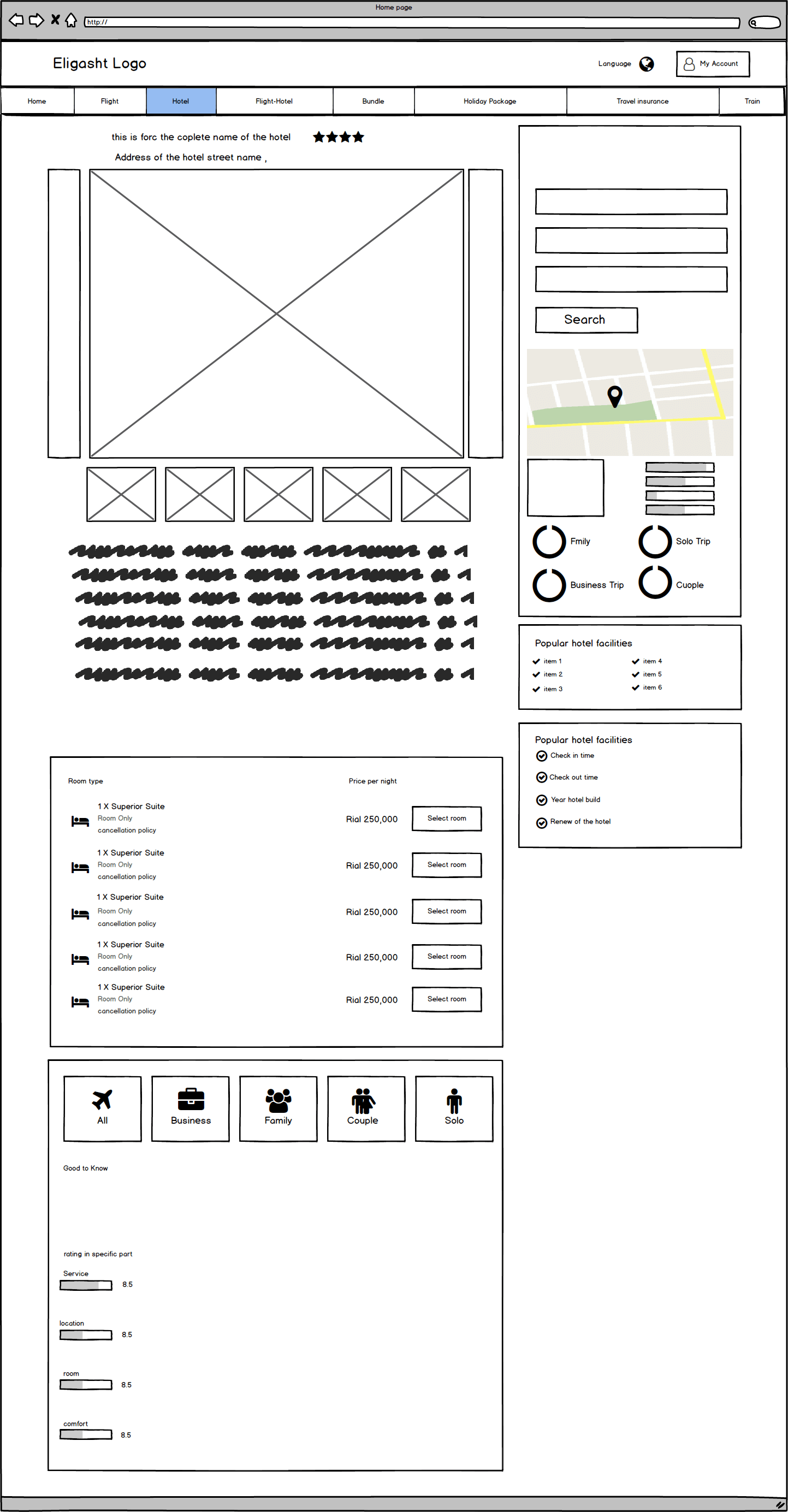
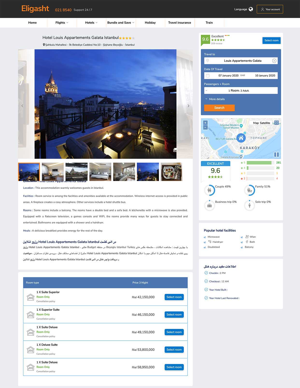
Let people search other cities while reading about a hotel
Context
The research showed users want to look at hotels in different cities while reading about one.
The call
On the hotel detail page, a search form and related information on the right, detailed information on the left, and available rooms in a clear list below.
What it did
Comparison happens without leaving the page.
Decision 04
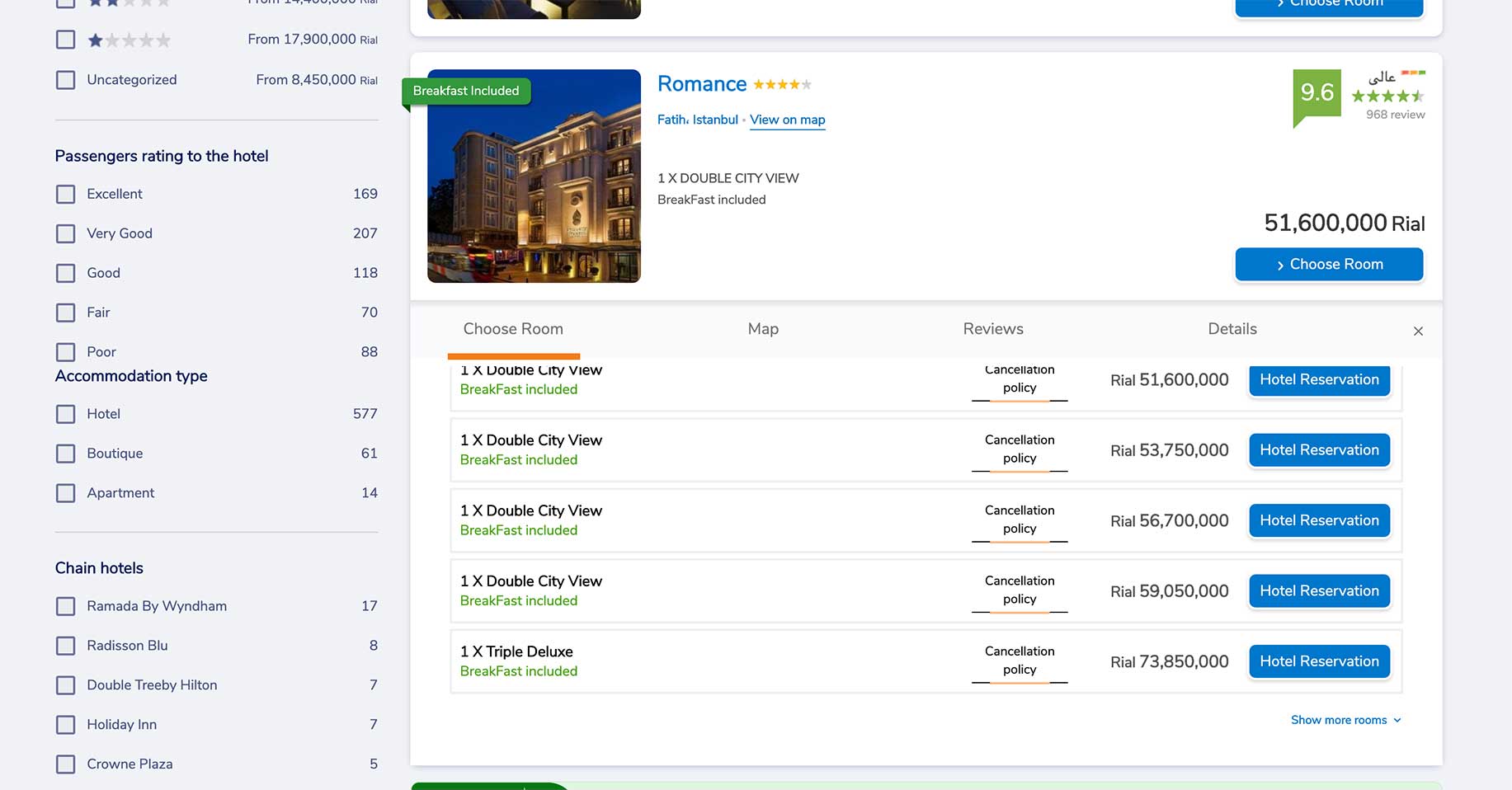
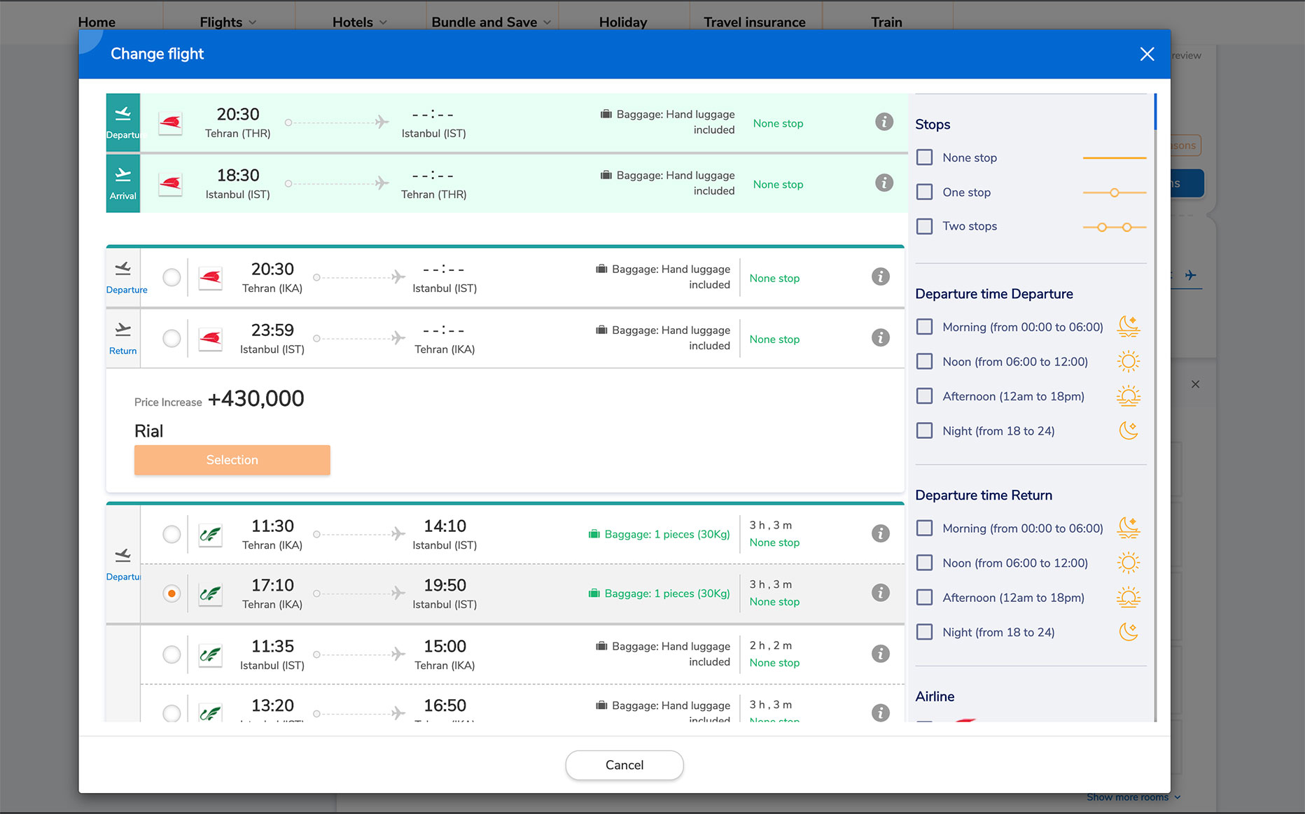
Keep long lists in a modal, so the user never feels they left
Context
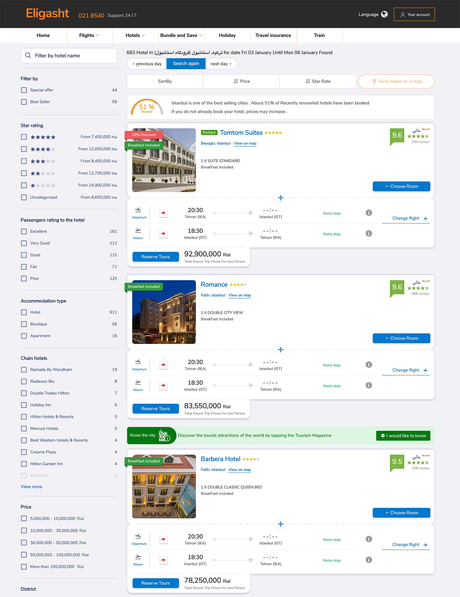
Hotel plus flight results need a way to swap one flight without starting over.
The call
A Change flight modal that shows the current flight and a list of alternatives, in the same visual style as the flight list.
What it did
No redirect, no extra frustration: the user stays on the page.
Decision 05
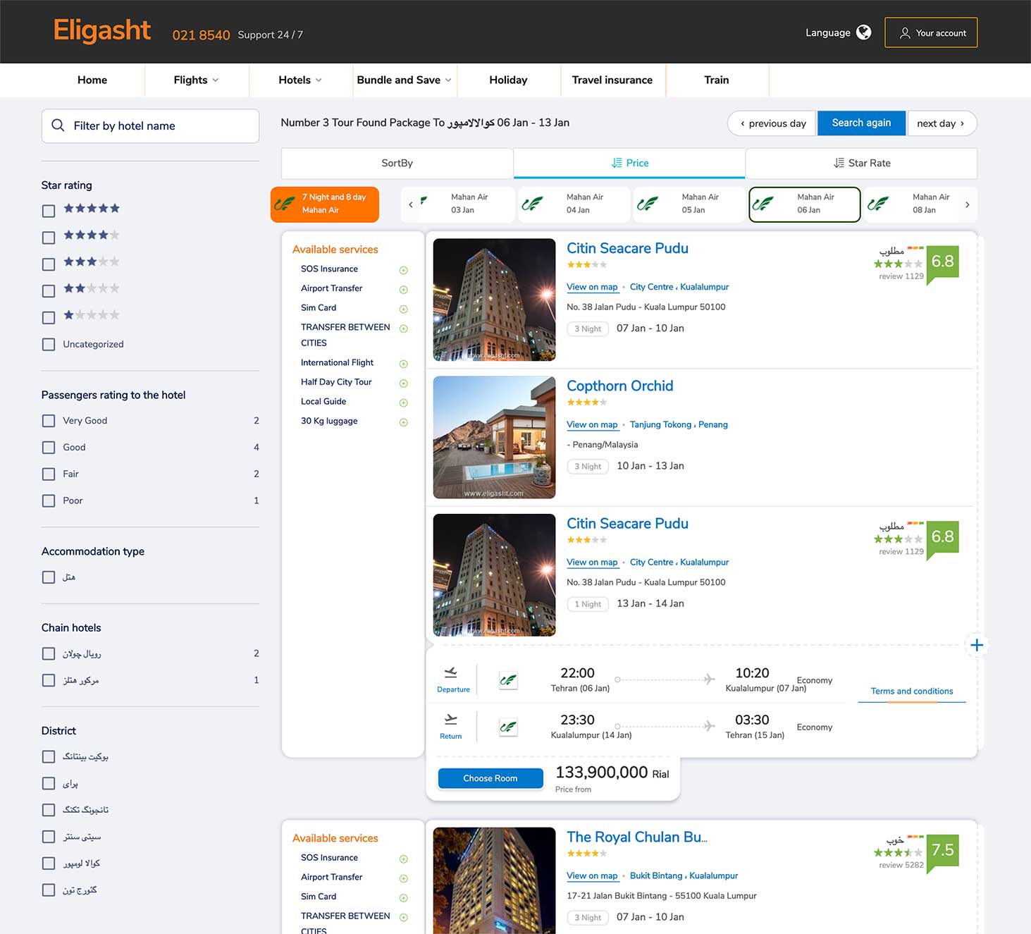
Show tour dates and airlines first
Context
Tour packages begin on different dates, and users care about the airline.
The call
A date section at the top, under the price filter, showing dates and available airlines for the specific tour.
What it did
A tiny feature that was one of our best decisions: it matched what users expected and the business goal of selling more tours.
Decision 06
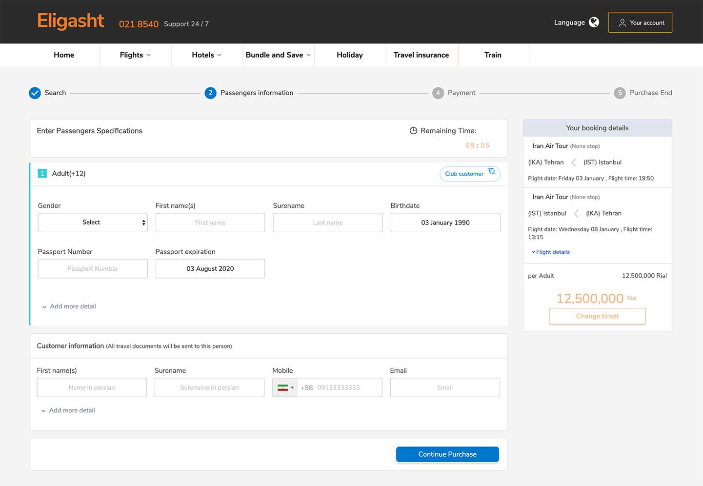
Make the checkout feel short
Context
The three personas all named an efficient checkout as a primary pain point, and there are many fields.
The call
A progress bar for the purchase stages, and optional fields hidden under an expandable Add more detail.
What it did
Less clutter on a page that has to collect a lot of information.
04 Testing
Four people, three scenarios
I tested the mid-fidelity greyscale wireframes first, so feedback was honest and about functionality, before any visual design. Four participants played three scenarios:
01
Book a round-trip flight for two people.
02
Find the tour packages for next month and select a flight.
03
Book a flight and a hotel together.
Navigation worked
Overall, users could navigate the site and find services and information easily.
Checkout felt slow
Participants found the checkout flow time-consuming.
Multi-direction flights
A few participants wanted a way to book a multi-direction flight.
Next
The start of a bigger process.
The next steps were more usability testing, iterating on the designs, and bringing more of Eligasht’s visual style and content into the site.