Project
Navaco customer club is a web – based app that
Credit card acceptors of the bank can benefit
From many events. the project was for one of the
biggest banks in Iran (Maskan Bank).
My role
- Explore personas
- Facilitate sketching sessions with the
- wider team
- Turn complex requirements into epics
- and user stories
- Create prototypes for usability testing
Objective
Provide service for credit card machine
acceptors of the bank to gain scores and
search the events all across the city to
Spend their score and get notified of any
new upcoming lottery.
Research methods
- stakeholder interviews
- Prototype testing
- Information Architecture
- Persona
- Market research analysis
- User Stories
Give small businesses a reason to use their card machine more.
01 Brief
A customer club for card-machine merchants
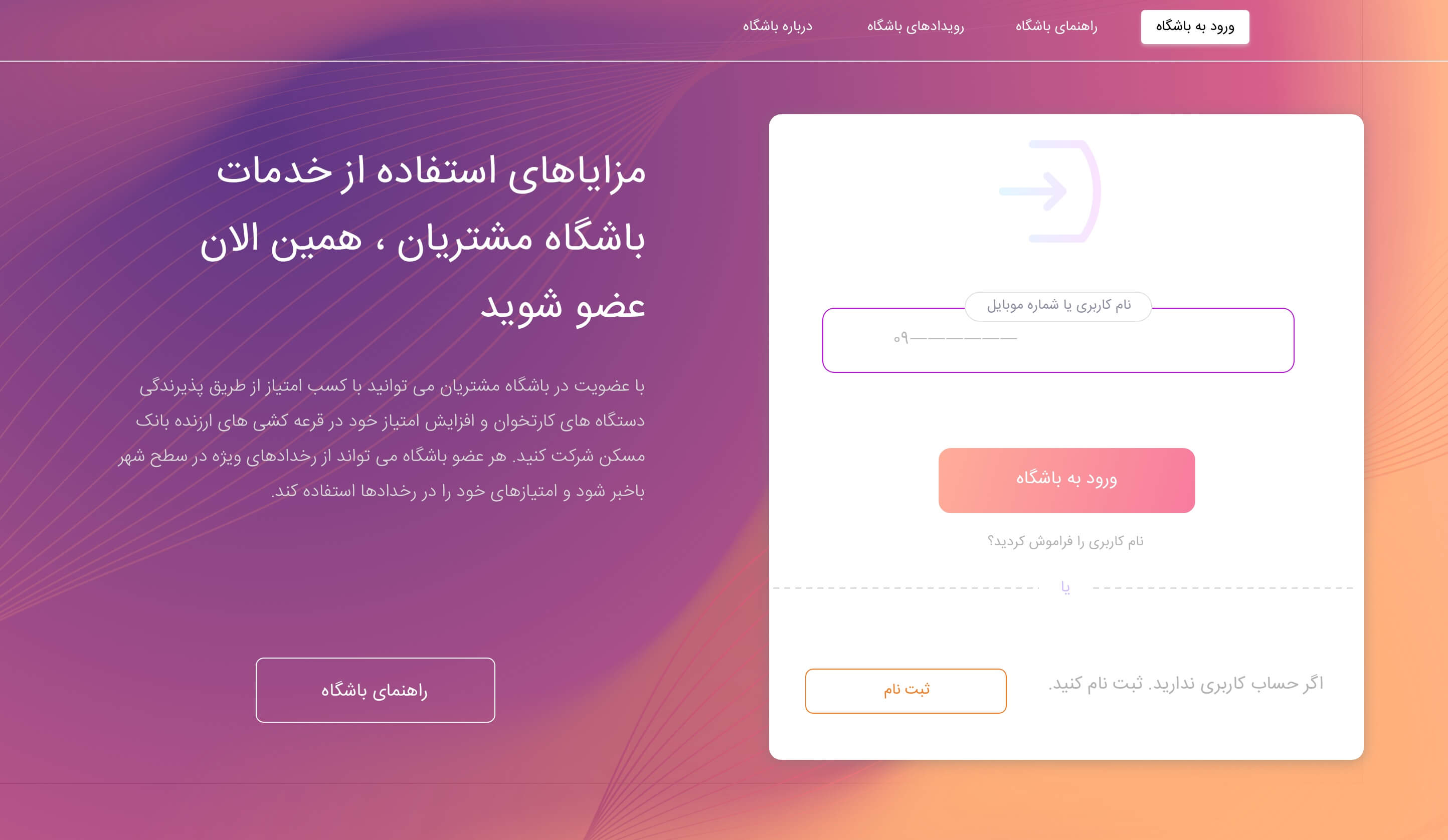
Navaco Customer Club is a web app that credit card acceptors of the bank (Maskan Bank, one of the biggest banks in Iran) can use to benefit from events. Merchants gain scores, search events across the city, spend their scores, and get notified of upcoming lotteries.
Because the project was driven by KPIs, I started with stakeholder interviews to learn which ones to focus on. The problem: convince a very specific type of customer, small businesses that use the bank’s card reader, to promote and create events on the platform and track their transactions, so the usage of the card machine increases.
3
Brainstorming sessions
3
Types of scores, each with its own colour
2
Rounds of usability testing
12
Test tasks in the scenarios
02 Research
Understand the problem before the solution
When the problem is not well understood, solutions only create new problems.
The principle behind the research
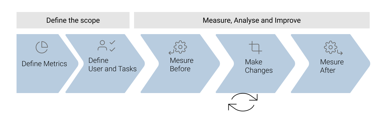
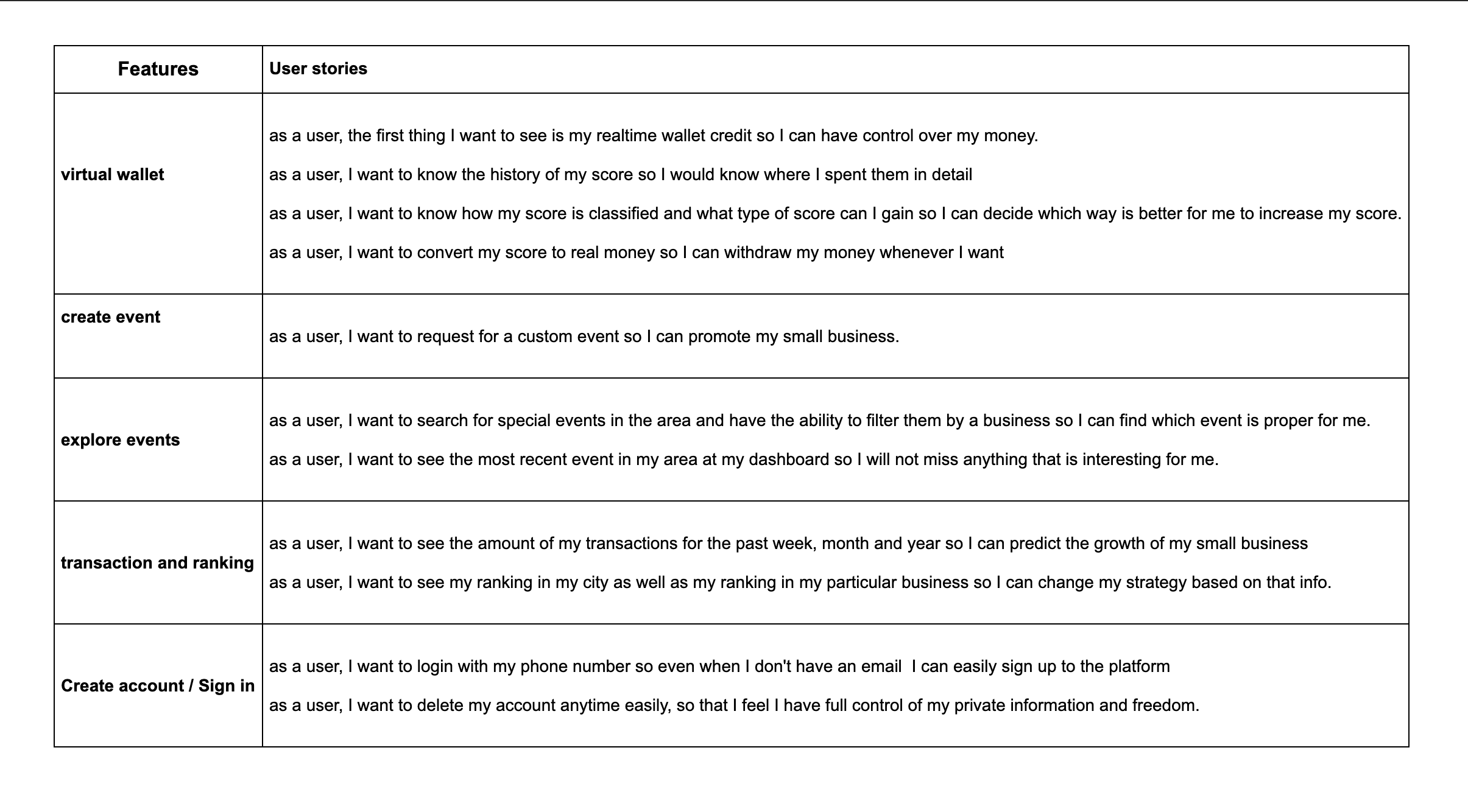
We interviewed target users and extracted user stories from them. I also used a framework to track the metrics: define tasks, users and metrics, then measure before and after making changes. To define the metrics I had to understand the company’s business goals, direction and objectives, so the project objectives could be aligned with the UX strategy.
01
Session 1: many ideas, but a lot were not technologically feasible.
02
Session 2: ideas from people outside our group broadened our perspective.
03
Session 3: the most productive, with consolidated, structured and feasible stand-alone solutions.
03 Structure
From personas to a simpler site map
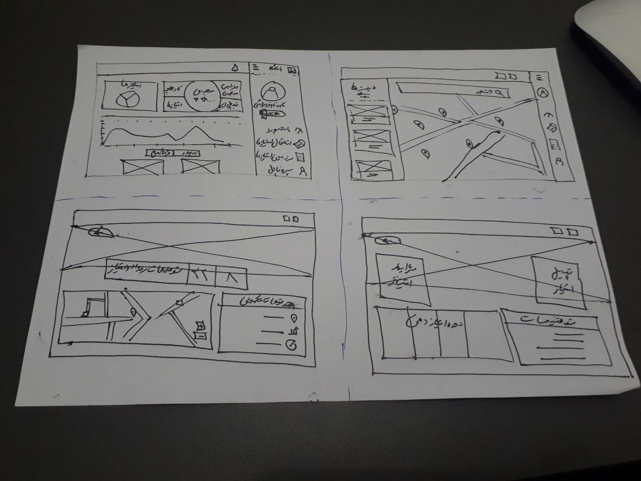
From the research, personas and journeys played a role in crafting a new, simplified site map. I presented personas, journeys and the site map to stakeholders, and then sketched all the pages needed for testing and development. Stakeholders also wanted to include converting scores to money.
Our research made it clear what matters most to users: knowing their wallet balance, how to increase their scores, and how to spend them.

04 Decisions
Design around balance, events and scores
Decision 01
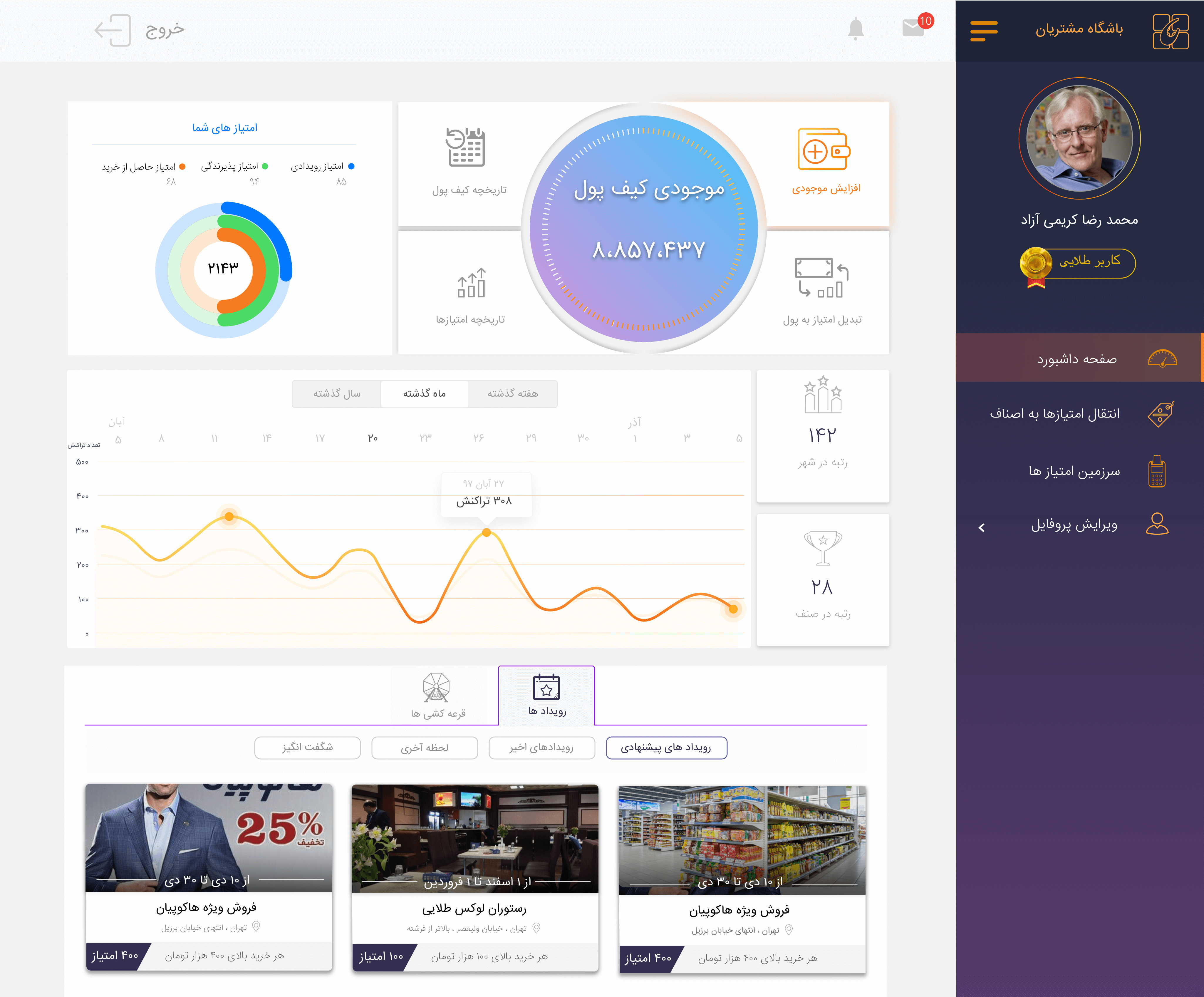
Put balance and scores at the centre of attention
Context
Users care most about their wallet and score.
The call
The account balance with all its functionality and the scores sit at the user’s attention centre of the main dashboard.
What it did
The first thing users see is what they came to check.
Decision 02
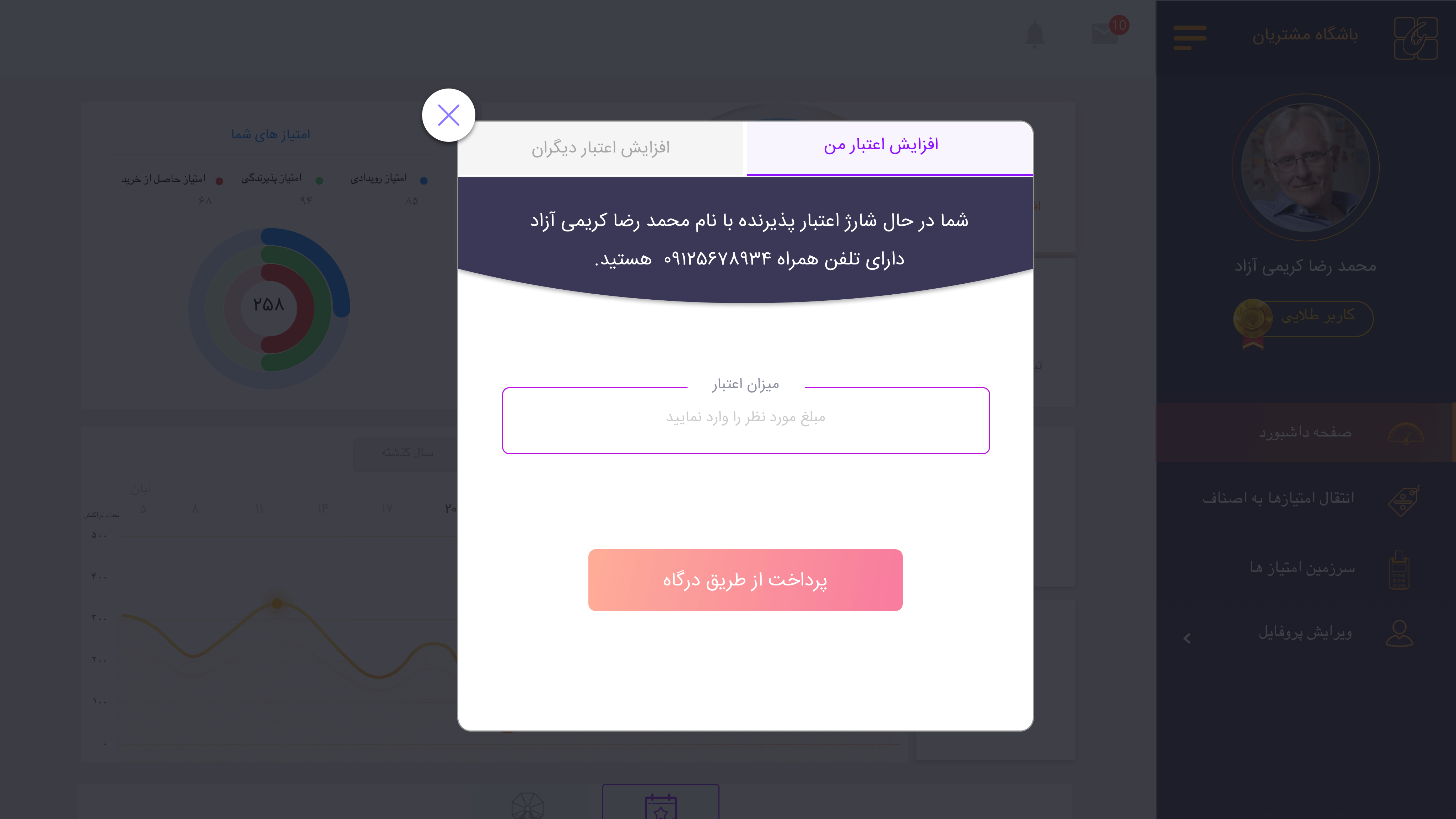
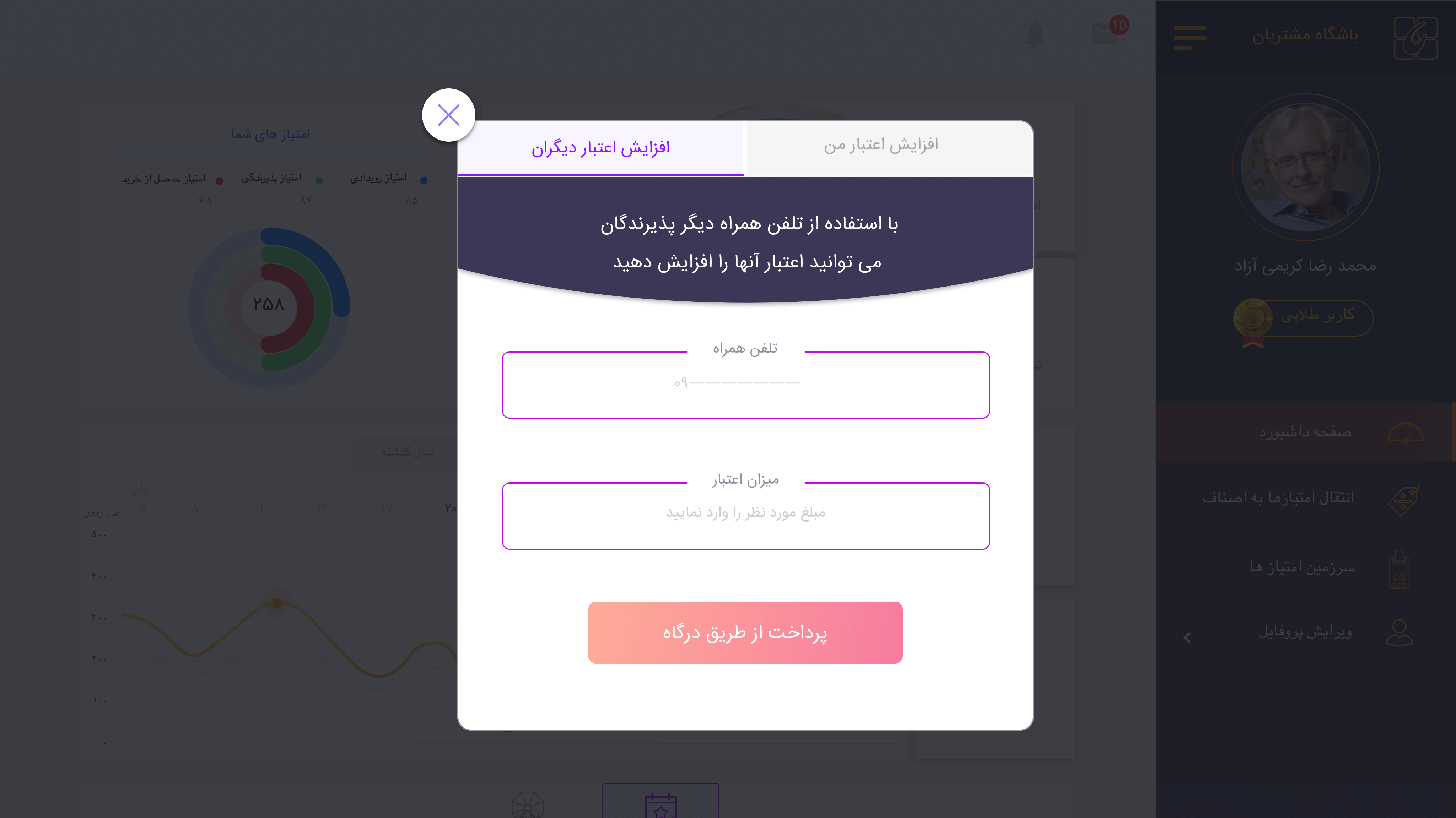
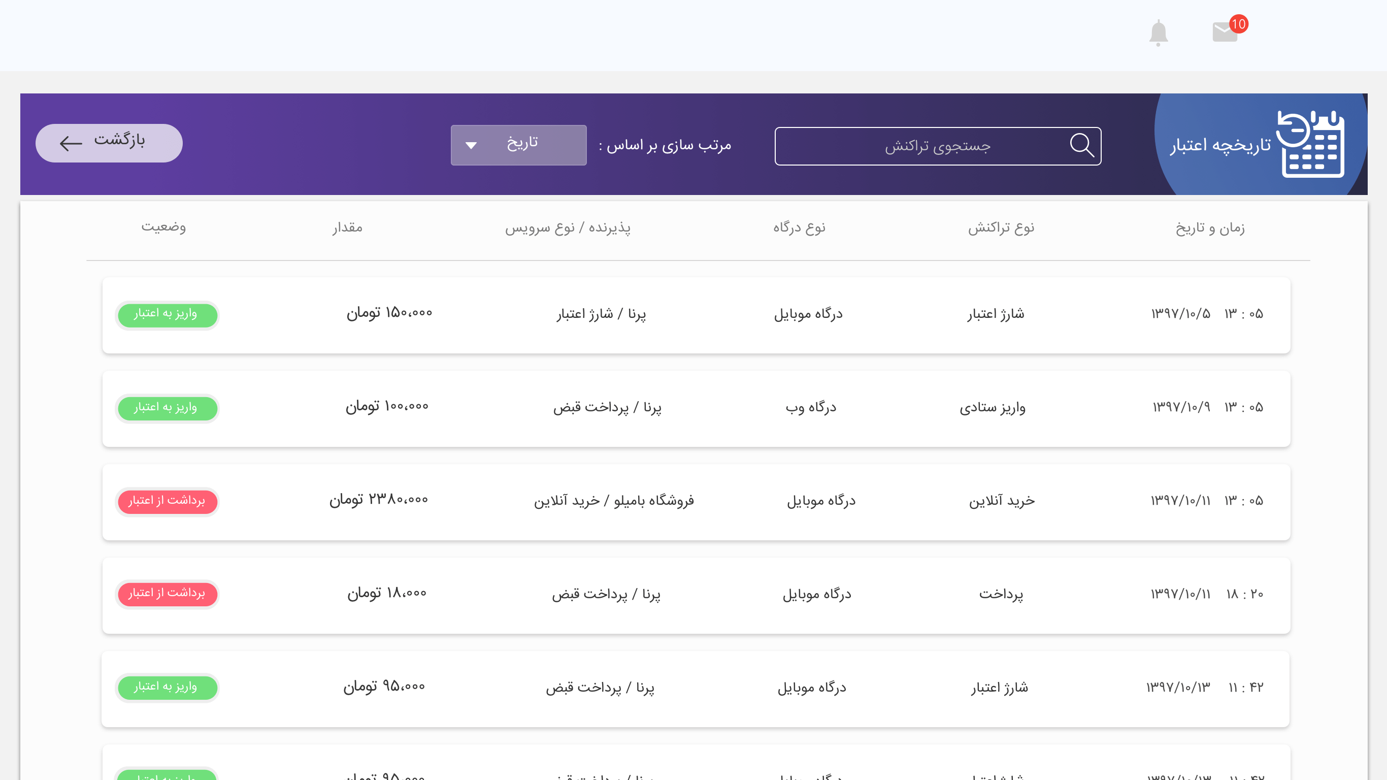
Increase the balance in one simple step
Context
Adding credit should not mean navigating away.
The call
A simple modal: enter the desired amount and go to the bank portal. There is also a way to increase credit for others.
What it did
Credit is added with one input.
Decision 03
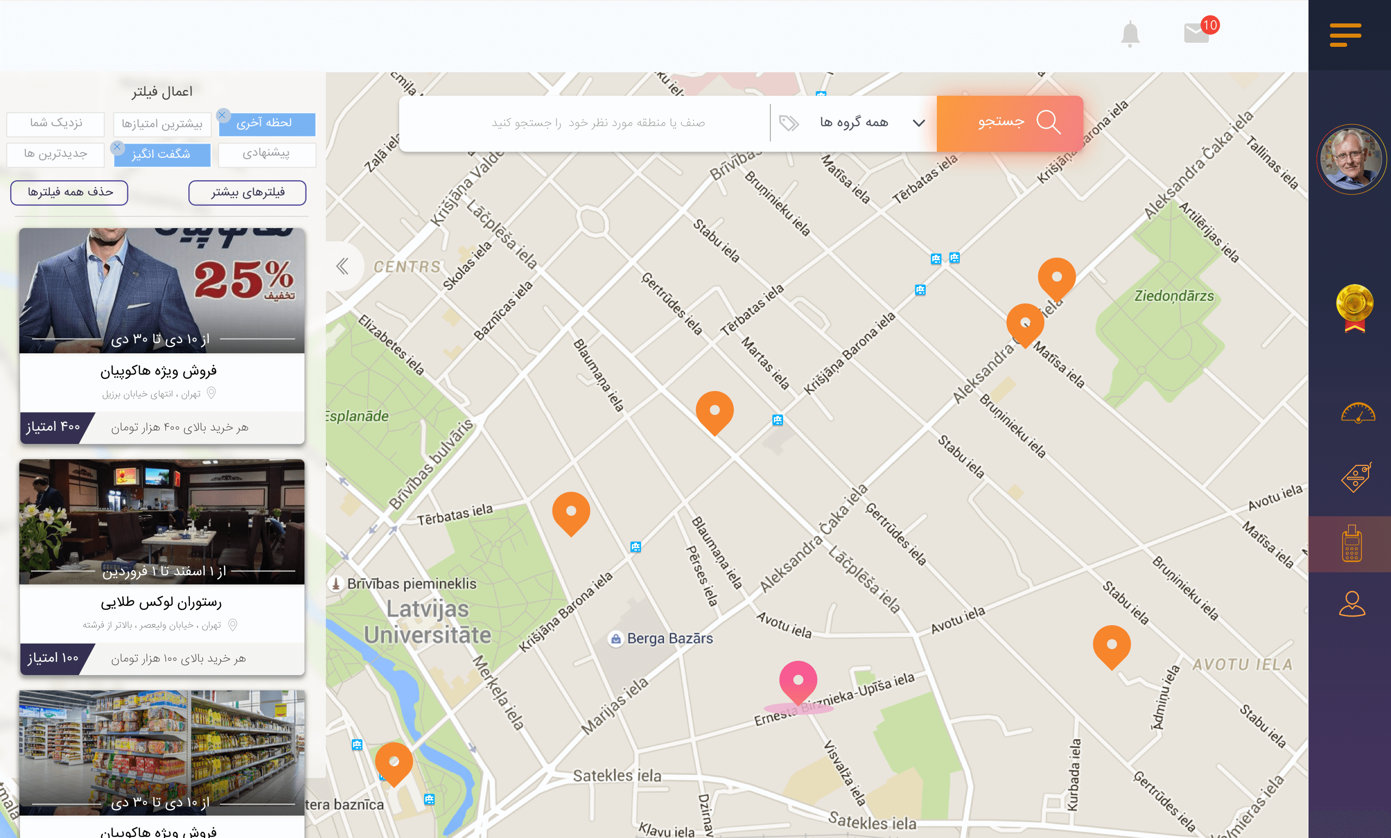
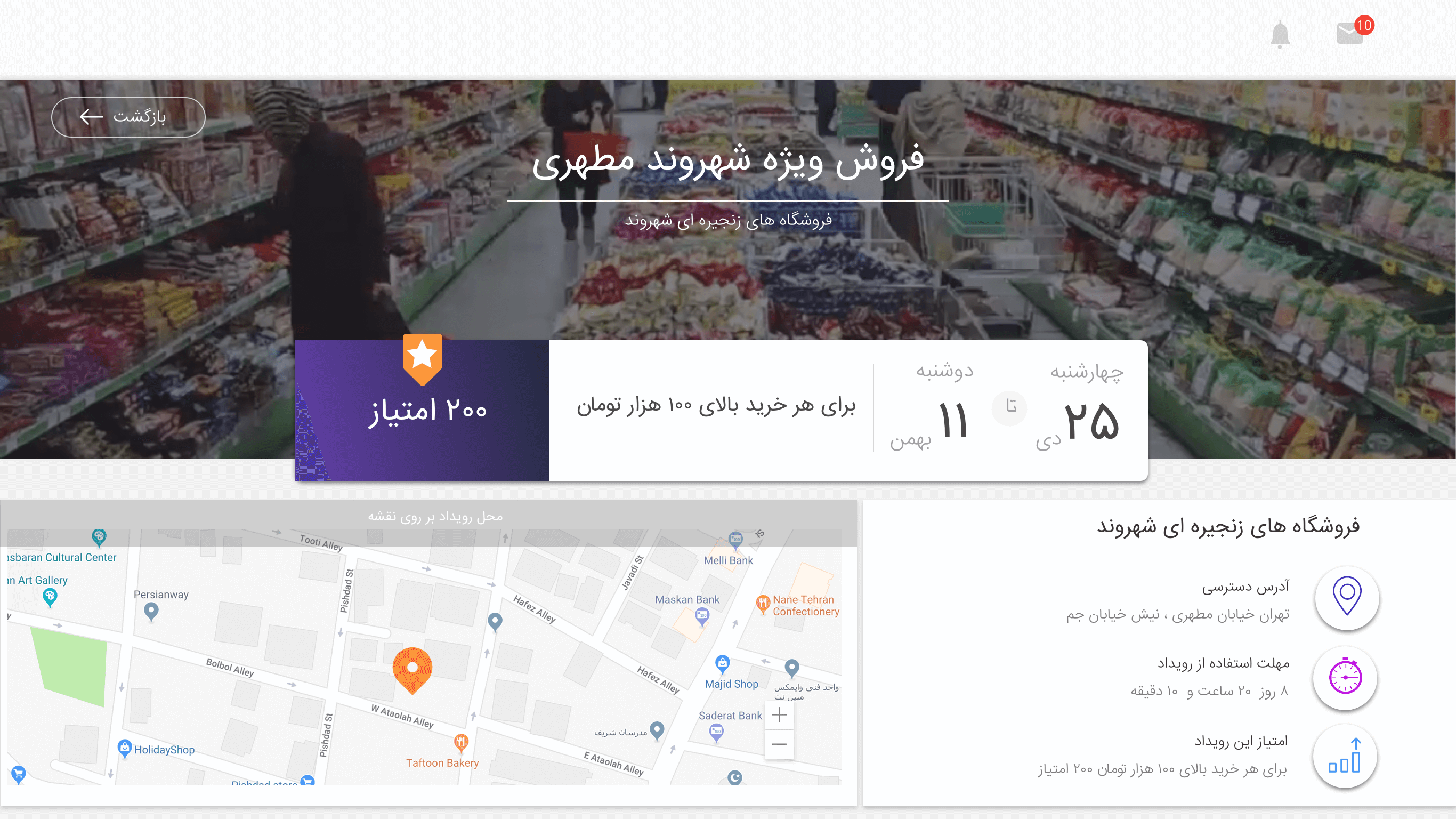
Search events on a full-screen map
Context
From the personas and research: users want to find events near them.
The call
A full-screen map with a search box on top, a card list of events on the left, and a clear filter. Each event page puts date and score in the middle so the basics are readable at a glance.
What it did
Finding and judging an event takes seconds.
Decision 04
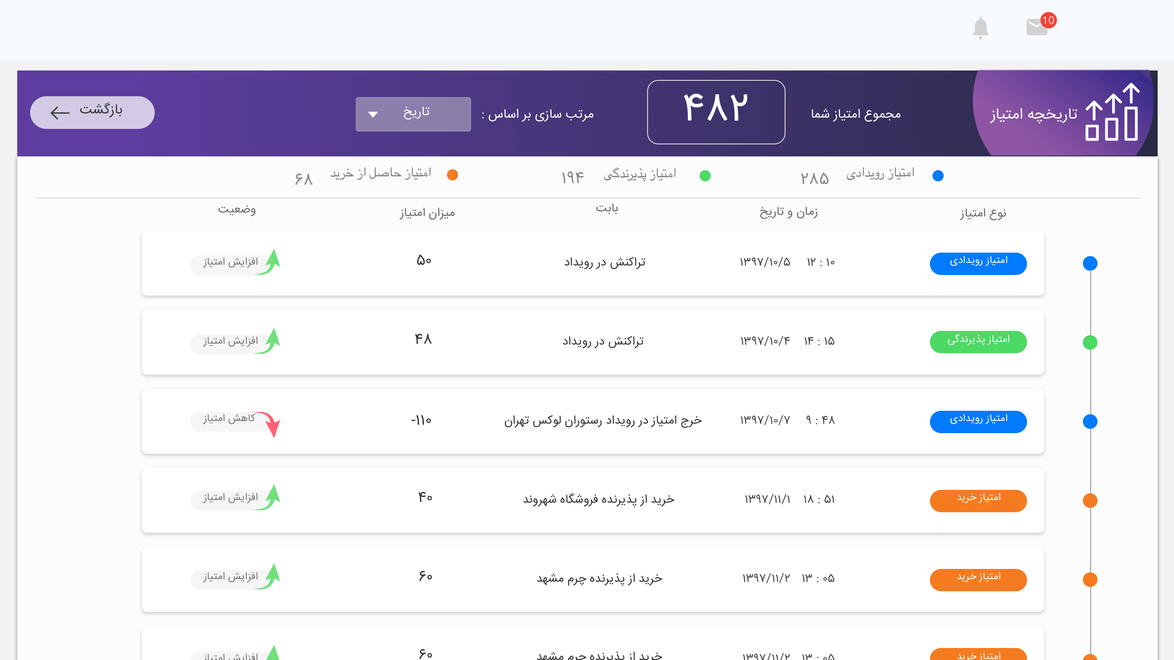
Say where every score came from
Context
Users want to know where and when they got their scores.
The call
A scores page with three types of score, each in its own colour, and the reason in every record.
What it did
Scores are transparent and easy to scan.
05 Testing
Two rounds with a clickable prototype
I created usability scenarios and ran two rounds of testing, letting users go through the tasks in a clickable prototype, taking notes and implementing changes. Tasks included:
Onboarding and profile
Go through onboarding, edit profile information, and find the total wallet amount and score on the main page.
Wallet and sales
Add an amount to the wallet, and find sales for last week and last month.
Events
Explore events near the current location, click an event pin, open event details, and find an event in a specific category.
Menu
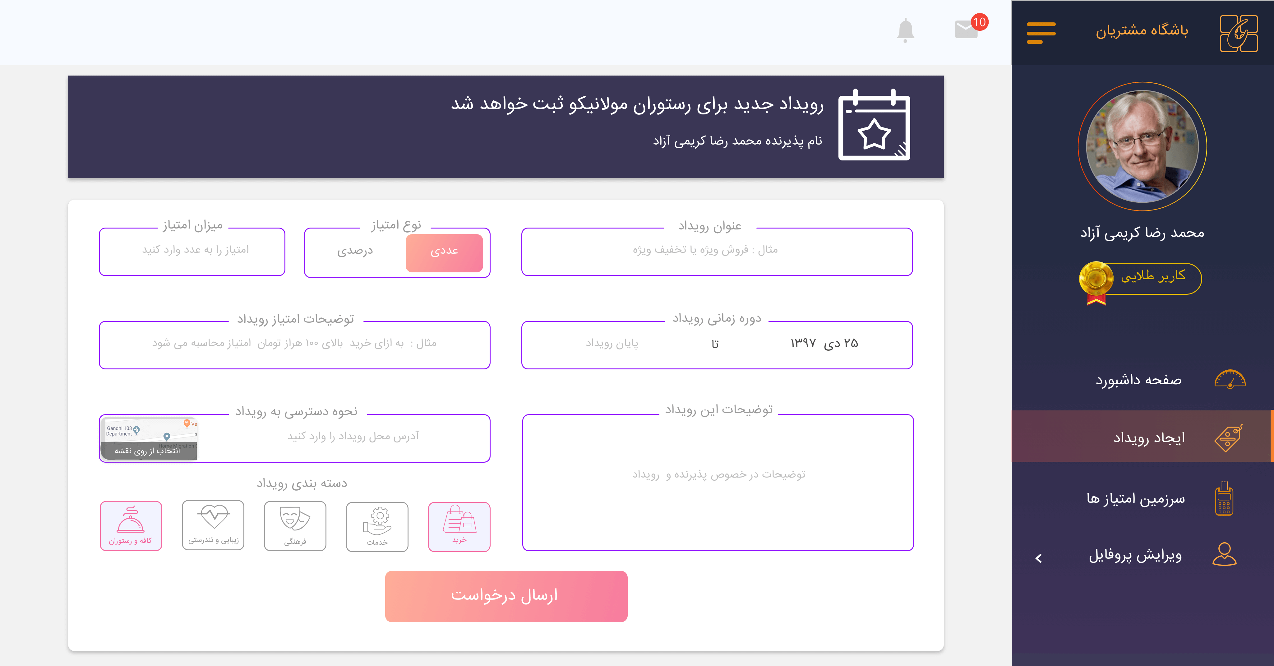
Edit profile information, request a new event and manage privacy settings.
Once linked up in InVision, the prototype was tested with users who fit the personas, in face-to-face tests with open, non-biased questions. I prioritised and implemented changes, the client signed off, and Navaco’s internal development team finalised the build.
Next
A reason to come back.
Balance, events and scores, designed around what merchants told us they cared about.