Project
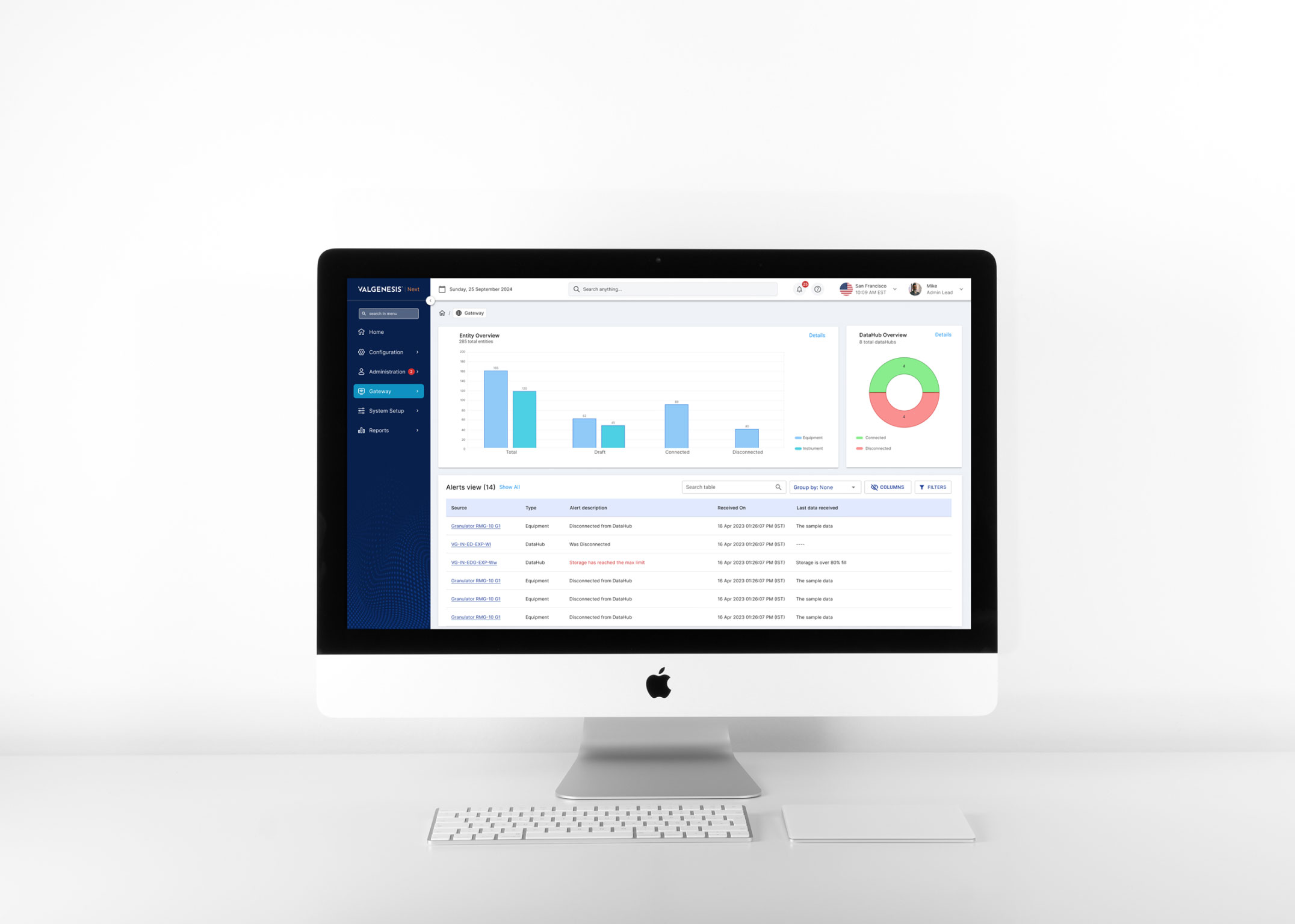
The Gateway project is one of the most interesting and innovative projects in pharmaceutical equipment.
It involves creating a simple dashboard to track and monitor all activities for all types of pharmaceutical equipment and instruments.
Users can easily configure and connect to the dashboard to track all the necessary parameters defined for specific equipment, ensuring that all the equipment performs in the best conditions.
My role
- UX Lead/ Team lead
- Responsible for running design workshops to define the scope of the project.
- Creating a customer journey map for the product
- Conducting stakeholder interviews with key team members
- Refining the design operation processes and iterating over designs
Objective
The main objective was to understand the root pains of the whole product flow and divide them into different chunks of project release.
We also wanted to provide an easy way for pharma companies with thousands of equipment to check their equipment’s parameters (temperature, humidity, and so on). Configuring and tracking data is a super complex task as connectors must also be connected to a specific data hub in the network.
Research methods
- Customer and stakeholder interviews
- Participatory design
- Customer journey mapping
- Task flow analysis
Imagine tracking every critical reading in a pharmaceutical lab from one intuitive dashboard. No headaches. No chaos. Just efficiency.
01 Tension
Thousands of instruments, one quality manager
Pharmaceutical companies run thousands of pieces of equipment and instruments. Each one has parameters, such as temperature and humidity, that must stay in the right range, and each one has to be connected to a specific data hub on the network.
Configuring and tracking that data is a very complex task. The Gateway project set out to turn it into a simple dashboard.
1
Dashboard for all equipment and instruments
4
Research methods: interviews, participatory design, journey mapping, task flows
3
Design challenges to solve
25%
Shorter development cycles after automating design handoff
Our objective was to understand the root pains across the whole product flow and split them into separate releases, so teams could deliver value step by step.
02 Discovery
Who are we really designing for?
We began with stakeholder interviews: engineers, lab managers and compliance officers, the people who felt the pain first-hand.
The kickoff workshop was built around one question: who are we designing for? Several departments touched the same equipment data, and each needed different things from the same dashboard.
Do we know which persona is the key decision-maker?
A stakeholder, during the kickoff workshop
That question changed the work. We stopped looking only at users and started looking at who influences the product’s success. We ran a persona-building session on a virtual whiteboard: sticky notes for every potential persona, grouped by role and responsibility.

03 Challenges
Three things the design had to get right
Simplify data complexity
The platform handled large volumes of real-time data. The challenge was to present it intuitively without losing important detail.
Design for scale
New functionality was coming. The design had to support future growth without being rebuilt.
Align stakeholder goals
Technical constraints, user needs and business priorities had to be balanced through close collaboration across teams.
04 Decisions
A first iteration built around exceptions and context
Decision 01
Make the first screen answer one question: what needs attention?
Context
Many roles, one dashboard, and far more entities than anyone can scan.
The call
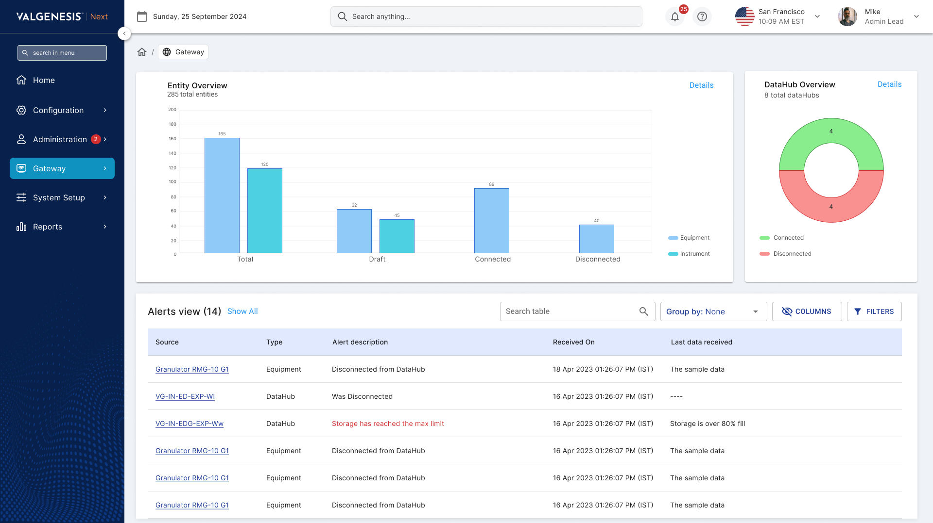
The main dashboard has three components: an entity overview, a DataHub overview, and an alerts area for any equipment or instrument with a problem.
What it did
Quality teams see what is connected, what is not, and what needs action before they open a single detail page.
Decision 02
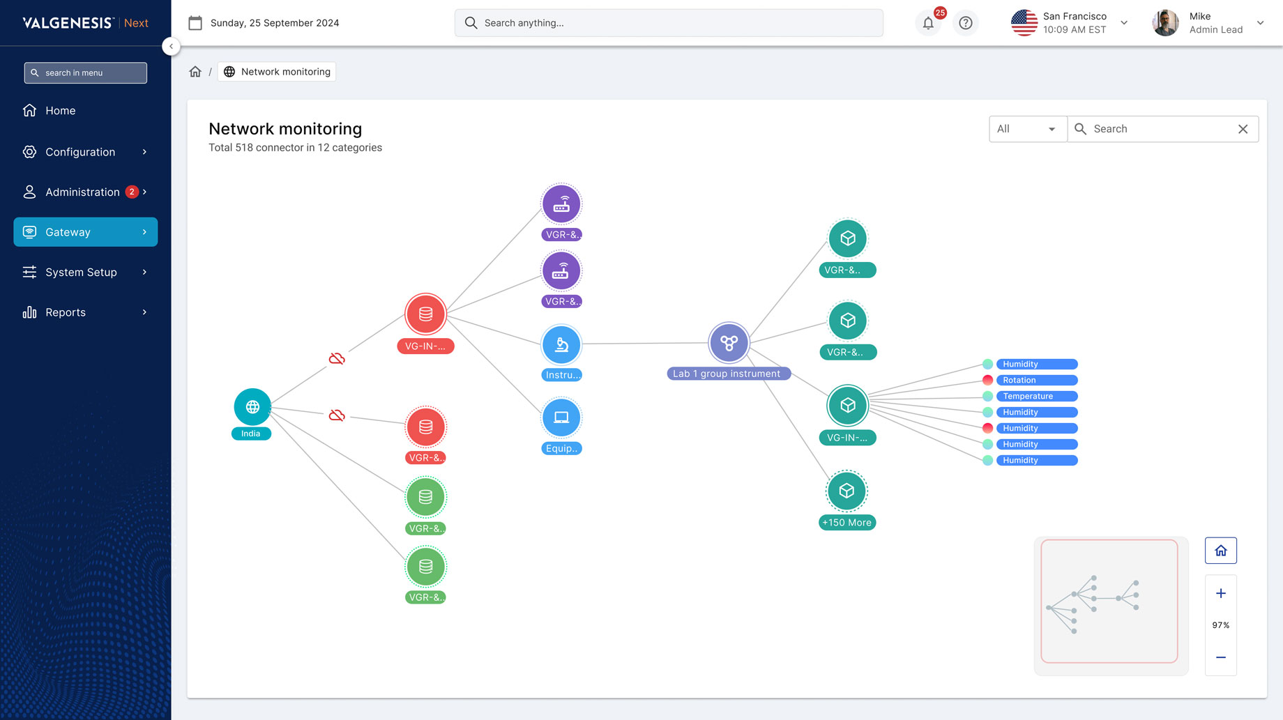
Show the network as a network
Context
Connectors have to be connected to the right data hubs, and a table does not show that.
The call
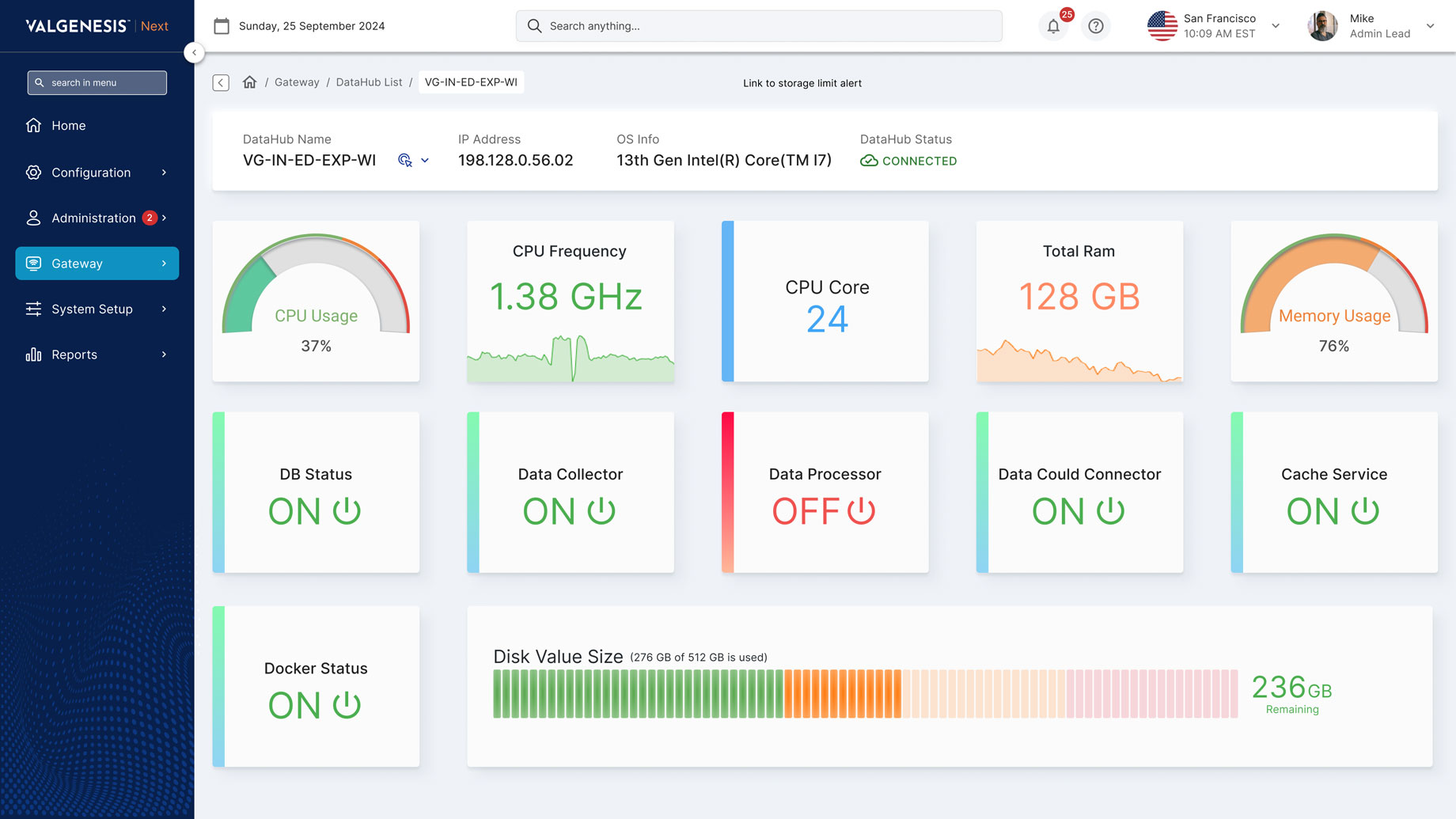
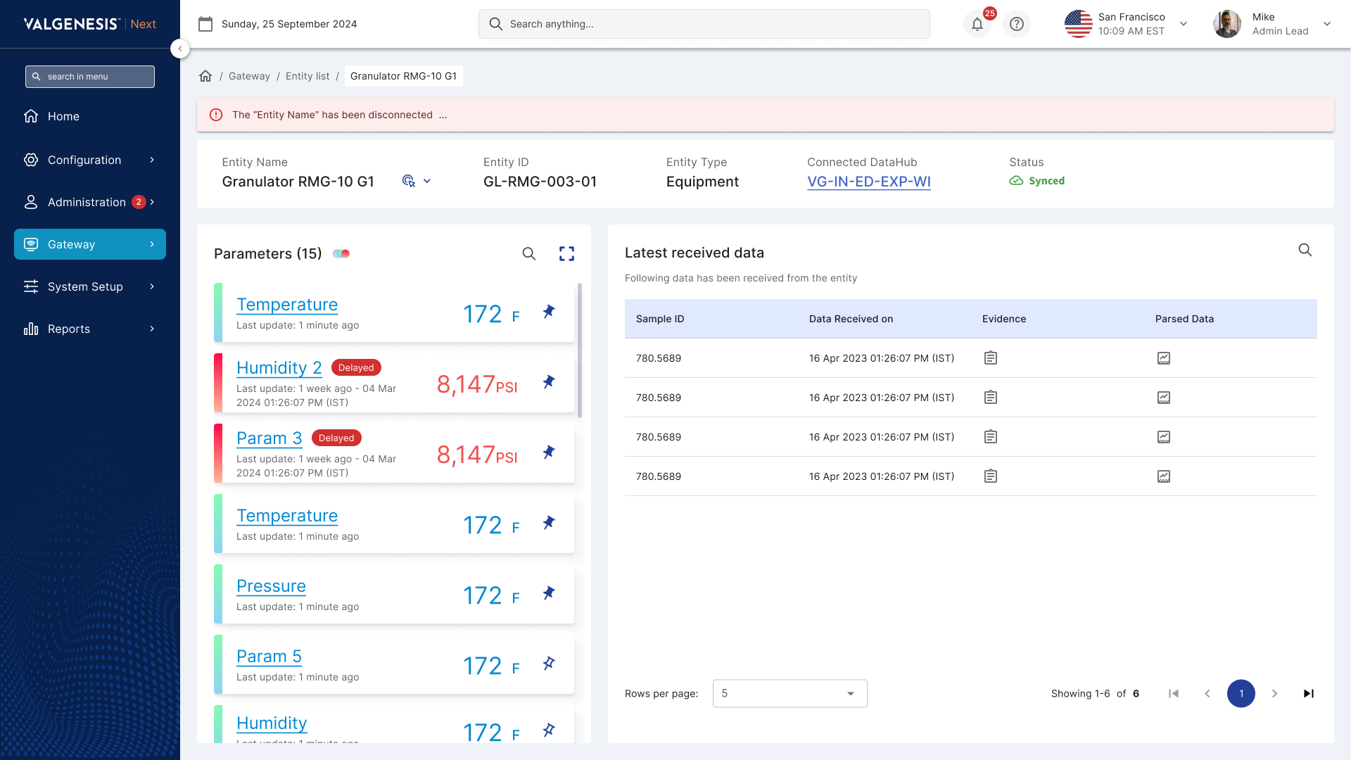
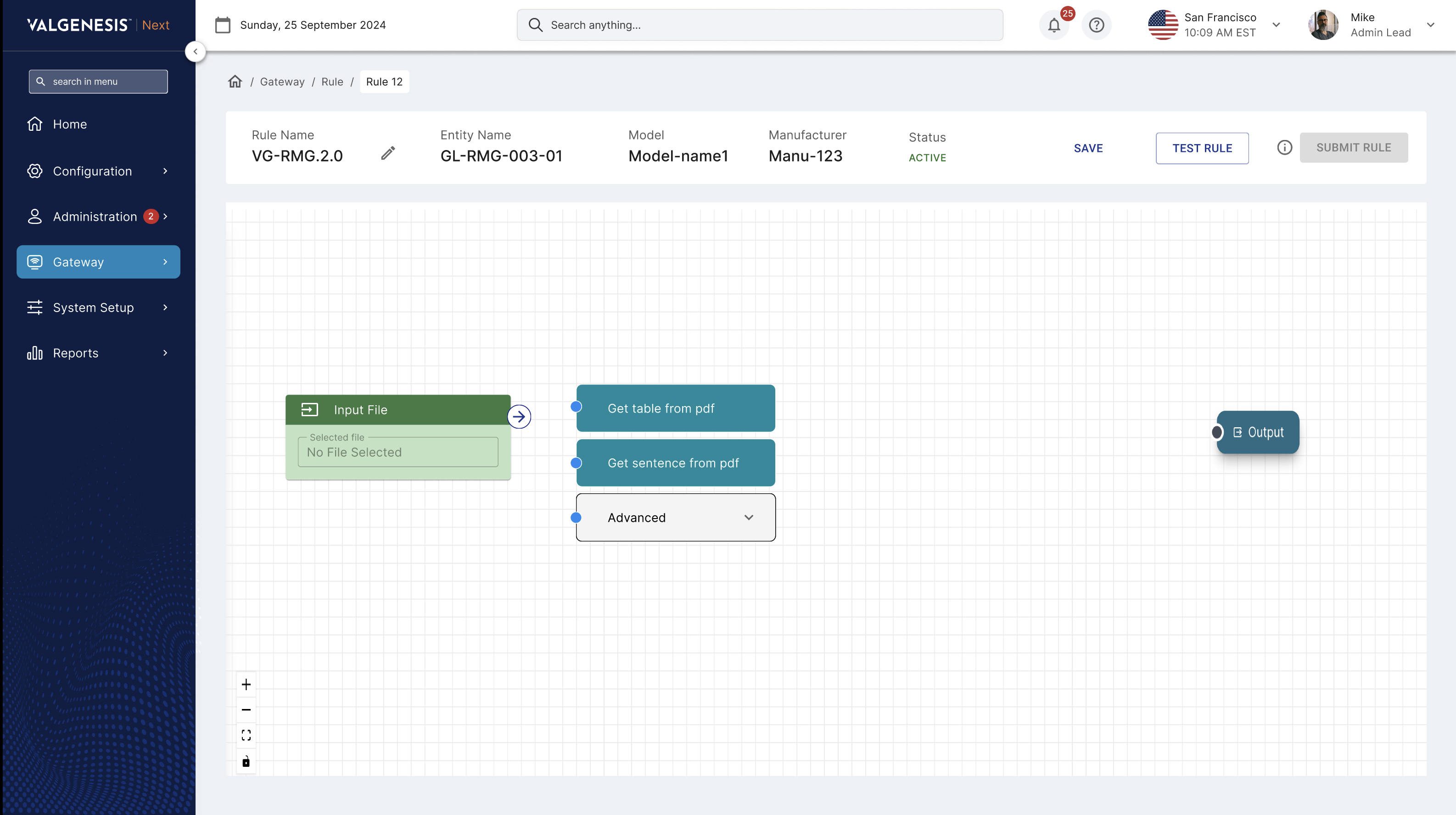
Dedicated dashboards for DataHubs, network monitoring and each connector (entity), so users can drill from the whole network down to a single parameter.
What it did
Problems can be located spatially and at the parameter level, and the path from overview to detail is short.
05 DesignOps
Improving how the team designs, not only what it designs
Alongside the dashboards and flows, I worked on design operations so cross-functional teams could work more efficiently and deliver a cohesive product faster.
Cross-functional design reviews
Regular reviews with designers, developers and stakeholders, to align early, catch issues sooner and bring diverse feedback into the module and the design chapter team.
Documentation and a shared repository
One place for guidelines, components and documentation, to shorten onboarding and keep work consistent.
Automated handoff
Figma plugins gave developers accurate specs and assets. This reduced development cycles by 25% and minimised errors.
A scalable design system
Built with developers from reusable components and standard patterns, so new features ship faster and stay consistent across the organisation’s platforms.
Next
Complexity managed, not hidden.
Gateway is where the design-operations side of my leadership shows most: the product and the way the team worked on it improved together.